Getting in
7Seven screens because a B2B workspace has a genuinely long front door: password, SSO, a second factor, and then the question of which workspace you meant. The brand only appears at full strength twice — on the splash and behind the sign-in card — and never again.
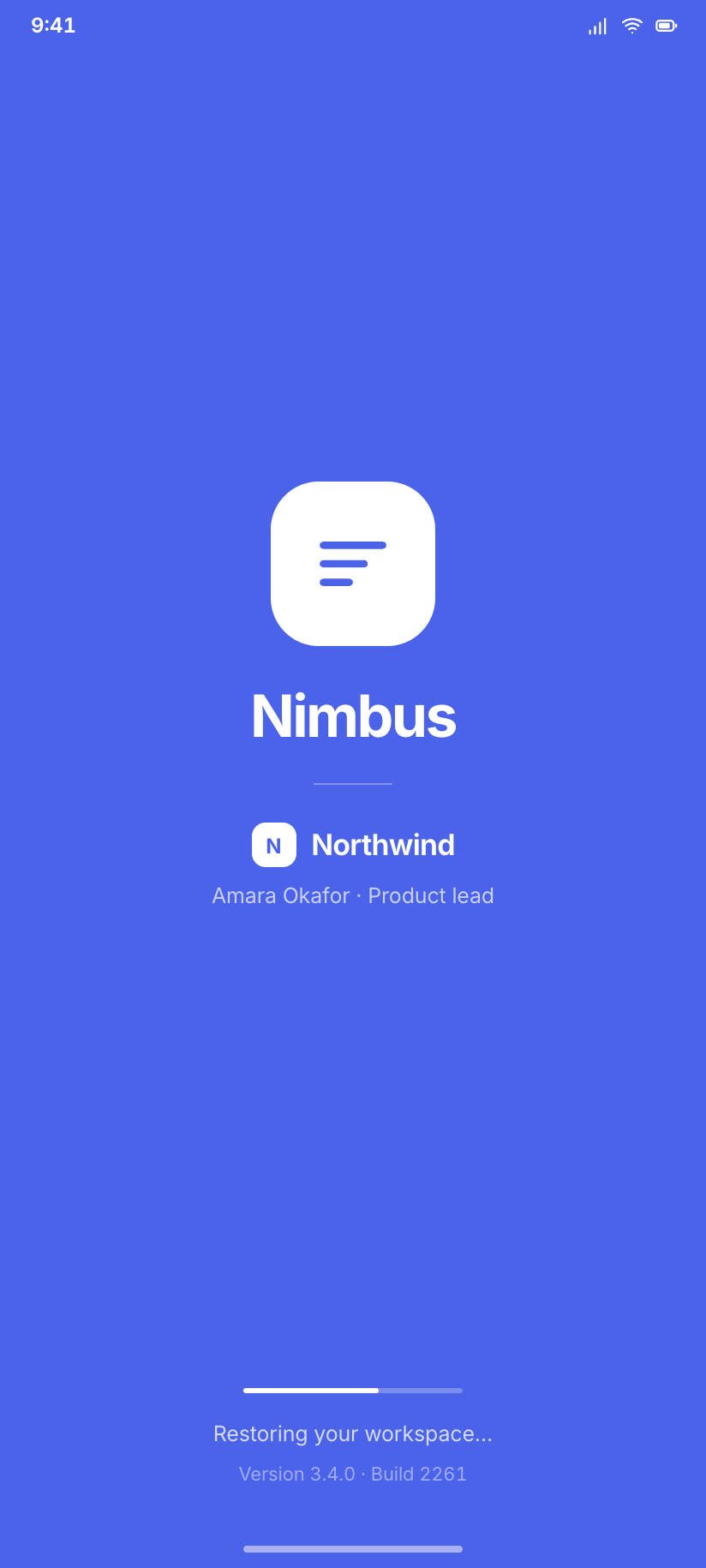
Splash
The one moment Nimbus is pure brand: the mark on a full-bleed indigo field, with the workspace name already resolved underneath.
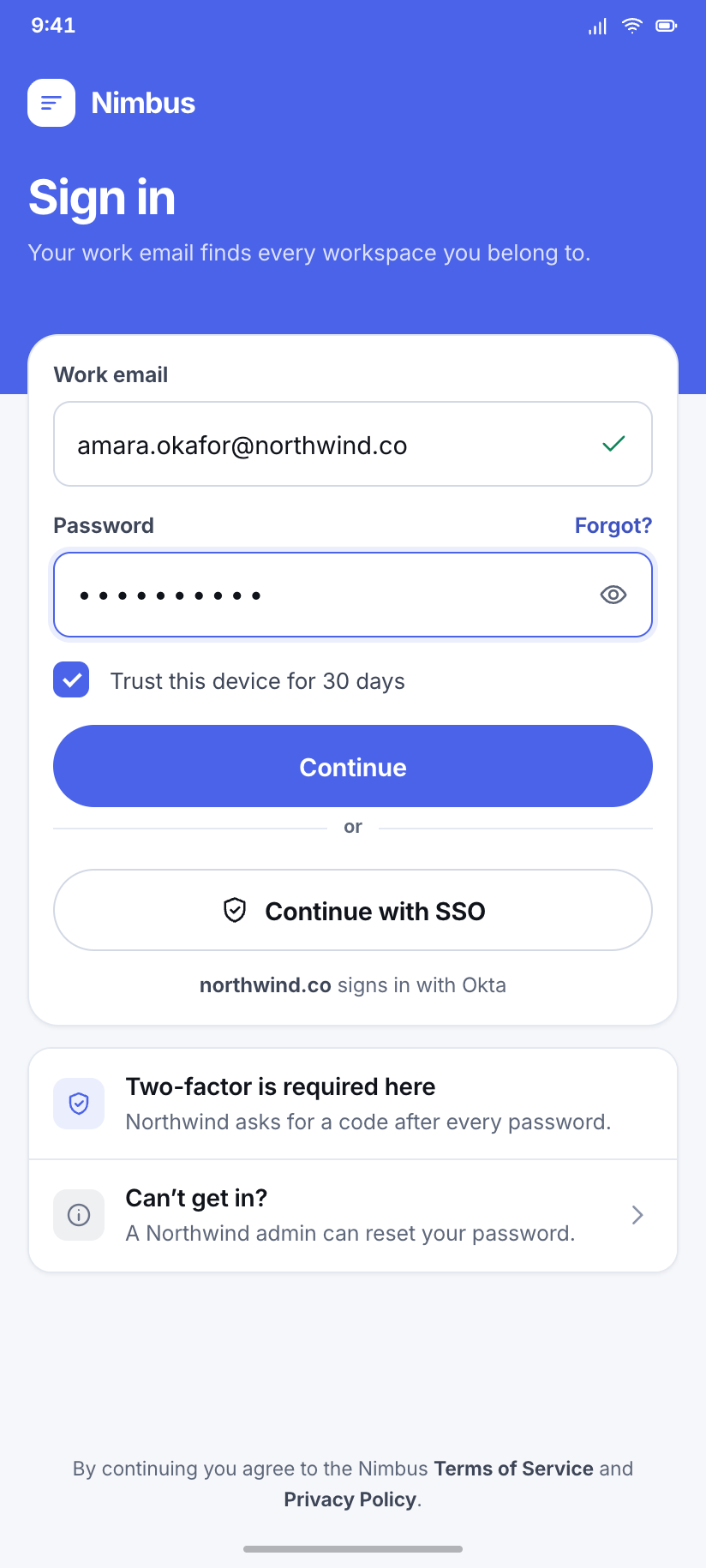
Sign in
Email and password with the SSO route given equal weight, because in a workspace app most people never type a password at all.
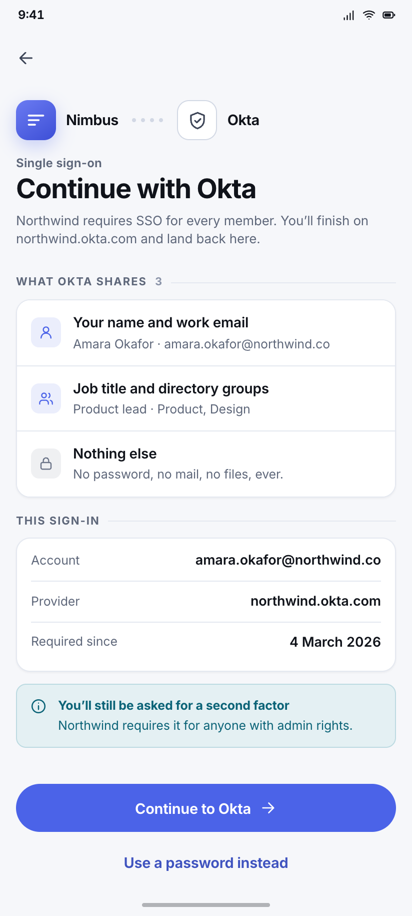
Continue with SSO
The handoff screen: which identity provider Northwind uses, what it is about to share, and the way back to a password.
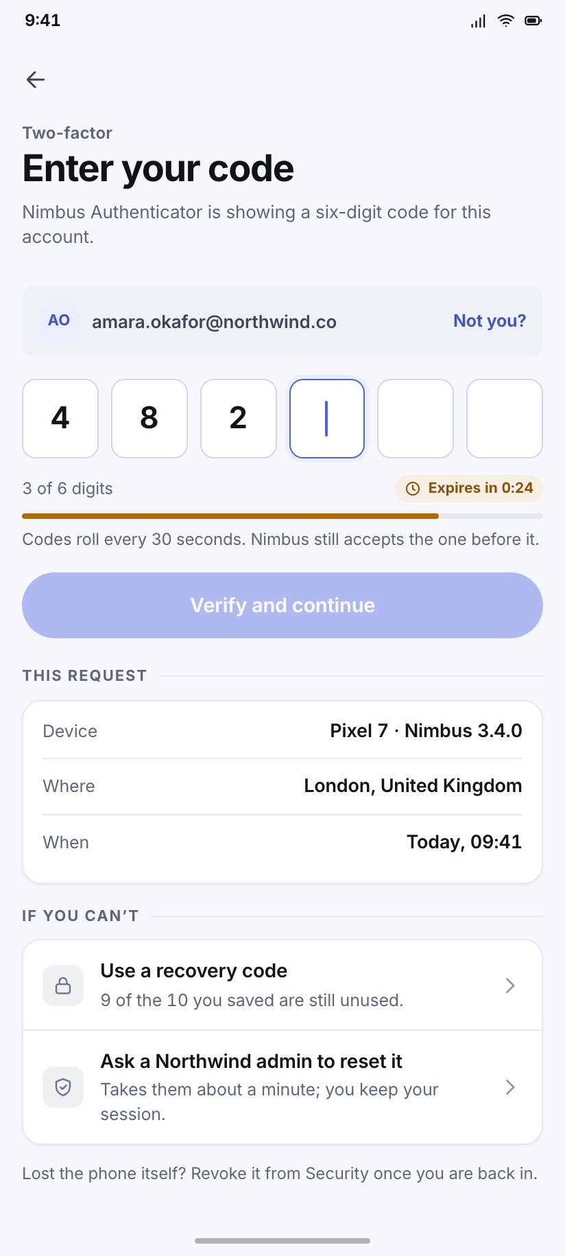
Two-factor
Six tabular boxes with the fourth focused, the code's remaining validity counting down, and the recovery route in reach.
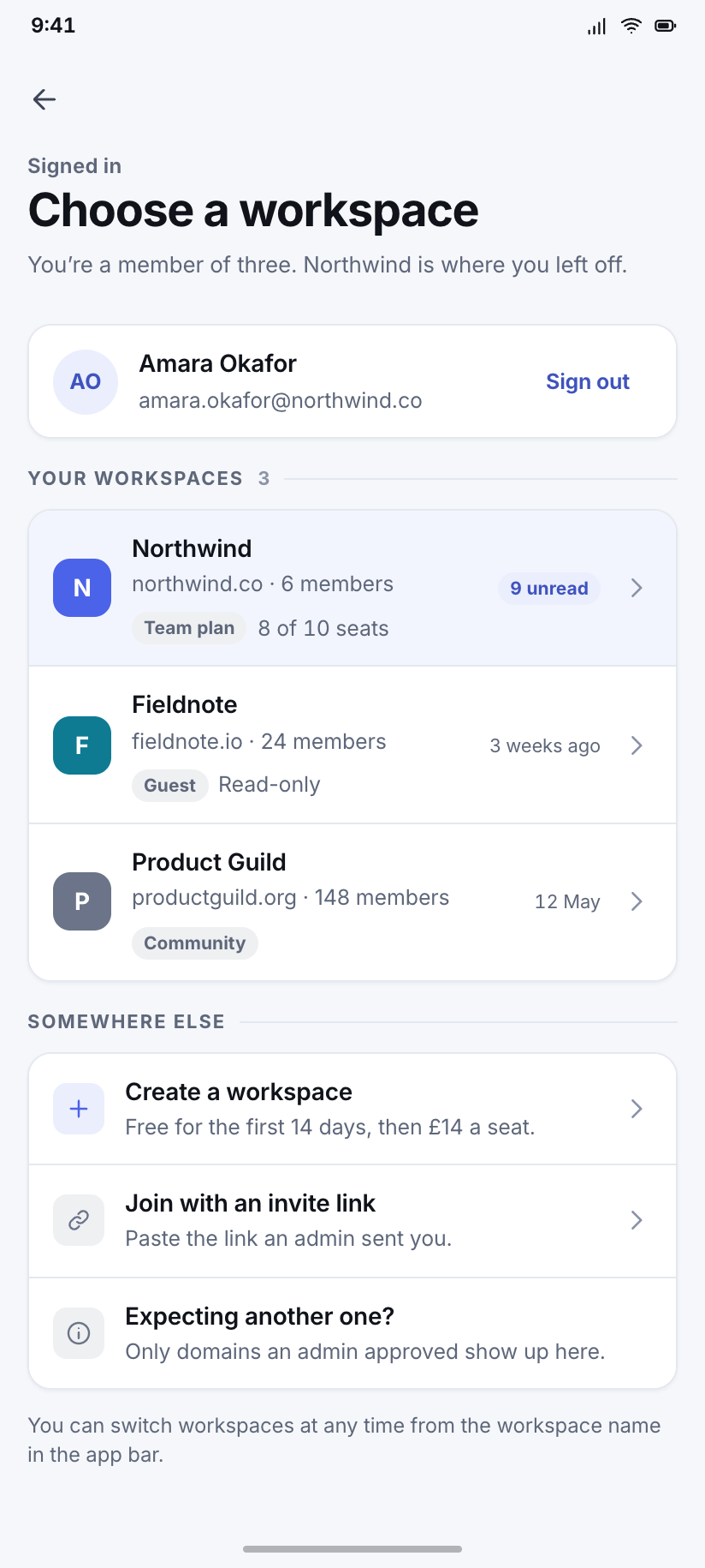
Choose a workspace
Amara belongs to three; Northwind carries her nine unread inbox items, which is the only reason to show counts here at all.
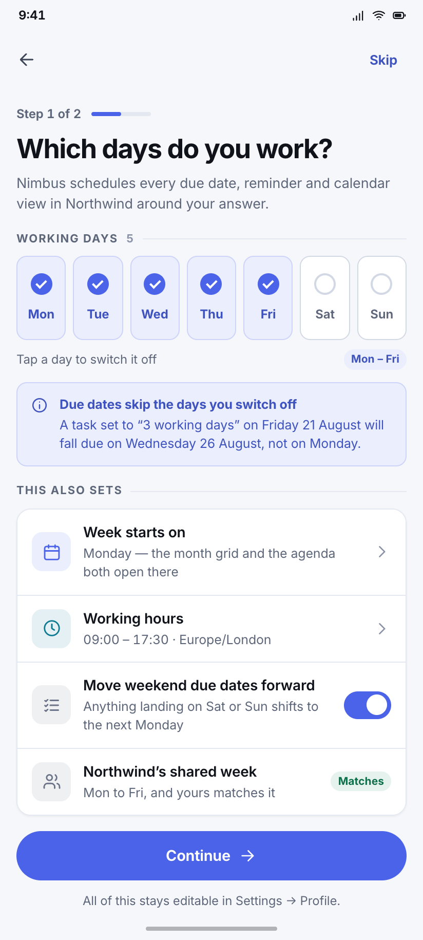
Set up your week
One question, not a carousel — which days you work — because the answer changes every calendar and every due-date in the app.
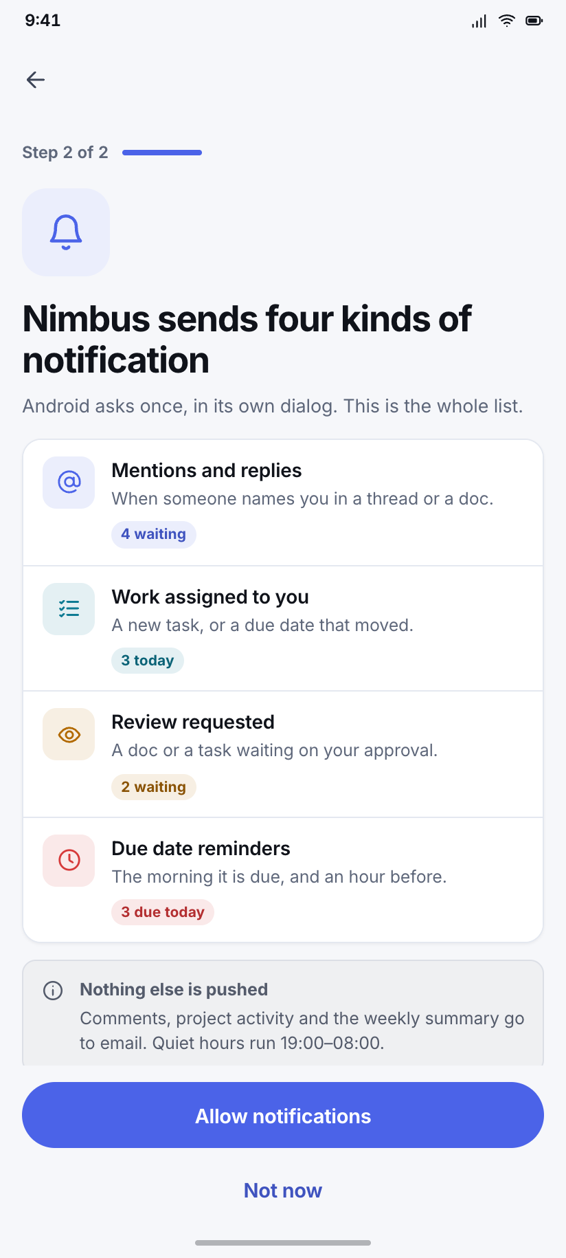
Notifications permission
The Android 13 pre-prompt: exactly which three things Nimbus would notify about, before the system dialog gets one irreversible chance.
Today
6Home answers one question — what is on me before lunch — in the order you would ask it: how much, when, and what. The drawer and the command palette both open from here, so all three states of the same destination live in this flow.
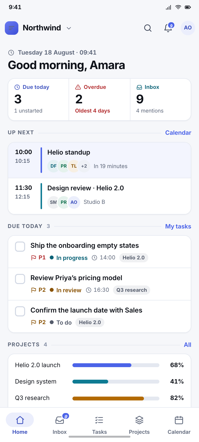
Home
The busiest destination: three counters, the next three calendar entries with the 10:00 standup flagged as nineteen minutes away, today's three tasks and four project meters.
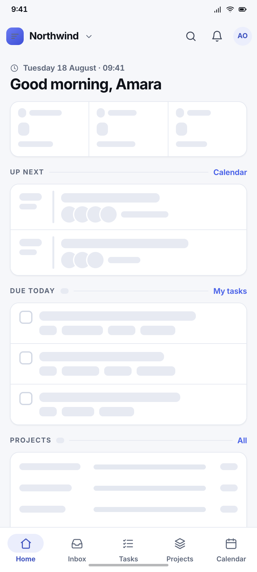
Home — loading
The skeleton mirrors Home's real geometry block for block, so nothing jumps when the data lands; flat grey, no shimmer, because a still frame of a shimmer is just a gradient.
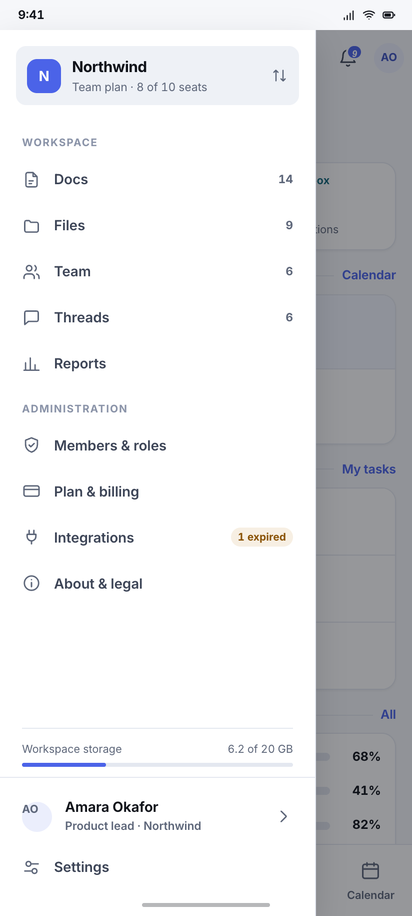
Navigation drawer
Nimbus's second navigation surface: the workspace switcher on top, then everything the five-tab bar could not hold — docs, files, team, threads, reports, admin.
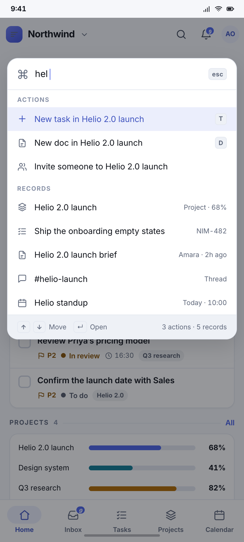
Command palette
Top-anchored over Home, three characters typed, showing actions above records because a palette is for doing and search is for finding.
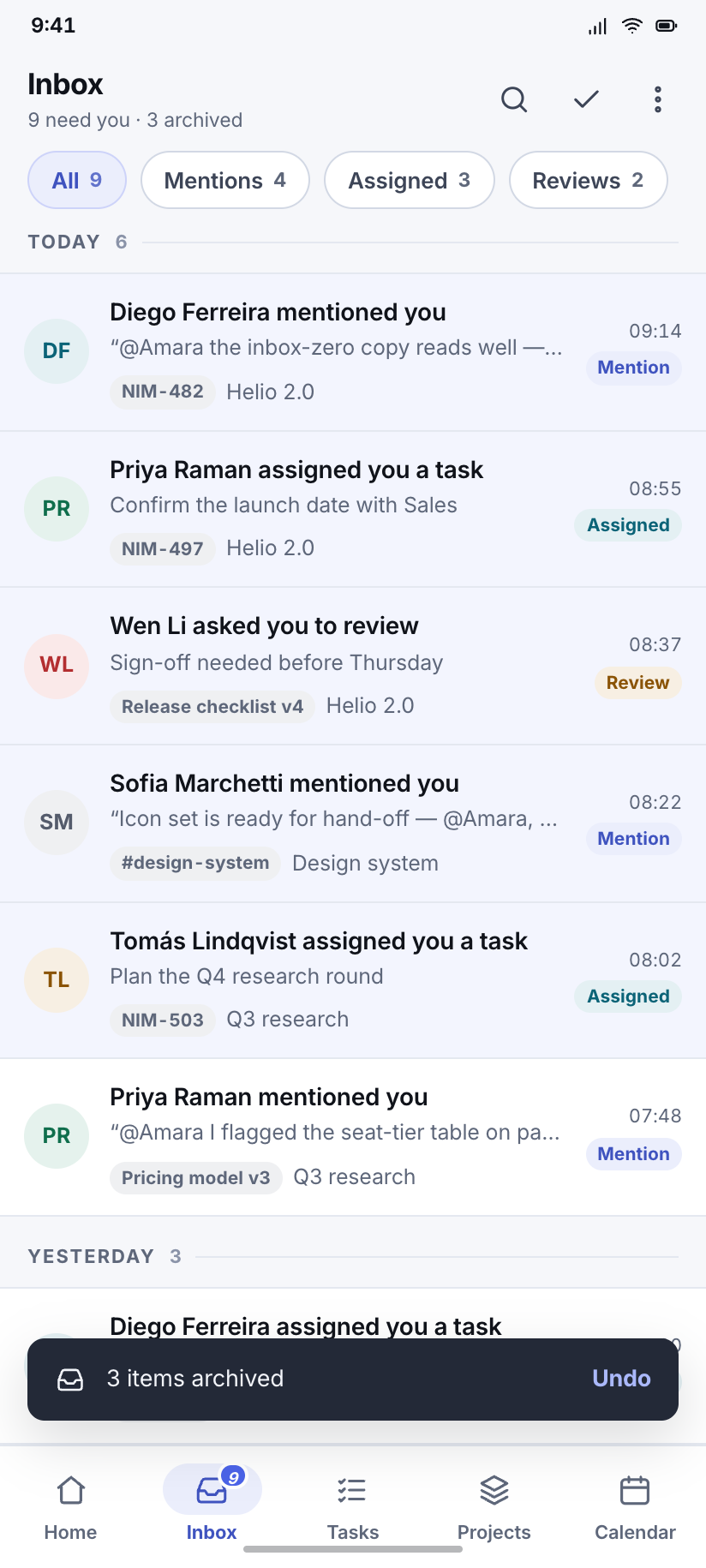
Inbox
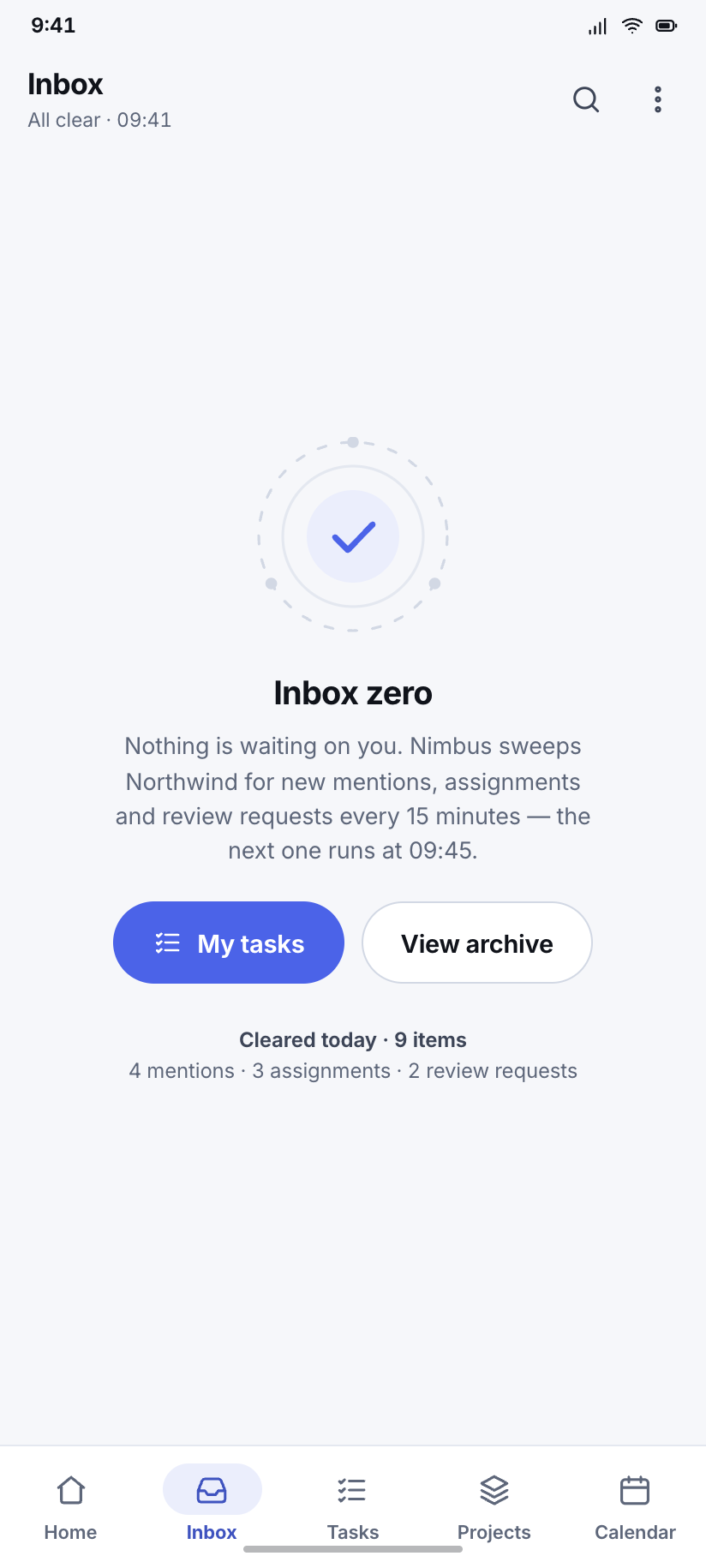
Nine actionable items — four mentions, three assignments, two review requests — with a snackbar offering to undo the three just archived.
Inbox zero
The empty state, drawn rather than decorated: concentric geometry, one true sentence about when the next sweep runs, and no confetti.
Tasks
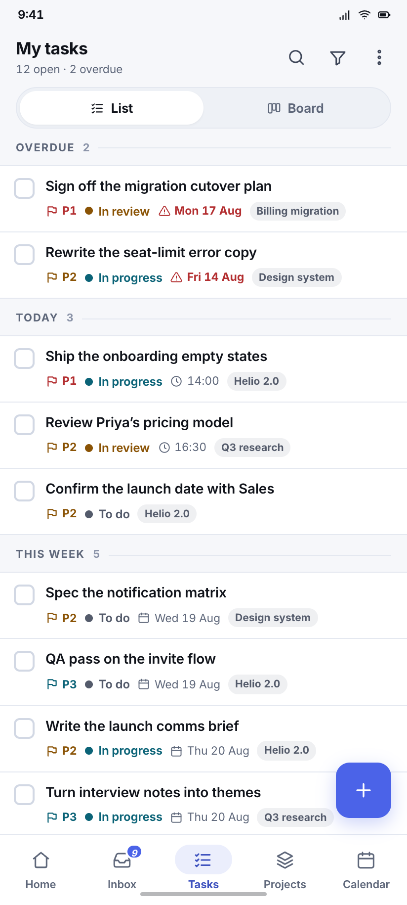
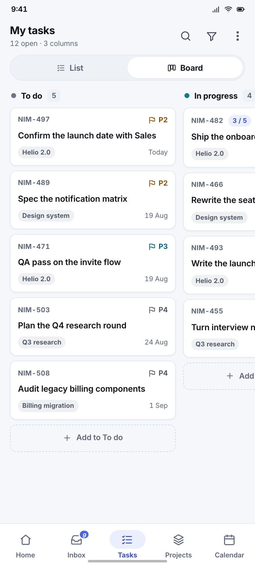
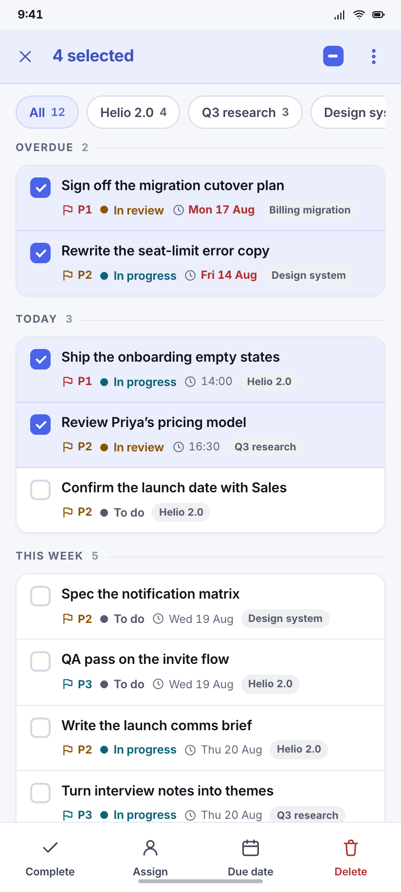
7The core object of the kit, in every mode a list can be in. List and board show the same twelve open tasks, so the column counts must always add to twelve. Selection mode replaces both bars rather than adding a third.
My tasks
Twelve open tasks grouped by when they are due — two overdue, three today, five this week, two later — with the group counts summing to the header.
Board
The same twelve tasks as columns: To do 5, In progress 4, In review 3, with the next column peeking so the swipe is legible in a still.
Filter & sort
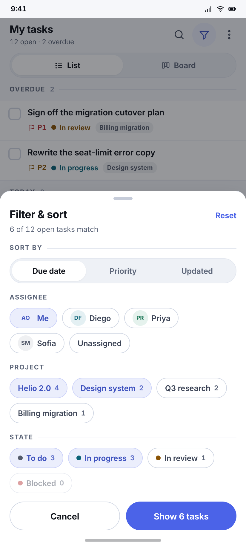
One sheet doing both jobs — sort segment on top, then assignee, project and state — with the result count updating live in the apply button.
Selection mode
Four tasks checked, the app bar replaced by a contextual bar and the bottom nav replaced by bulk actions; nothing is added to the screen, two things are swapped.
Task detail
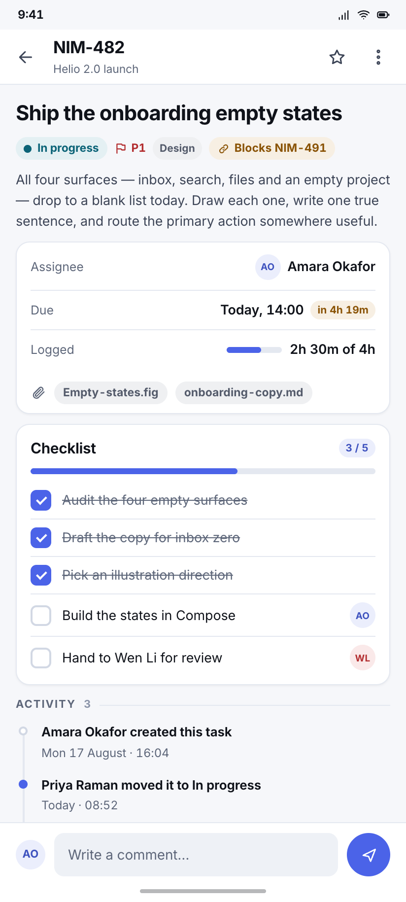
The dense one: state, priority, assignee and dates, a five-item checklist at 3 of 5, two attachments, the blocking link, and the activity trail down to a live comment box.
New task
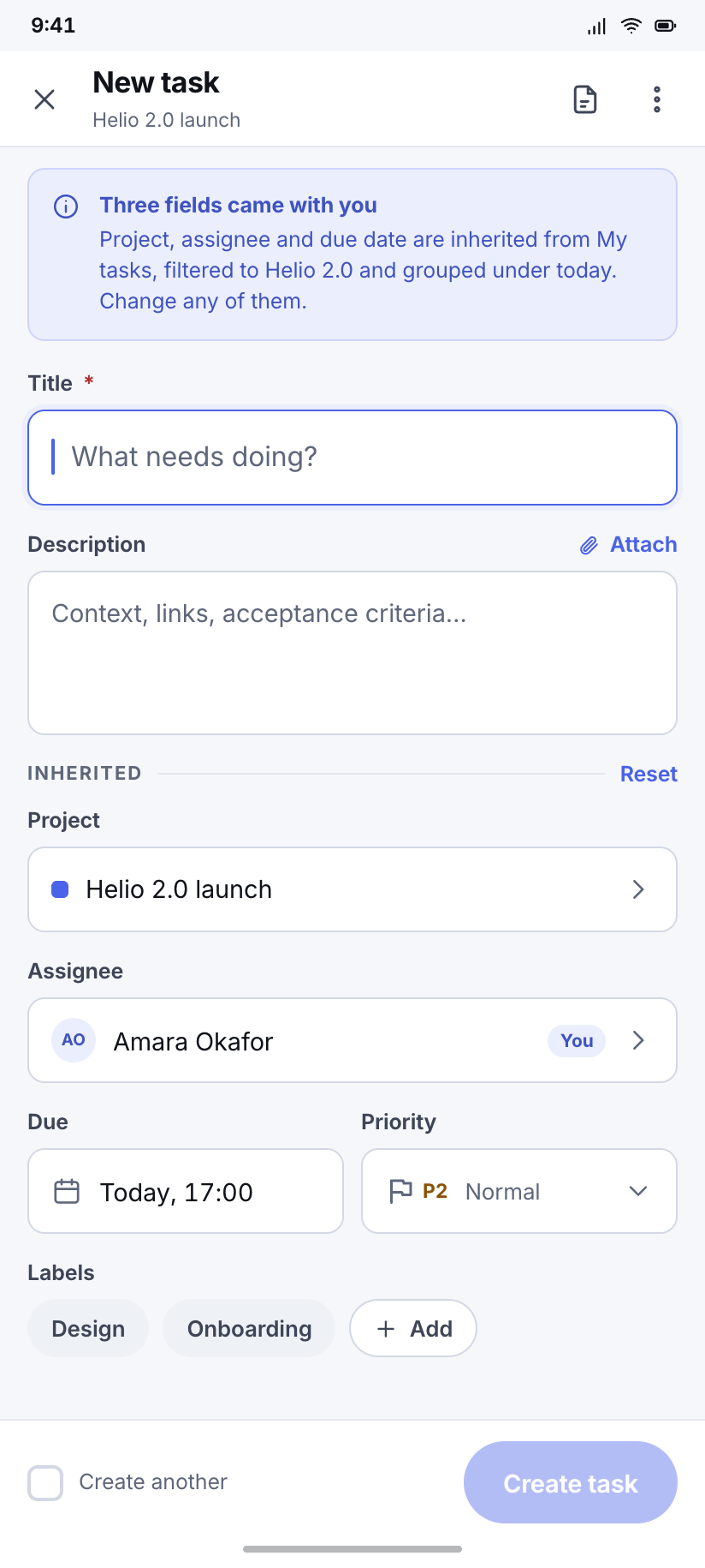
A create form that is already 70% filled from context — project, assignee and due date inherited from where you pressed the button, so only the title is really empty.
Delete task
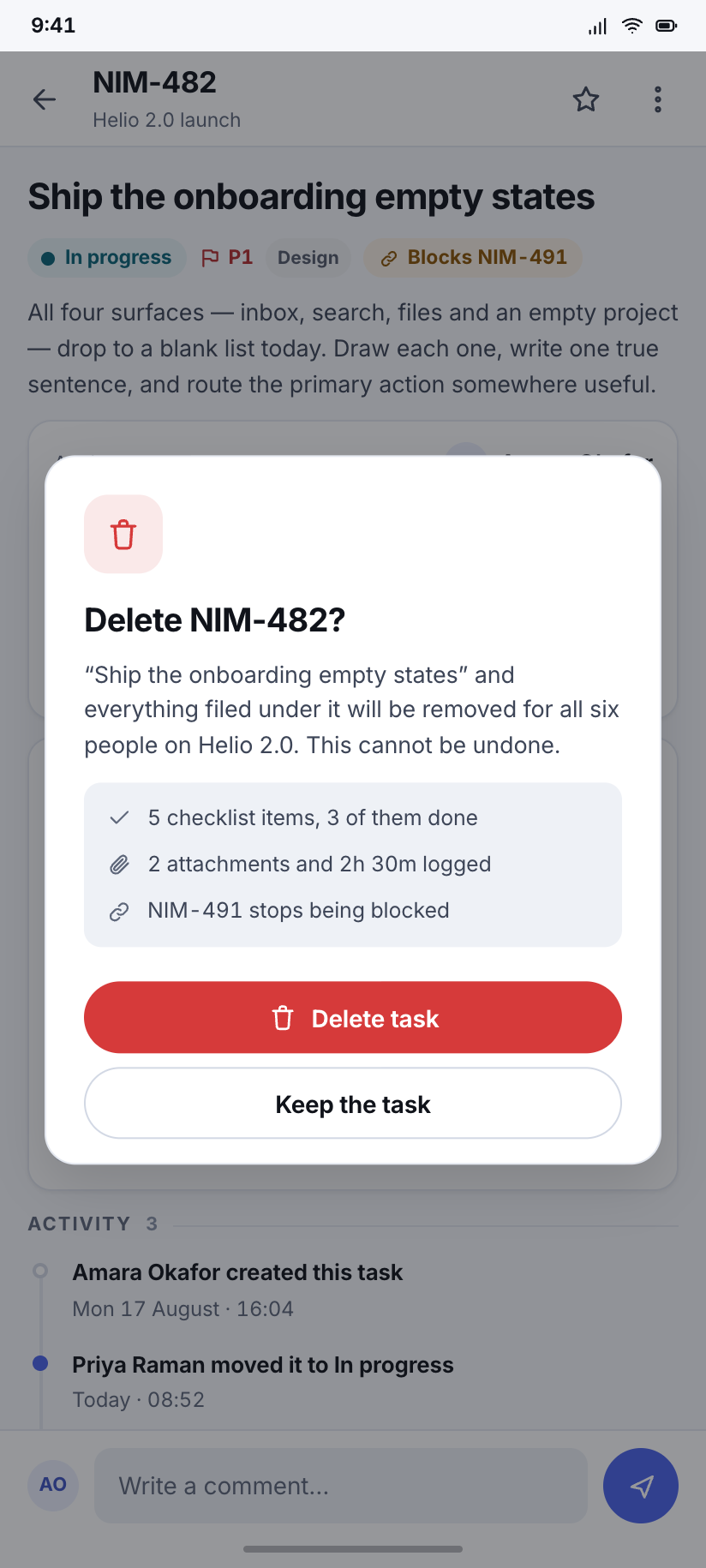
The design's one destructive dialog: it names the task, says what else goes with it, and puts the safe choice where the thumb already is.
Projects
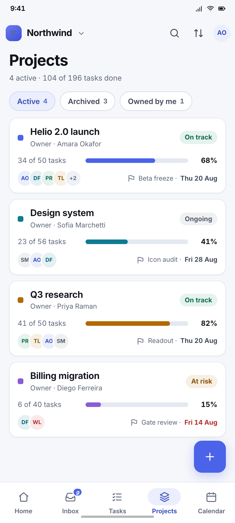
3Four projects, and the same four percentages appear on Home, here and on the overview — 68 / 41 / 82 / 15 — because a number that disagrees with itself across two screens is the fastest way to make a mockup look invented.
Projects
Four project cards with progress, owner, member stack and next milestone; Billing migration carries the only red date on the screen.
Helio 2.0 launch
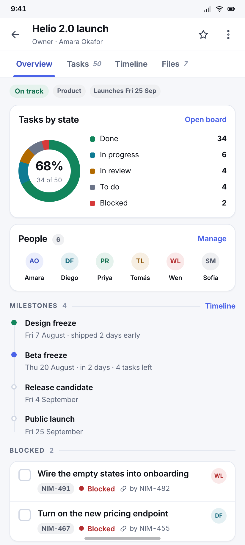
The active project at 34 of 50 tasks: a doughnut by state, the six people on it, the four milestones, and the two things currently blocked.
Timeline
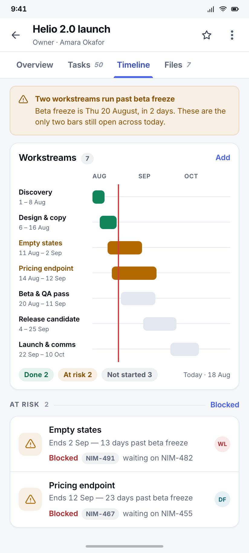
Seven workstreams across August to October as a gantt, with the today-marker on 18 August and the two bars that cross it flagged at risk.
Docs & files
3Nimbus has no photographs and no thumbnails — a file is an icon tile, a name, a size and who touched it last. The doc reader is the one place in the kit with a reading measure rather than a scanning one.
Docs
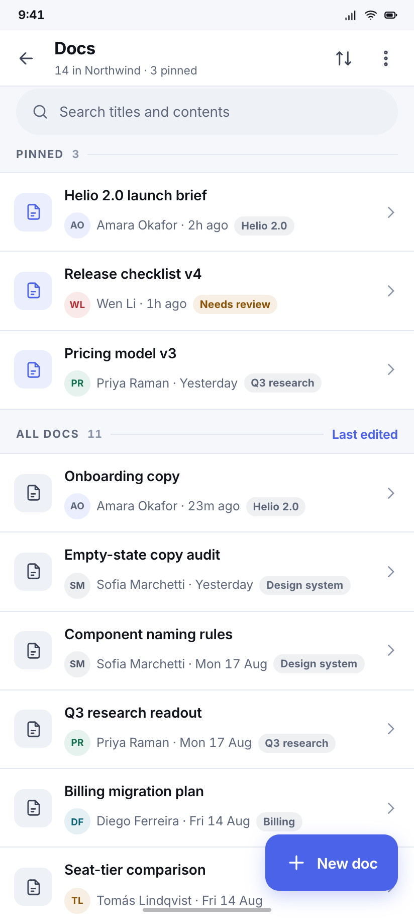
Fourteen documents in two groups, pinned first, each with the person who last edited it and how long ago — the only sort a doc list actually needs.
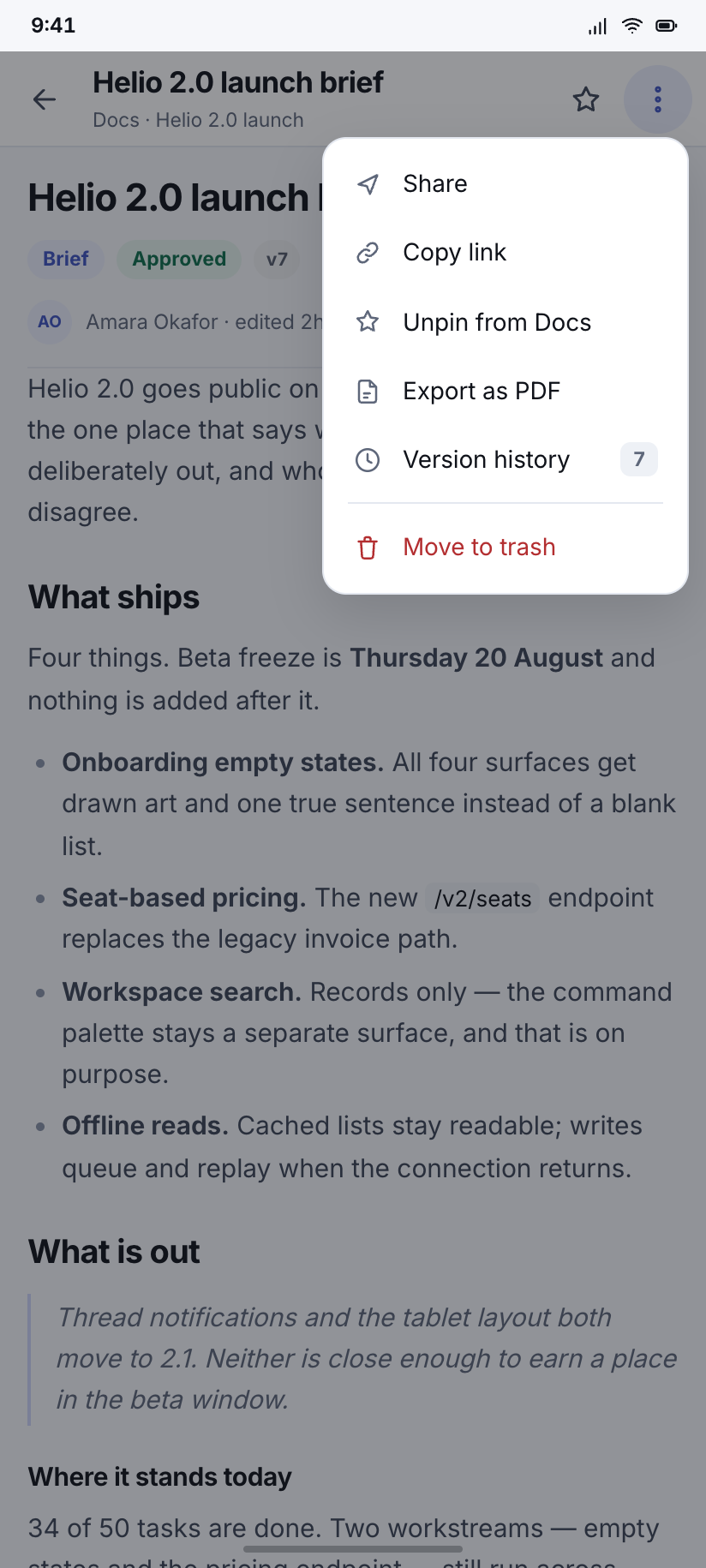
Doc reader
The Helio launch brief set at 15px on a 1.62 measure, with the overflow menu open over it showing the six things you can do to a doc.
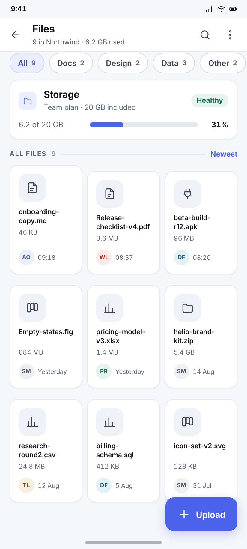
Files
Nine attachments as icon tiles rather than thumbnails, with a storage meter that reads 6.2 of 20 GB and agrees with the plan on the billing screen.
Calendar
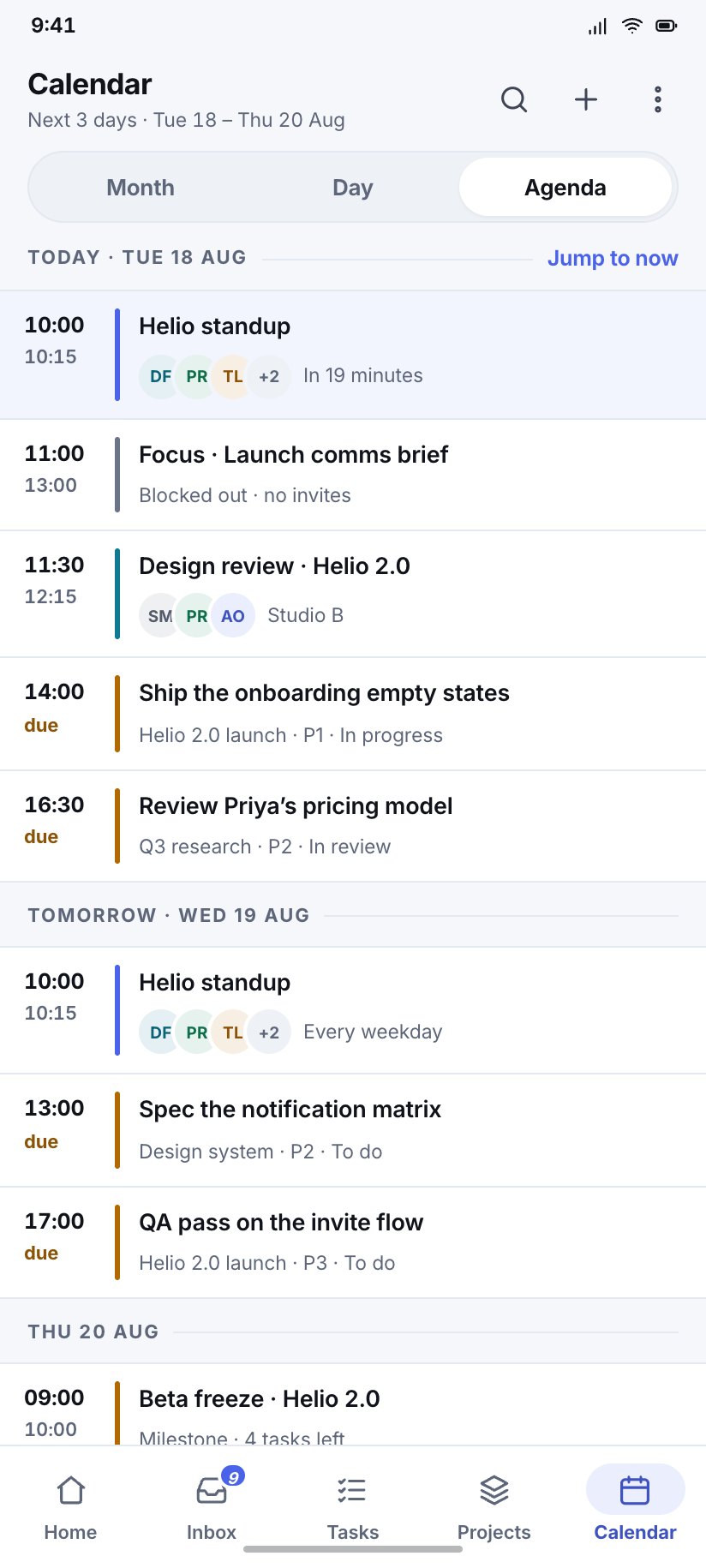
3Three views of one Tuesday. Month, day and agenda all sit on the same destination and keep the bottom nav; the segmented control switches between them, and 09:41 is drawn as a real now-line in the day view.
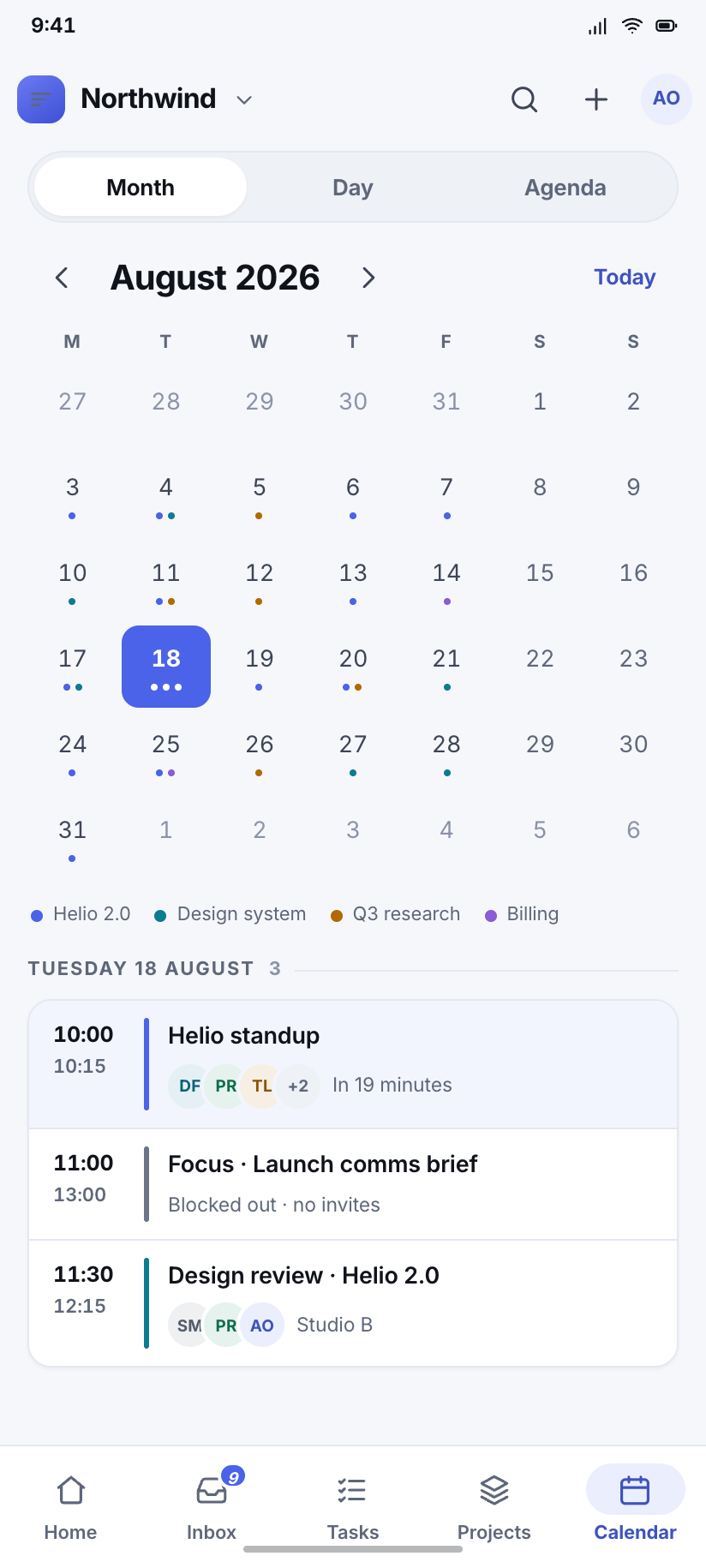
Month
August 2026 with the 18th filled, event dots coloured by project, and the selected day's three entries listed underneath the grid.
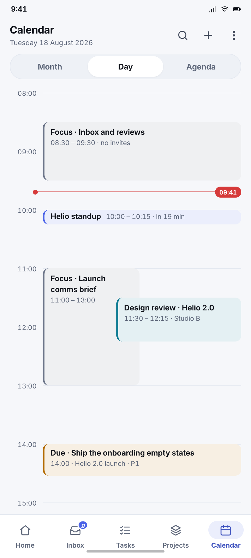
Day
An hour rail from 08:00 with the now-line at 09:41, the 10:00 standup nineteen minutes out and the 11:30 review overlapping a focus block.
Agenda
The next three days as one continuous list — the view people actually live in — with due tasks interleaved among the meetings.
People
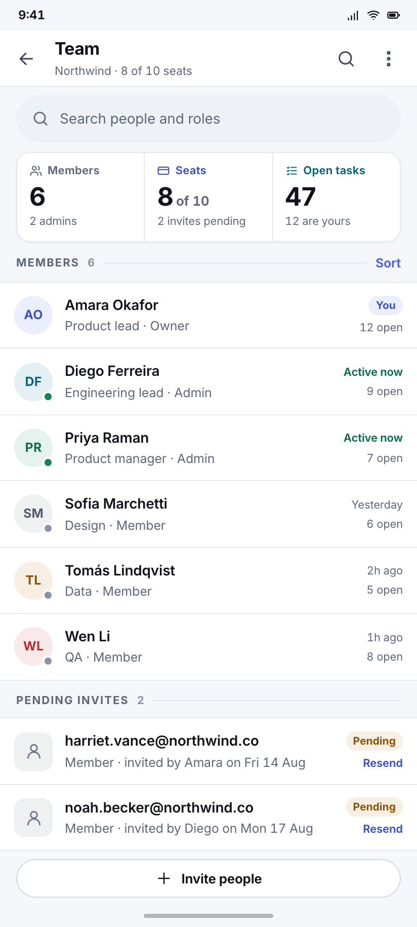
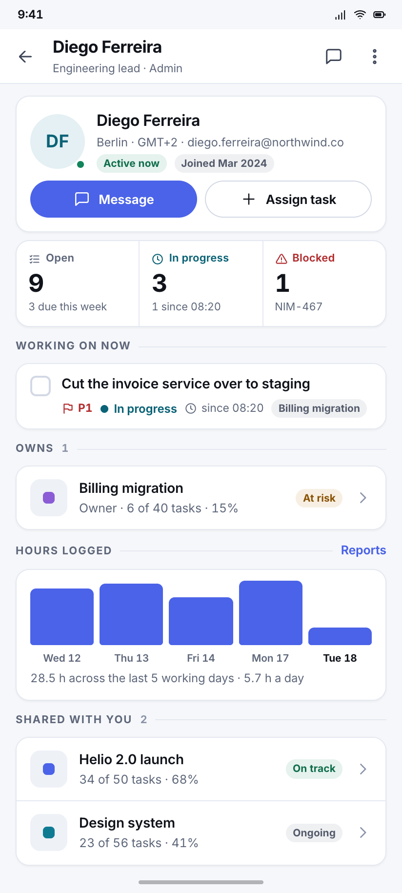
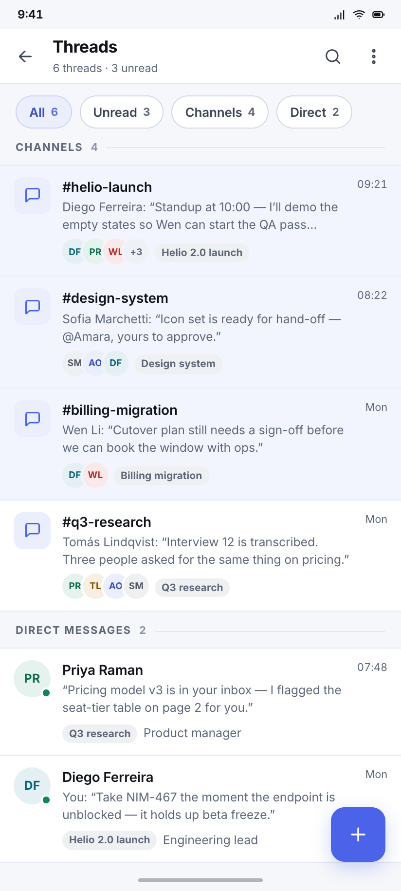
4Six people, fixed initials and a fixed avatar hue each, on every screen in the design. Threads are the workspace's chat surface; a thread is attached to a project, which is why the header carries the project badge.
Team
Six members and two pending invites, each row carrying role, current load in open tasks, and a presence pip that only Diego and Priya have lit.
Diego Ferreira
One person's page: what he owns, what he is working on now, his week in hours logged, and the two projects he shares with you.
Threads
Six conversations with unread ones tinted rather than badged, each showing the project it belongs to and the last line that was said.
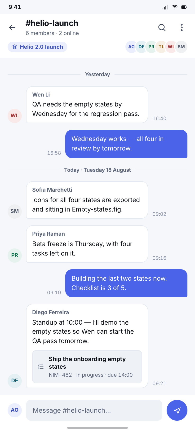
#helio-launch
A working conversation with a day divider, an inline task reference that renders as a chip, and Amara's own message on the brand field.
Find & measure
3Search is for records, the command palette is for actions, and notifications are for what happened while you were away — three surfaces that products usually collapse into one and then regret.
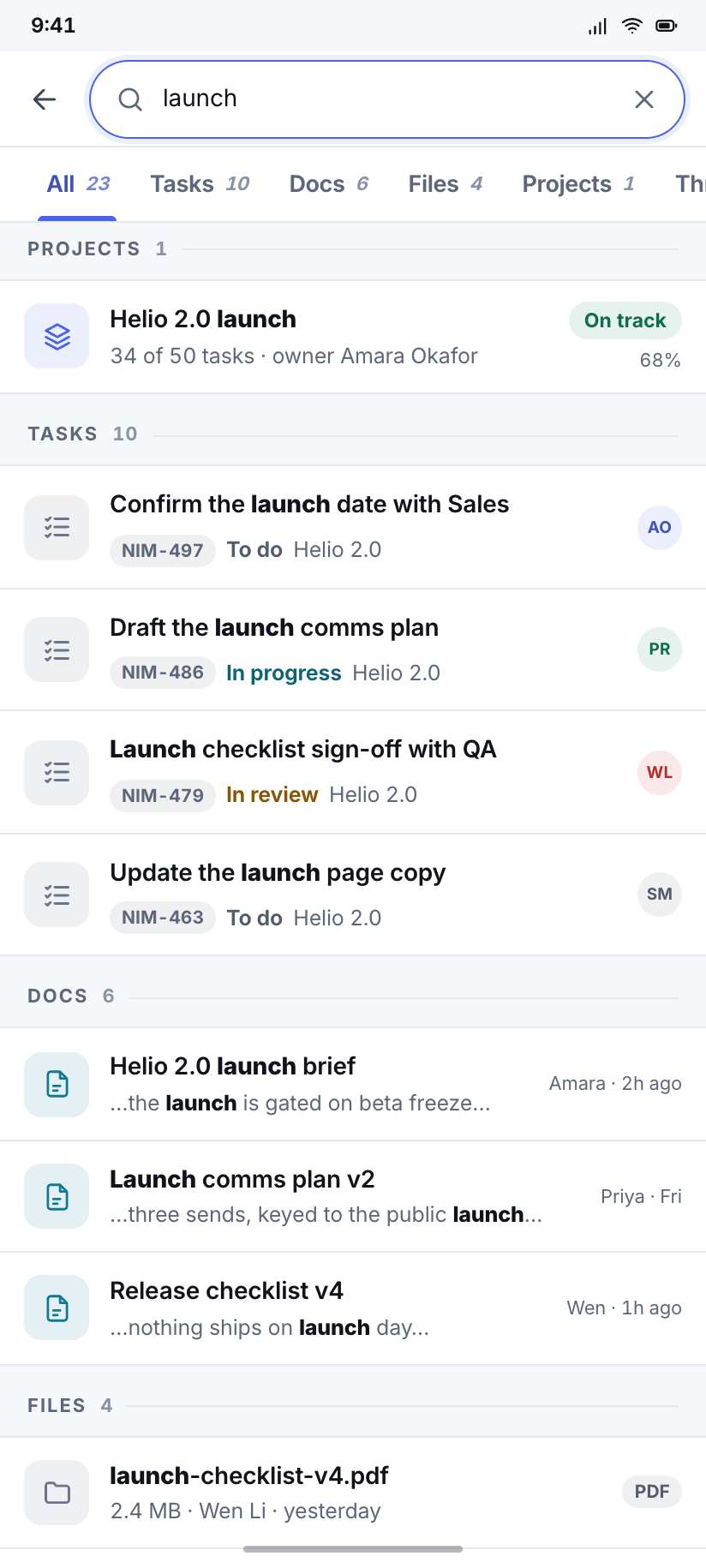
Search
One query across everything, scoped by tabs that sum to the 23-result header, with the matched fragment bolded inside each row.
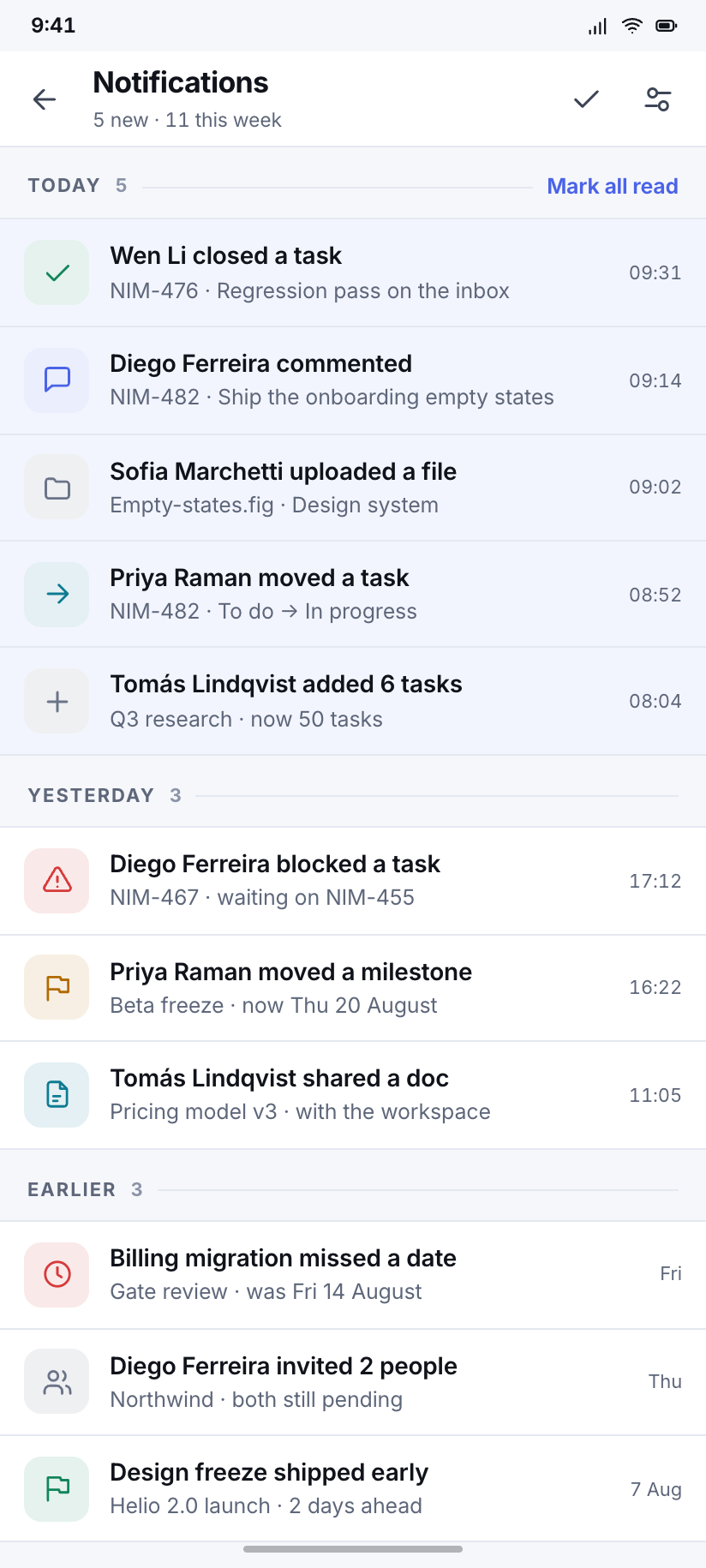
Notifications
The activity feed, grouped Today / Yesterday / Earlier — what happened, as opposed to the Inbox, which is what is still owed by you.
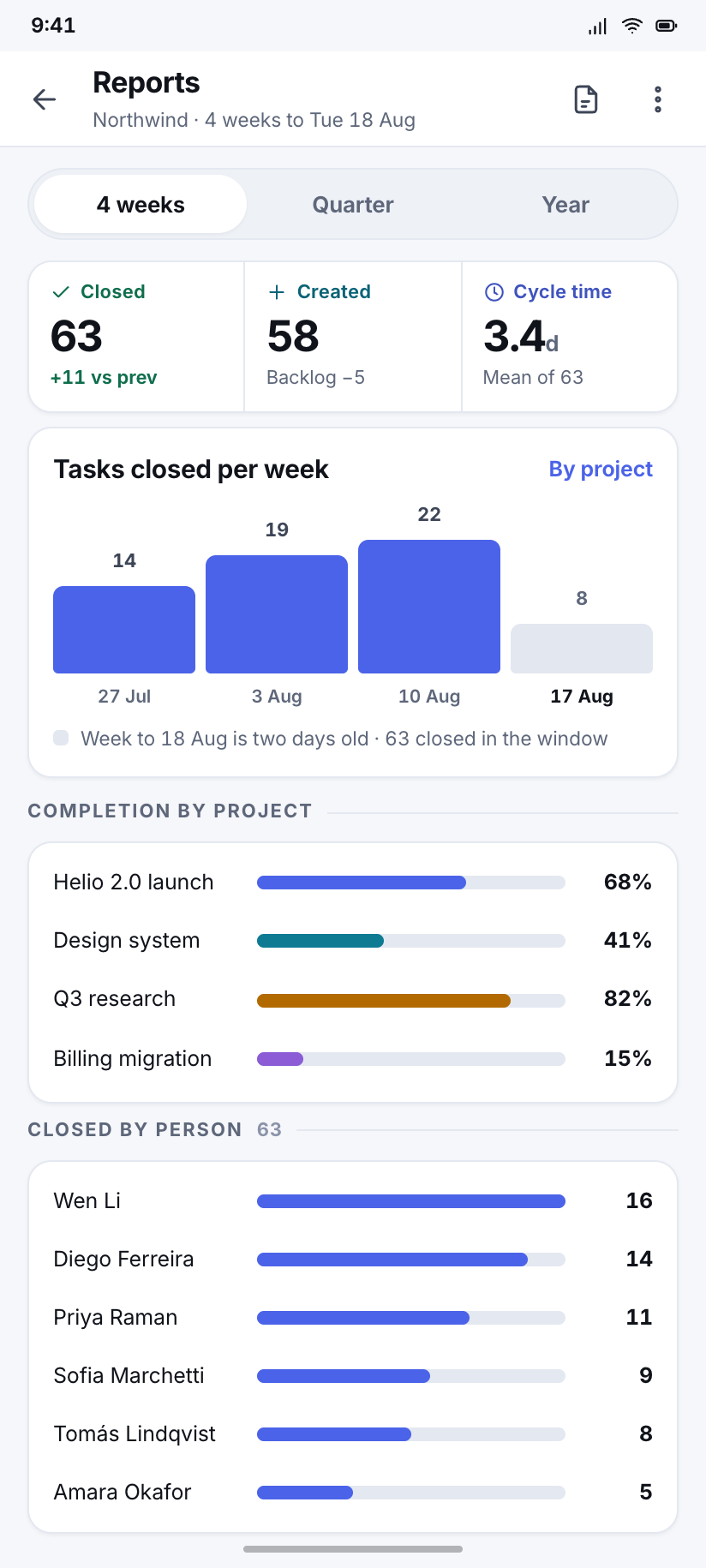
Reports
Four weeks of throughput as columns, completion by project as meters, and a cycle-time figure that names the number of tasks it averages over.
Settings & account
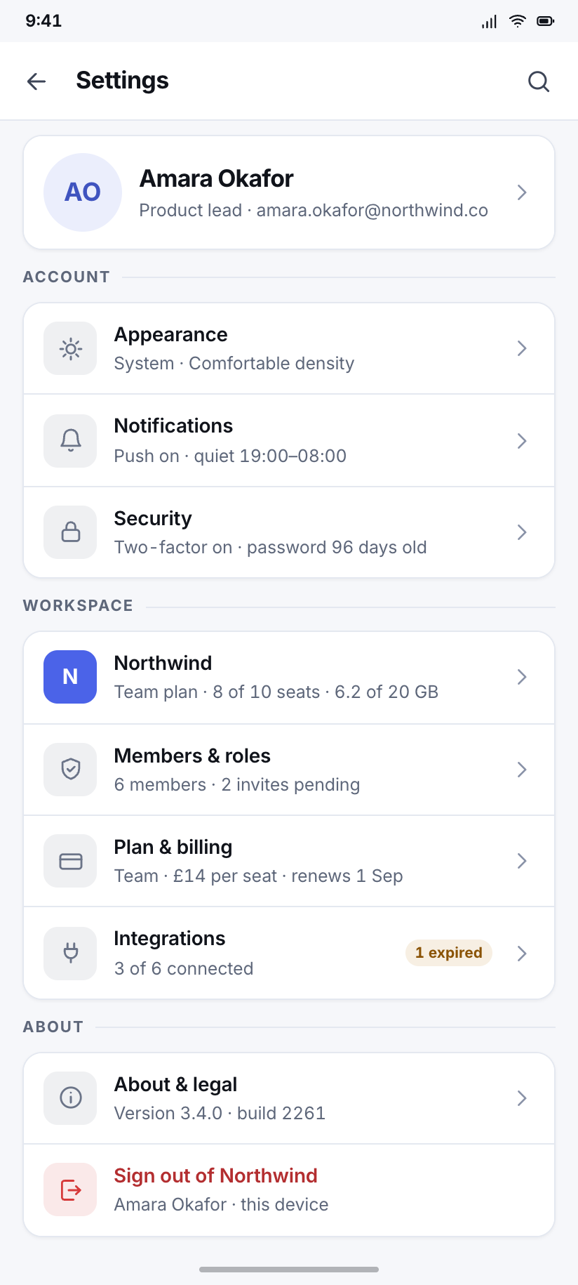
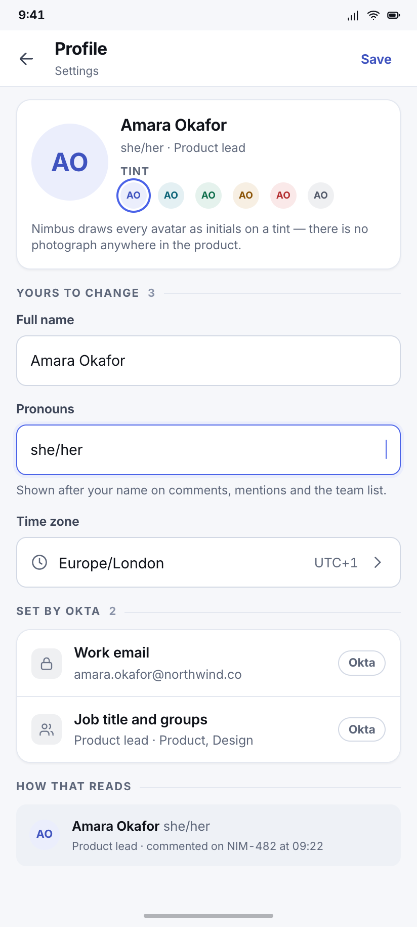
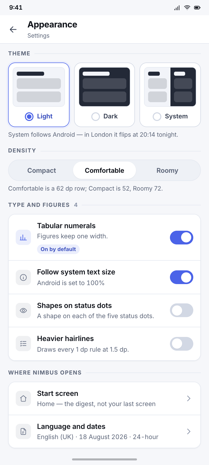
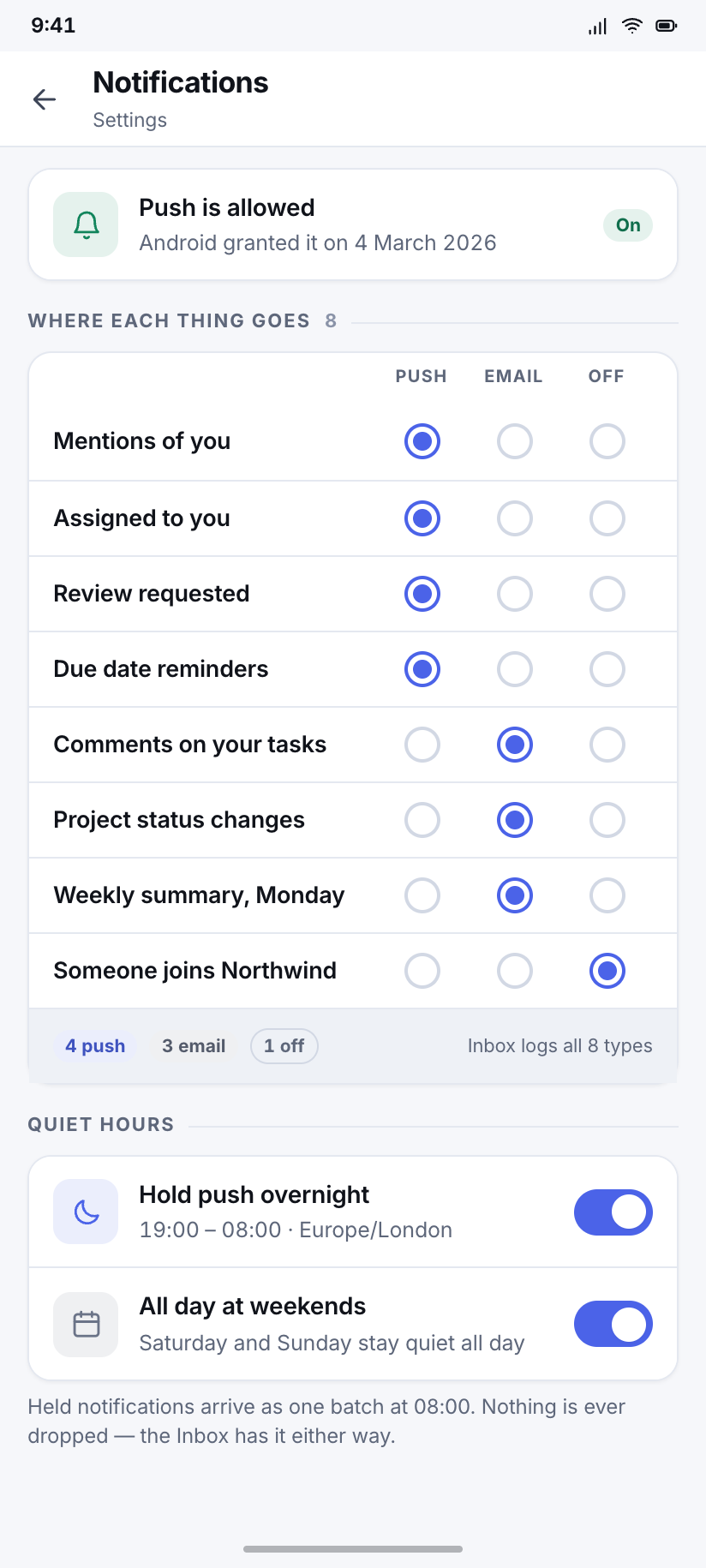
9A settings hub plus five sub-pages, then the two screens every B2B product needs and most kits skip: what the workspace is paying for, and who is allowed to do what.
Settings
The hub: your account at the top as a person, then the workspace as an organisation, with every row saying its current value rather than just its name.
Profile
Editable identity — name, role, pronouns, time zone — with the avatar shown as the initials tile it actually is, since Nimbus has no photographs.
Appearance
Light, dark and system as three drawn previews rather than three radio labels, plus density and the tabular-numbers switch that is on by default.
Notifications
A matrix of what notifies where — push, email, none — per event type, with quiet hours set to 19:00–08:00 and honoured on weekends.
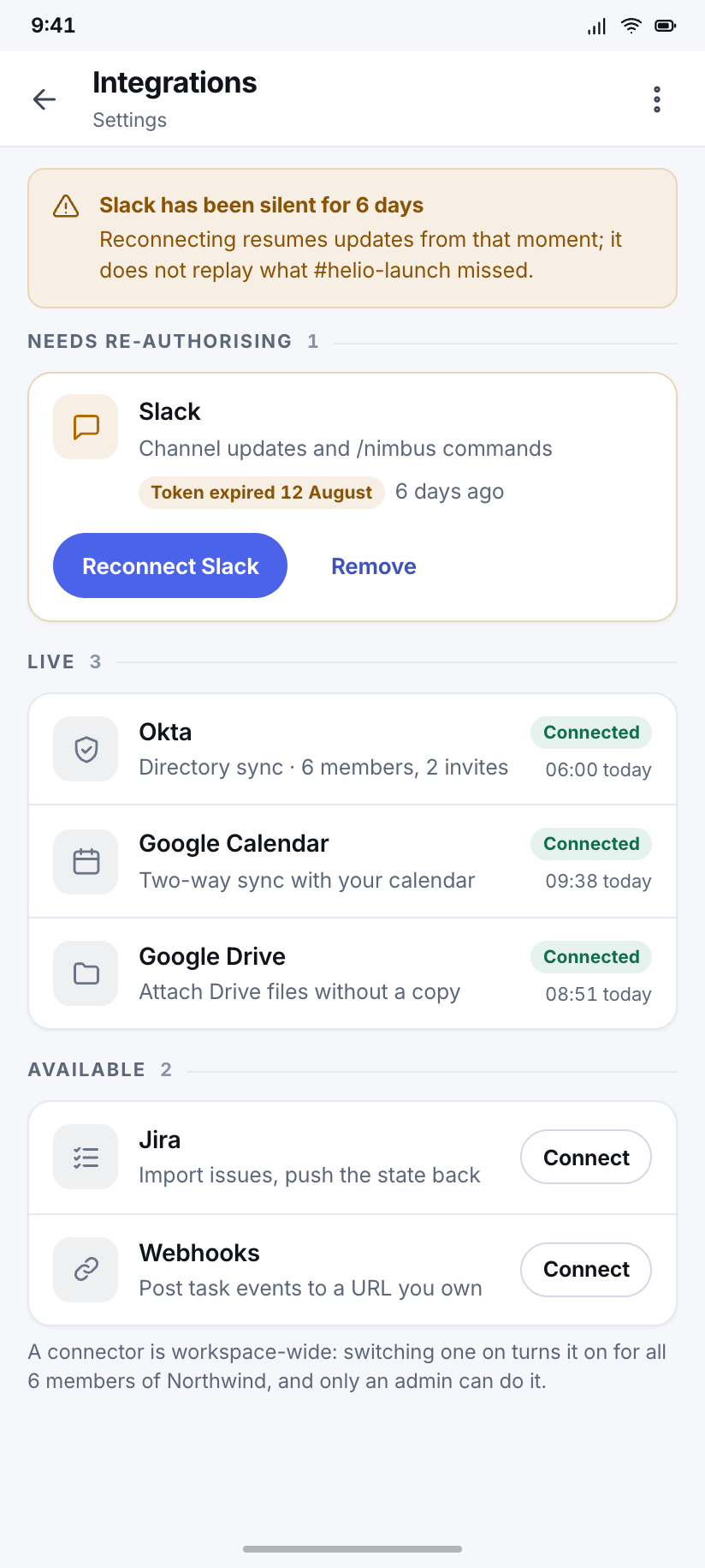
Integrations
Six connectors, three of them live, one showing a re-authorisation warning with the date its token expired.
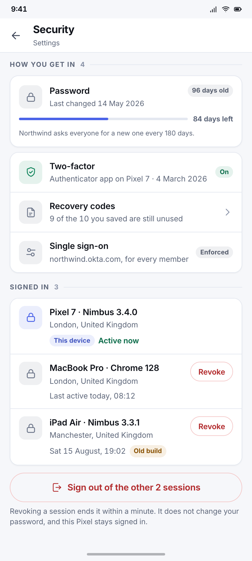
Security
Password age, two-factor via authenticator app, and three active sessions with the current device marked and the other two revocable.
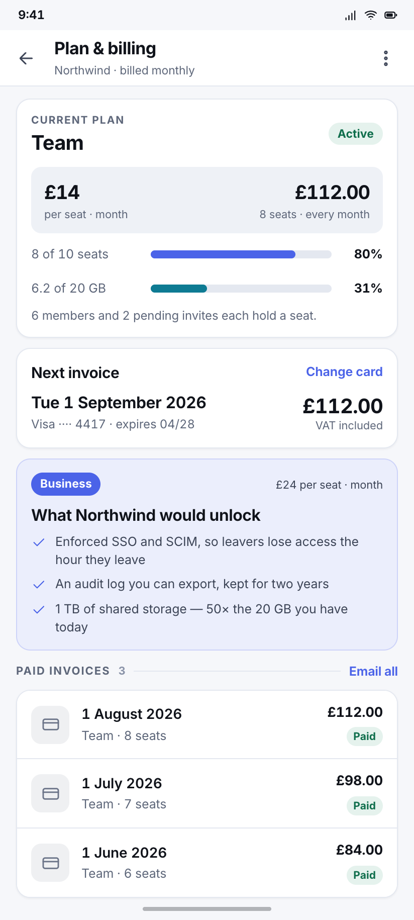
Plan & billing
Northwind on Team at £14 per seat: 8 of 10 seats used, the next invoice dated and priced, and the upgrade framed as what it unlocks rather than what it costs.
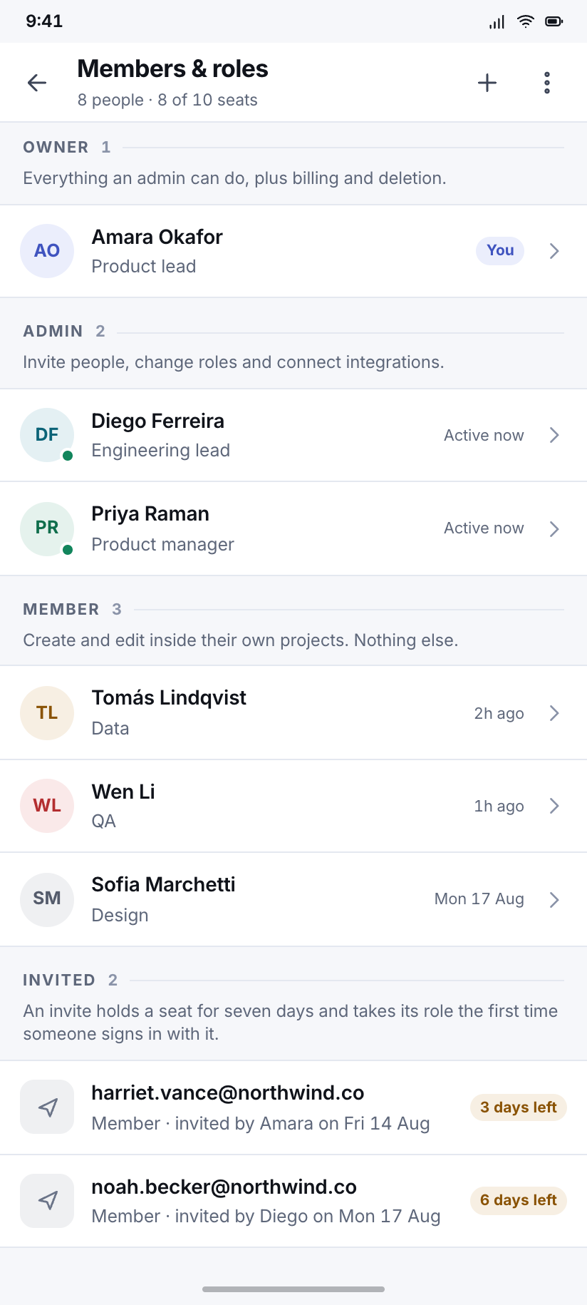
Members & roles
The admin view of the same eight people, grouped by role, with the permission each role carries spelled out instead of implied.
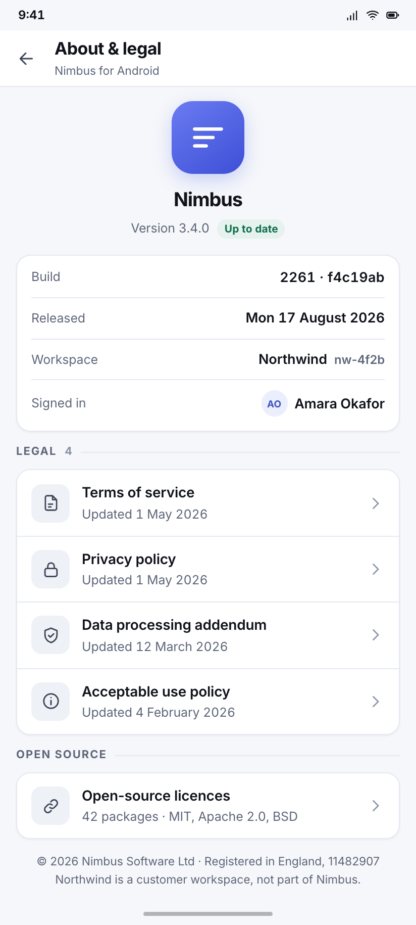
About & legal
Version, build, the four legal documents, open-source licences, and the one screen in a workspace app that is allowed to be boring.
When it breaks
2Both of these are drawn over a real destination with its nav intact, because that is where a user actually meets them — never as a standalone page with a sad face.
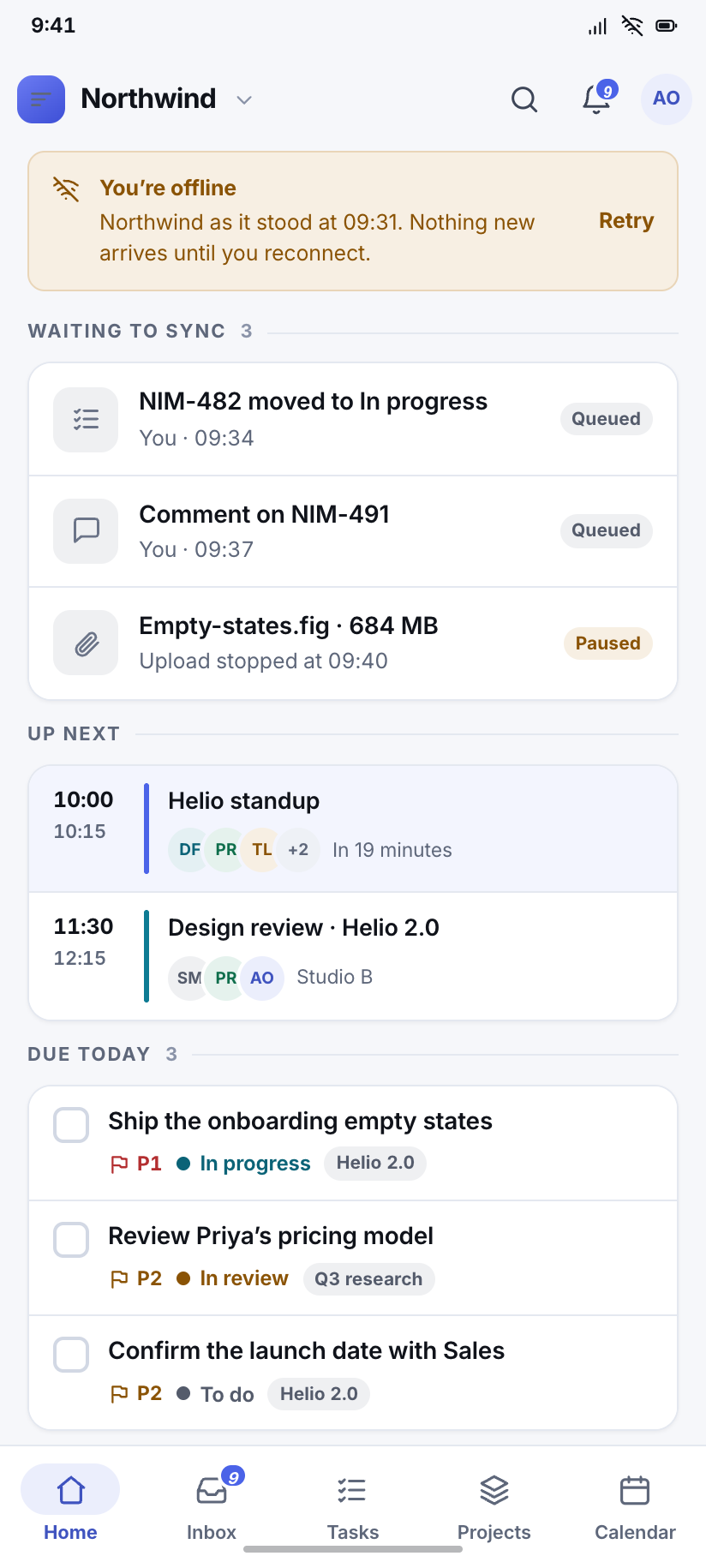
Offline
Home with a persistent offline banner: cached content stays readable, the three things queued for sync are named, and the FAB is disabled rather than hidden.
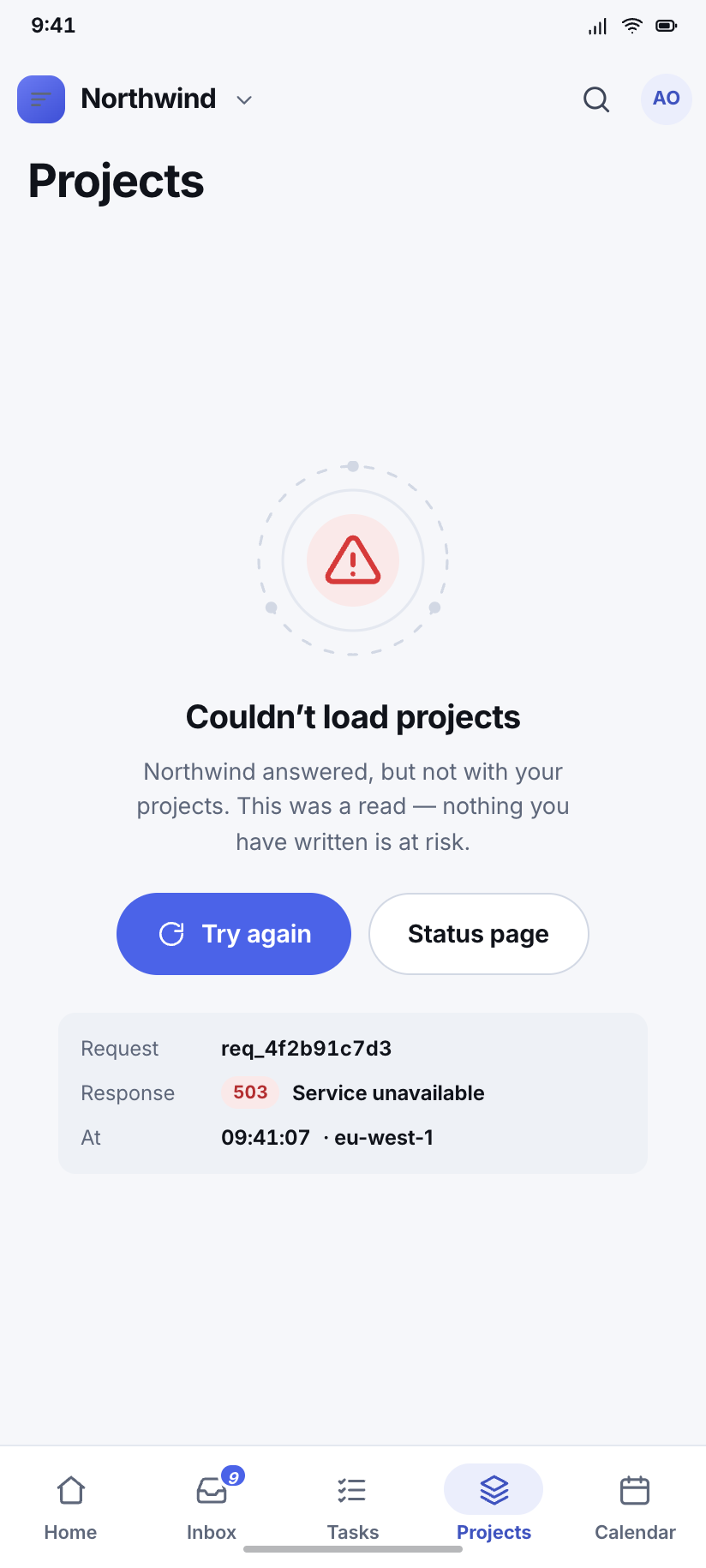
Couldn’t load
The Projects destination failing with a drawn error state that gives the request id, so the retry button is not the only thing on offer.
How this folder is built
One signal, five roles
Indigo is the only brand colour and it means this is interactive or this is yours. Everything else is a status role — success, warning, danger, info and a deliberate fifth, --neutral, for backlog, archived and unassigned. A workspace app needs a grey chip far more often than it needs a fifth hue, and having one is what keeps the other four meaningful.
Soft fills are opaque
A badge lands on a card, on a well and on the page across different screens. If the tint were an alpha its measured contrast would change per screen, so every -soft is pre-flattened. One number per role is then the whole truth, and README.md prints all 24.
Dark is surface steps, not shadow
A 32px black shadow on a #0E1117 page is invisible. Depth comes from four steps — page, card, well, deep well — and every raised thing keeps a 1px edge that is lighter than its own surface. Sheets go one step past cards so they float over a card rather than beside it.
Numbers are furniture
Every figure in Nimbus is tabular. Counts, durations, percentages and dates all sit on font-variant-numeric: tabular-nums, so a column of right-aligned numbers never shifts a pixel between rows — the single cheapest thing that separates a tool from a toy.