Ten Android design concepts, each drawn at 412 × 915 dp and rendered locally at 2×. Four are multipurpose kits meant to be rebranded; four are drawn from products that actually exist, measured rather than guessed; two are the community app and admin console for one mosque in Düsseldorf. Every screen is a self-contained HTML file that names design tokens and never a colour, which is how one set of markup ships light, dark, and — twice over — several styles at once.
Nimbus
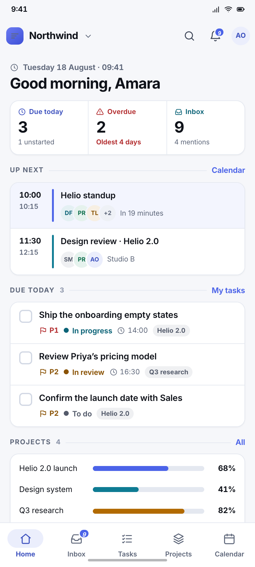
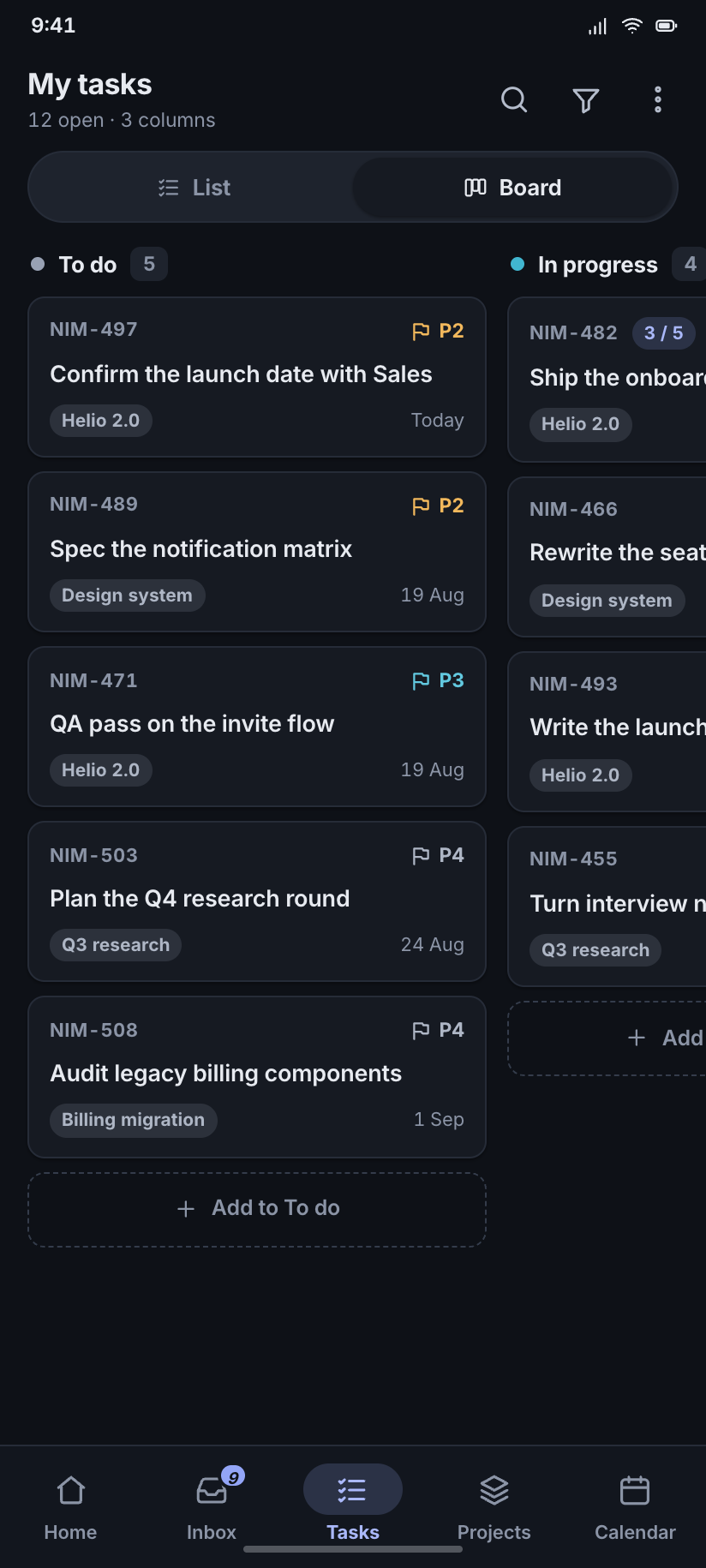
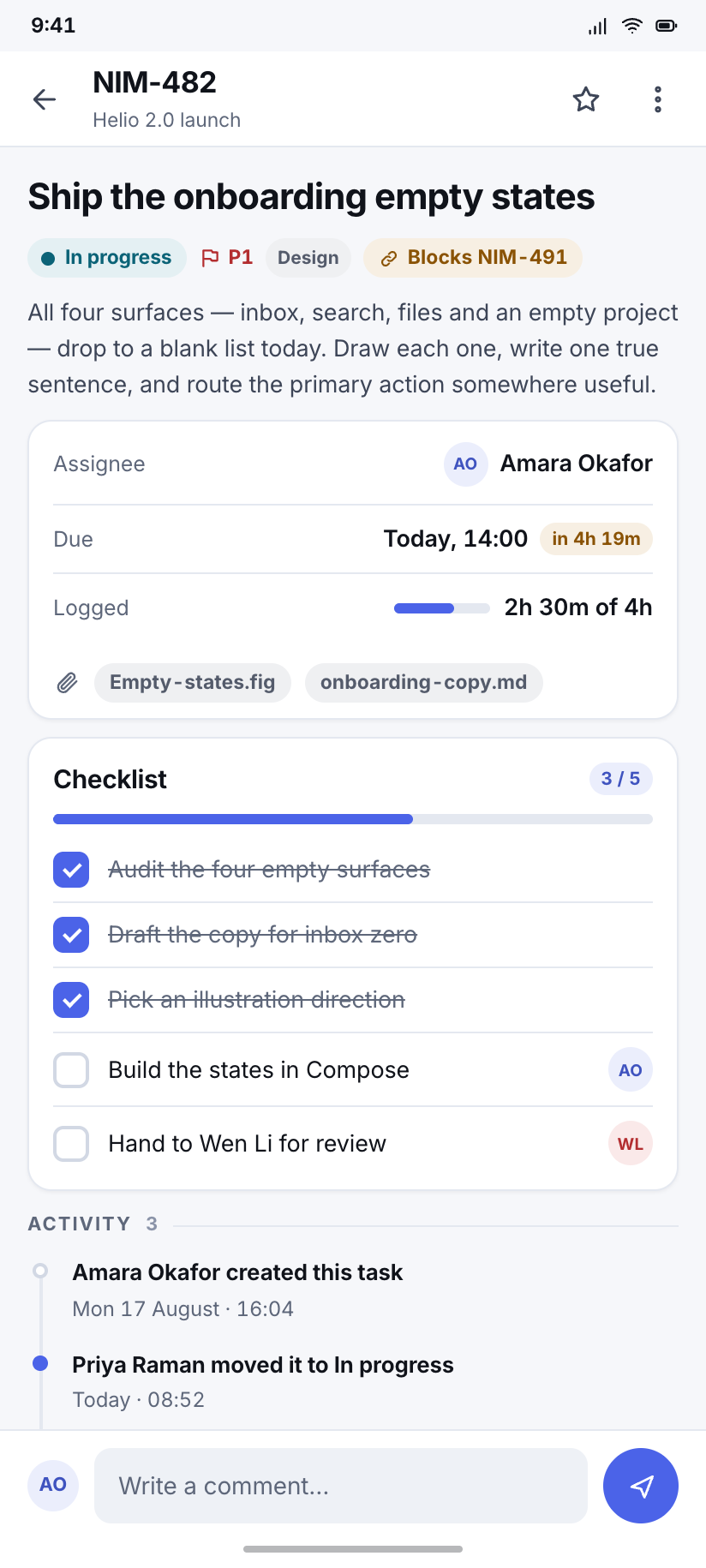
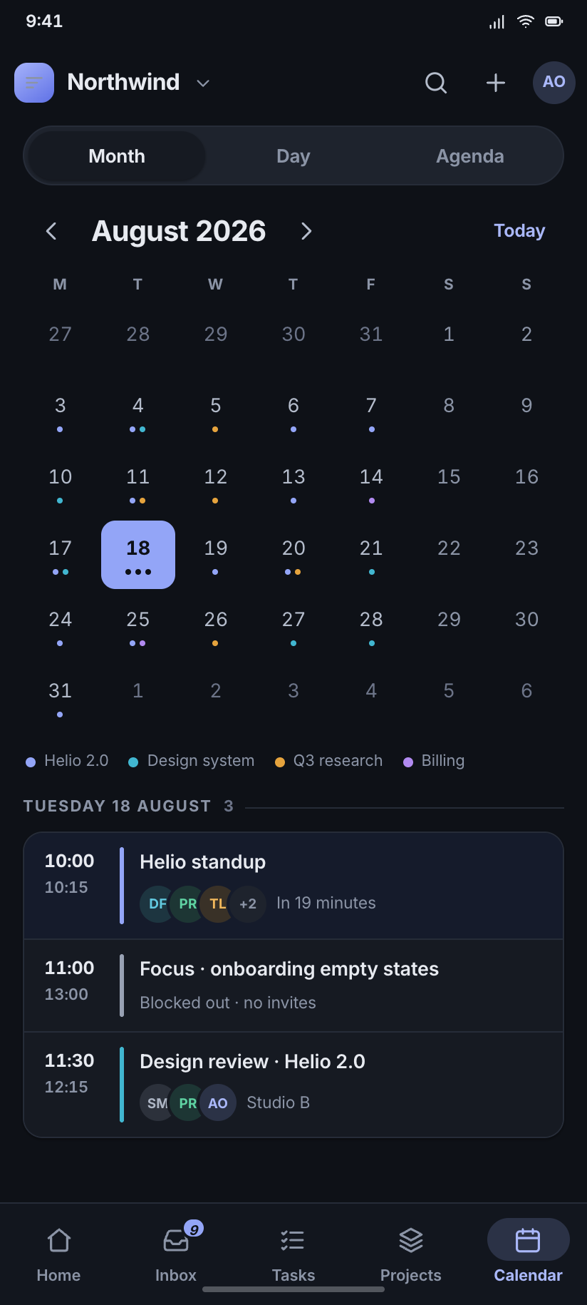
A multipurpose workspace kit — projects, tasks, docs, calendar, threads and a full admin corner. Cool neutral greys, one indigo signal, tabular numerals wherever a number lives.
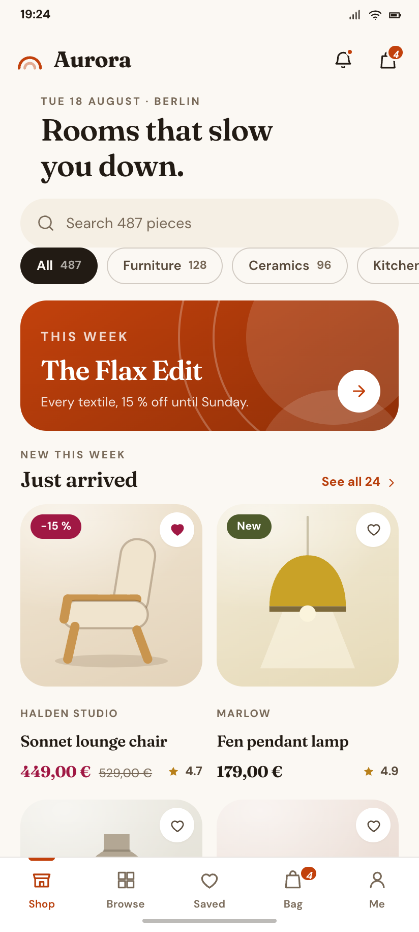
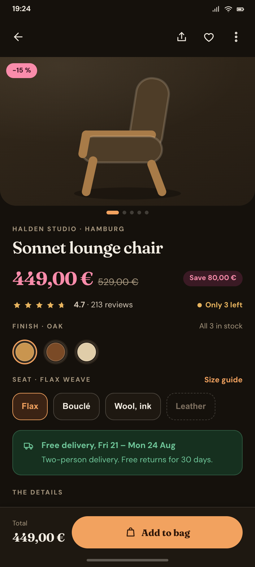
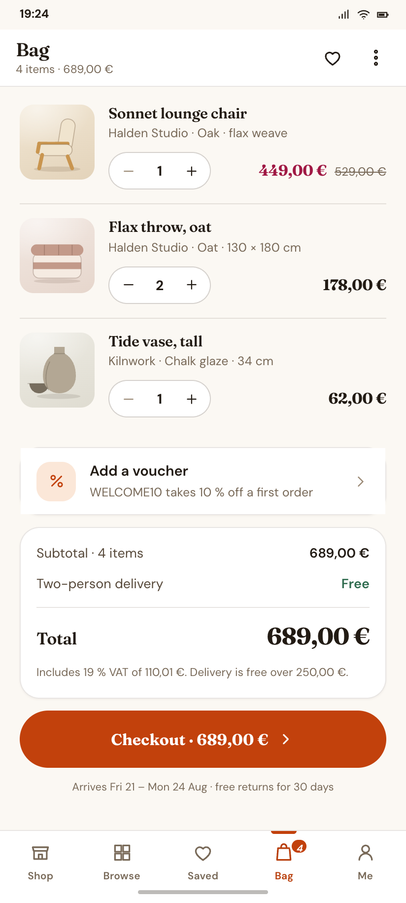
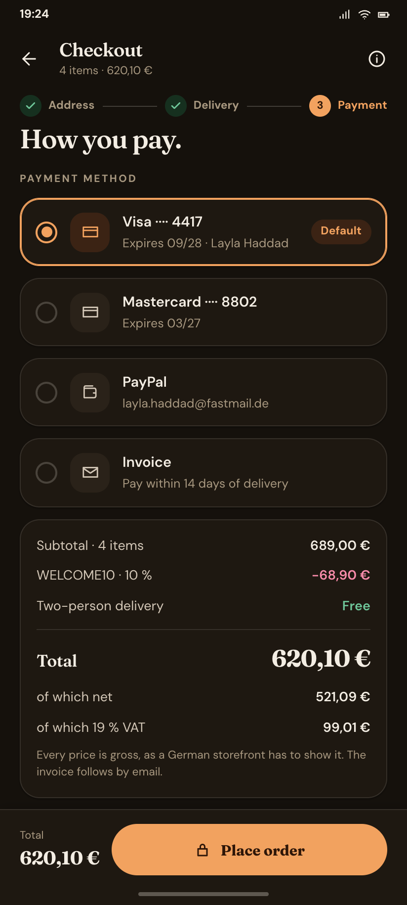
Aurora
A multipurpose commerce kit — storefront to checkout to returns, plus a seller studio. Ivory paper, burnt amber, and a serif display face that no other shop template has.
Pulse
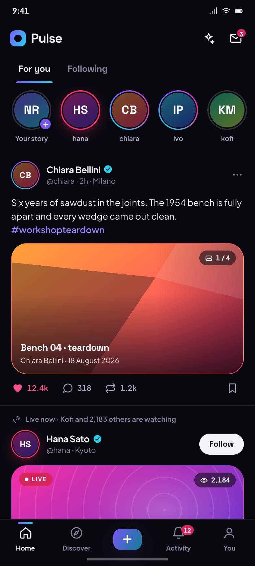
A multipurpose social & creator kit — feed, stories, reels, DMs, live, events and a creator studio. Dark-first and loud, with a light mode that is designed rather than inverted.


Terra
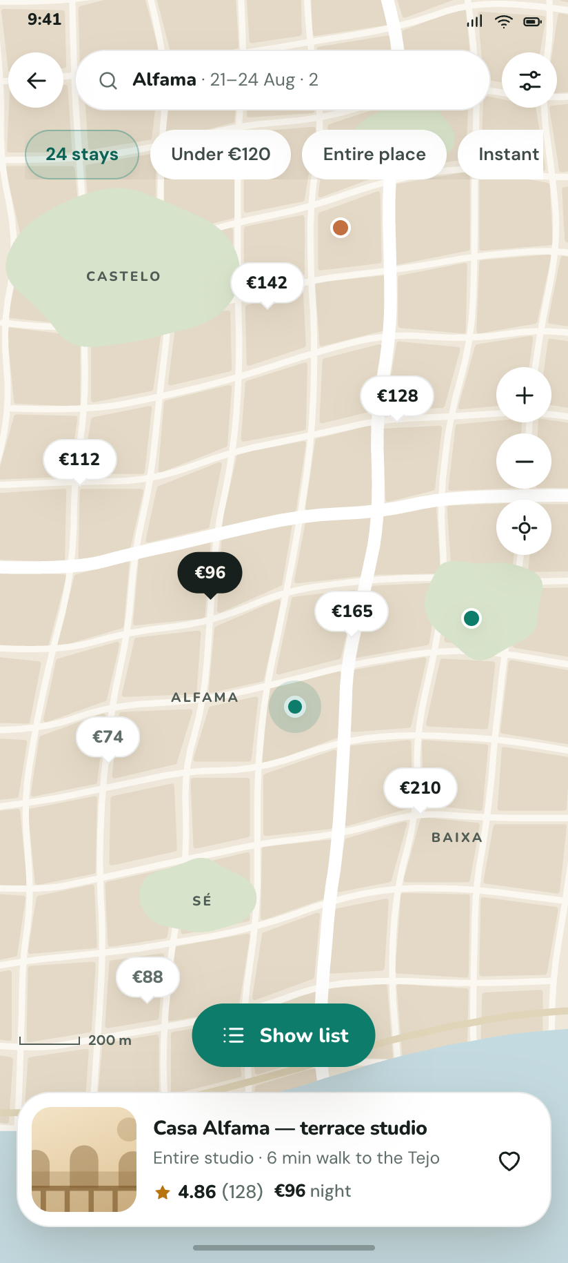
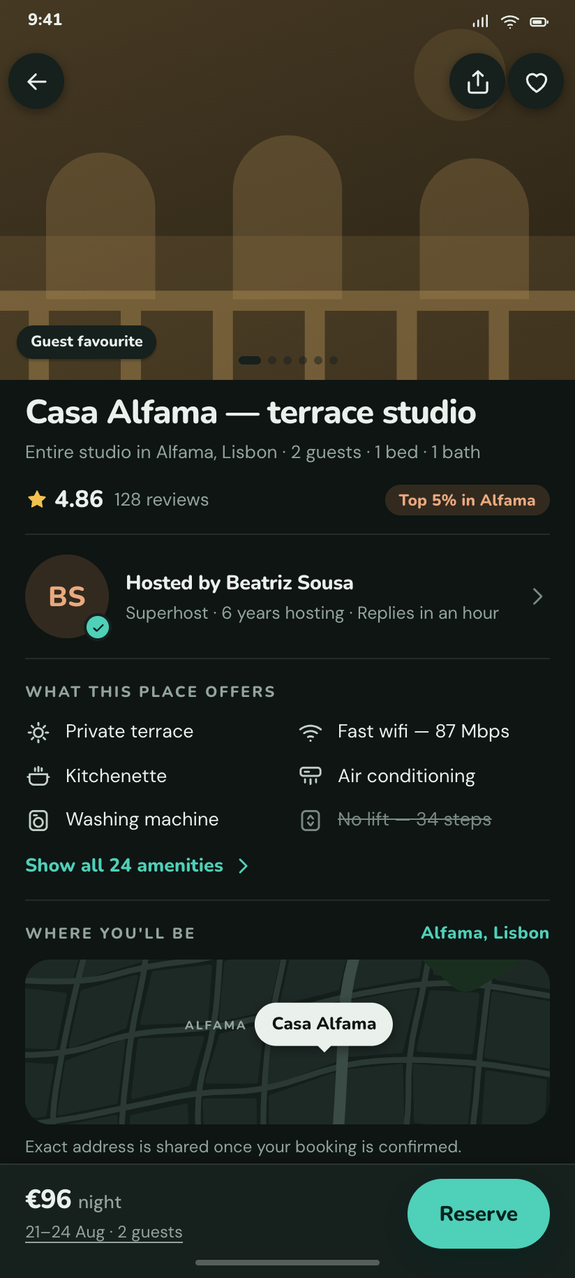
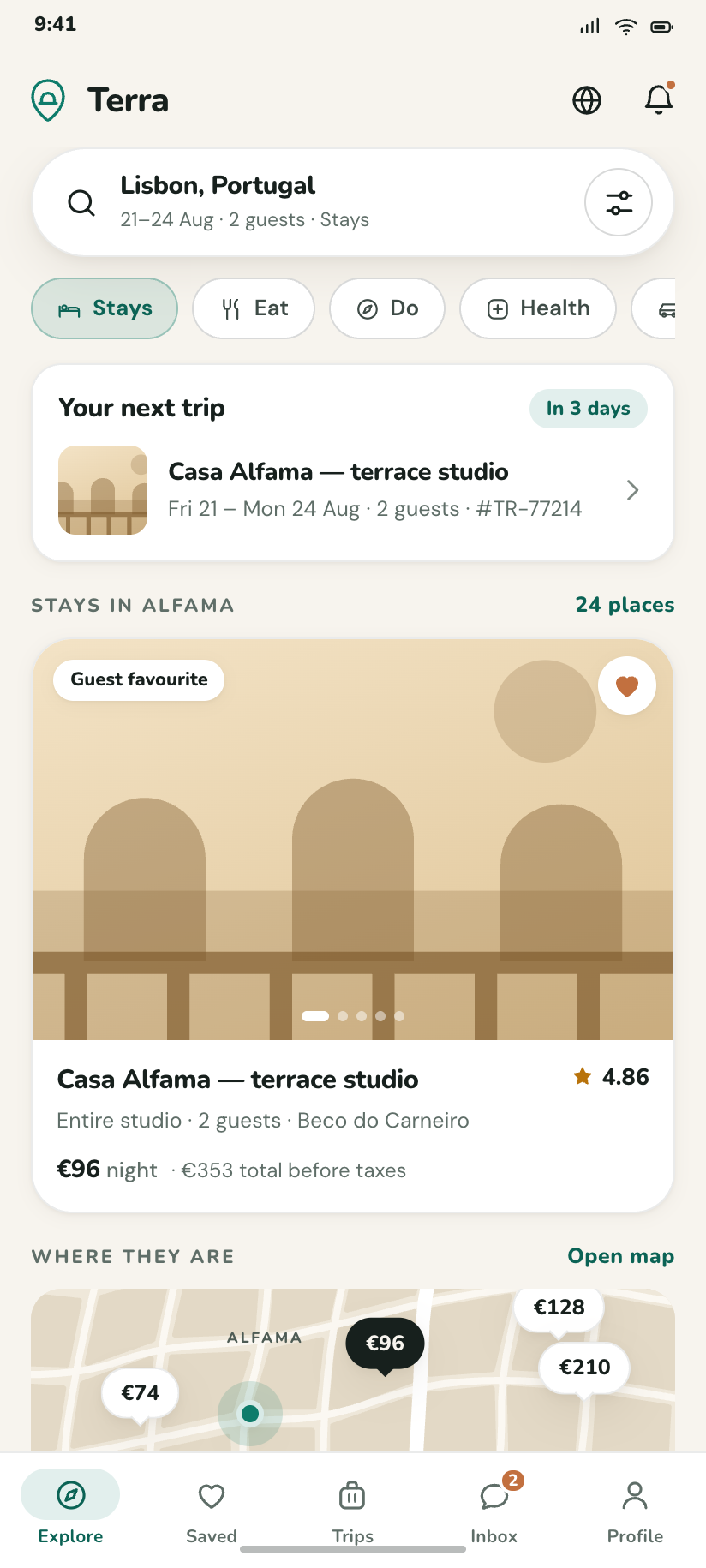
A multipurpose booking & local kit — search, map, listing, booking, trips, host mode. Sand and deep teal, and a street map drawn entirely in SVG so it re-colours with the theme.

Minber
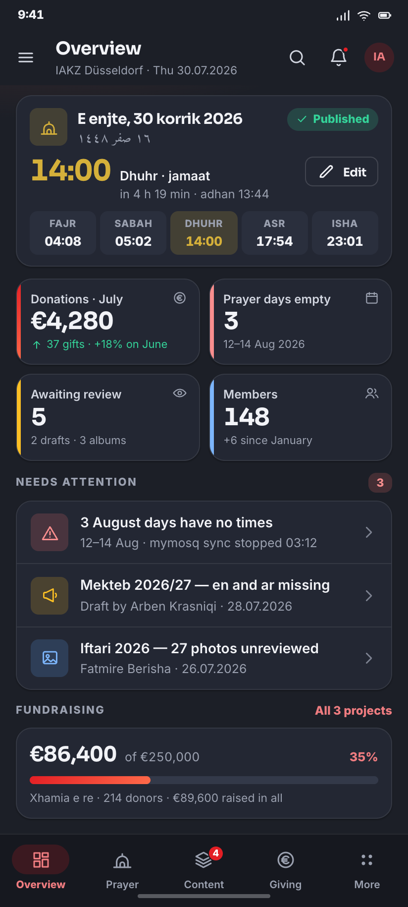
The community app for IAKZ Düsseldorf — a real Albanian mosque, founded 1992. Its own signal red and type, a year of real prayer times, four languages including Arabic in RTL, and everything a phone can do that a website cannot.
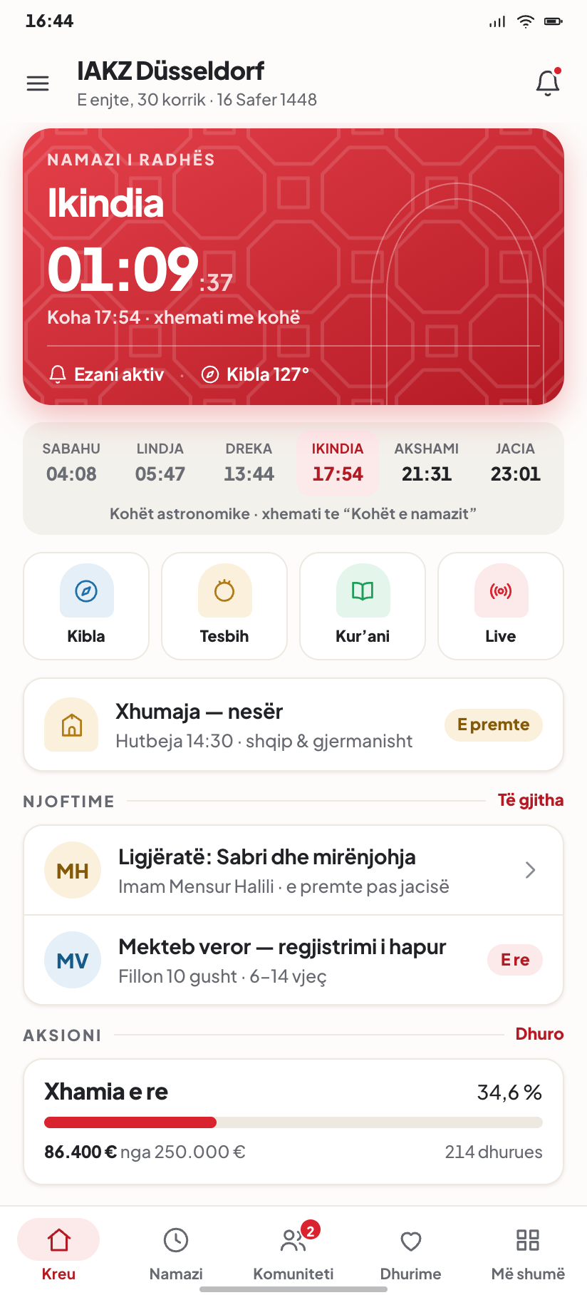
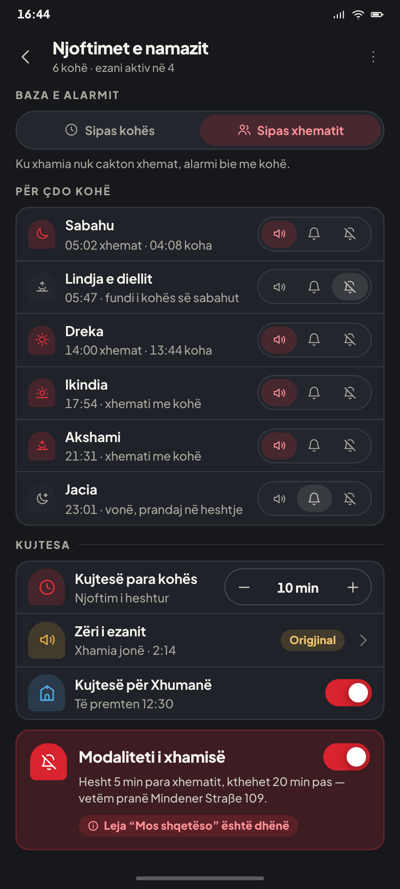
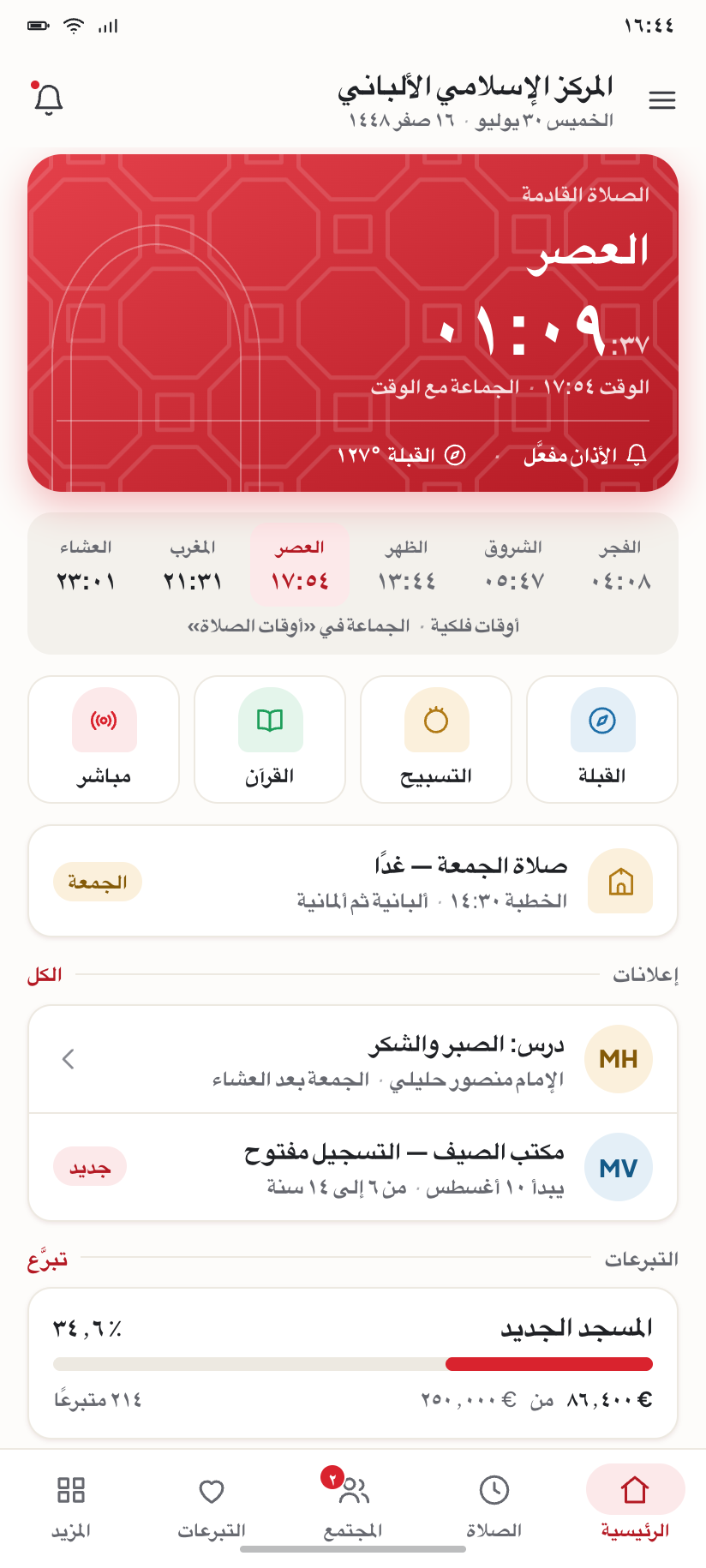
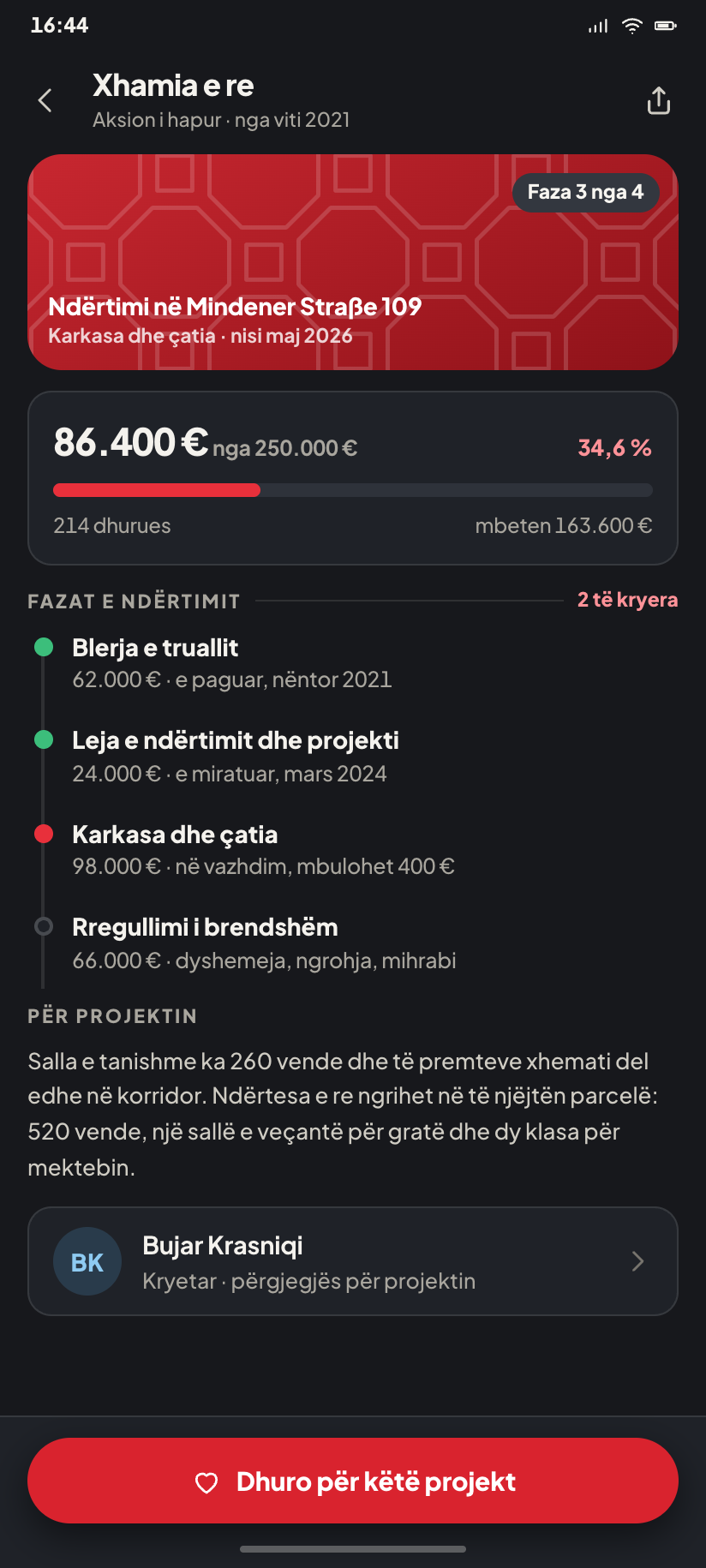
IAKZ Majlis
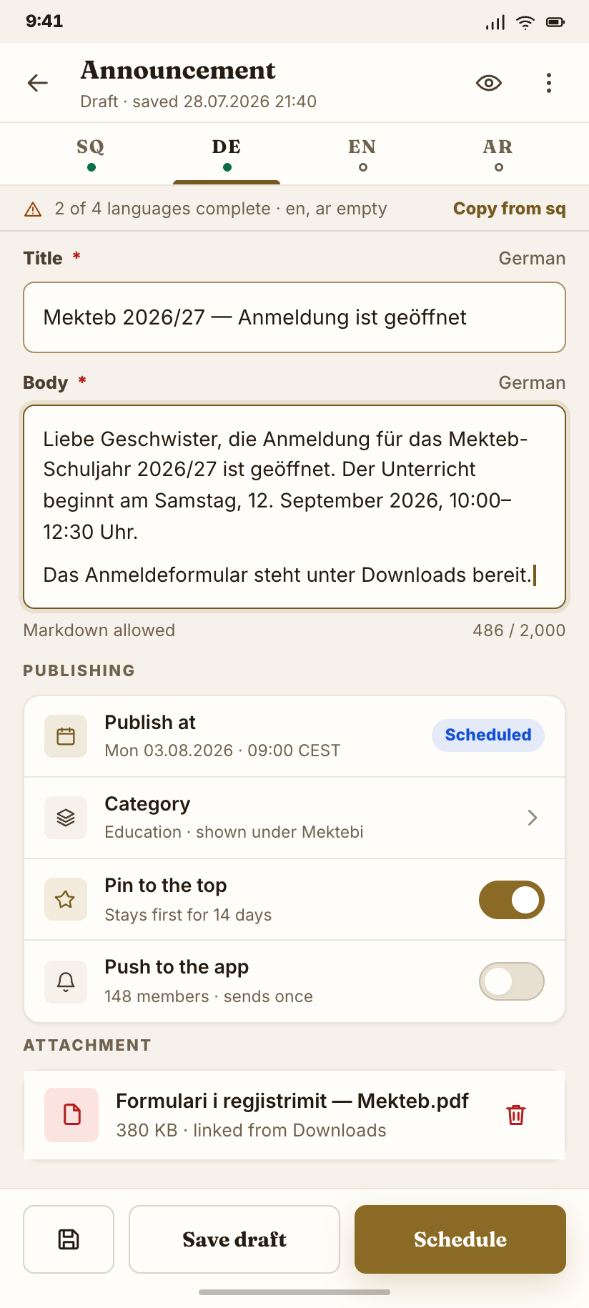
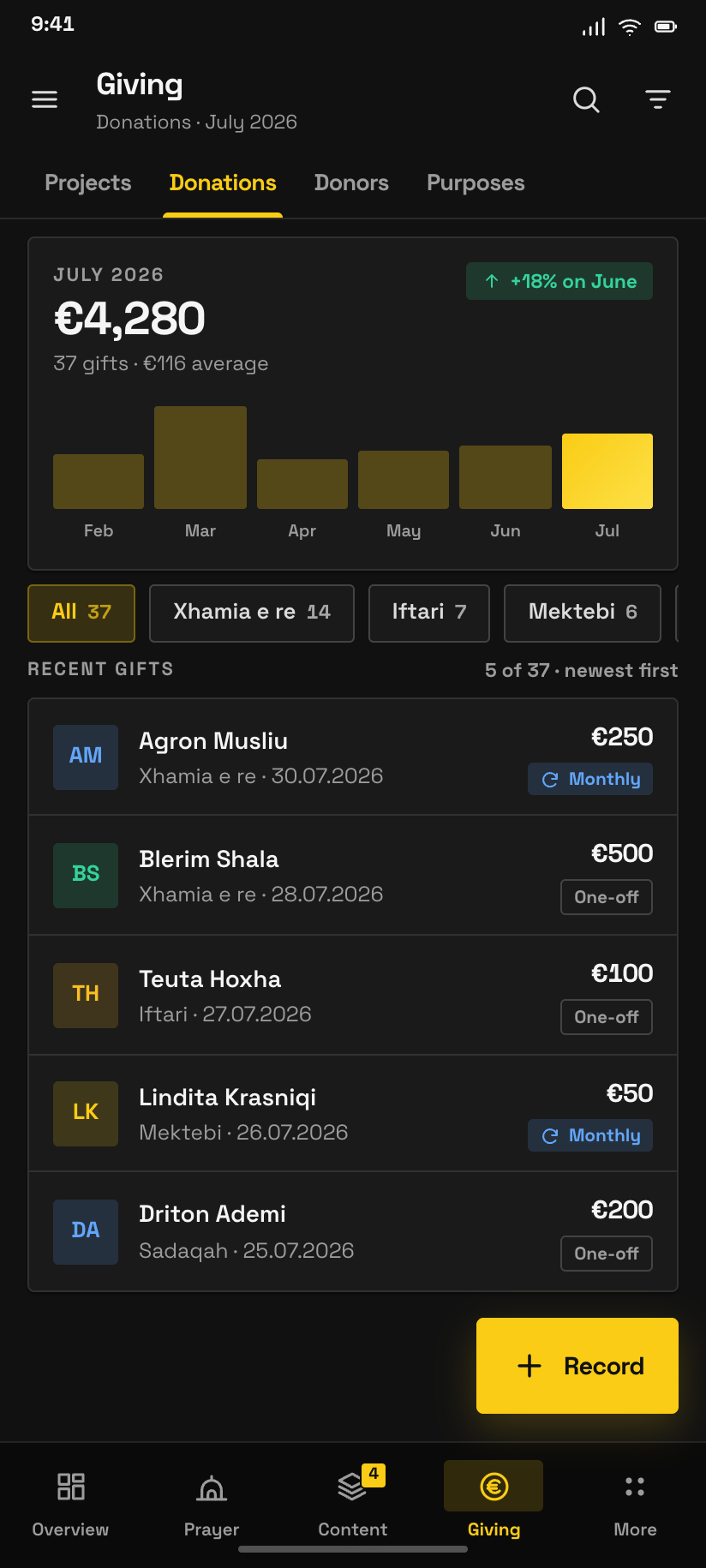
The admin console behind it — prayer times, announcements, activities, projects, members, gallery, media and donations, kept up to date from a phone. Ten desktop routes become five destinations, in all three of the product's own variations.


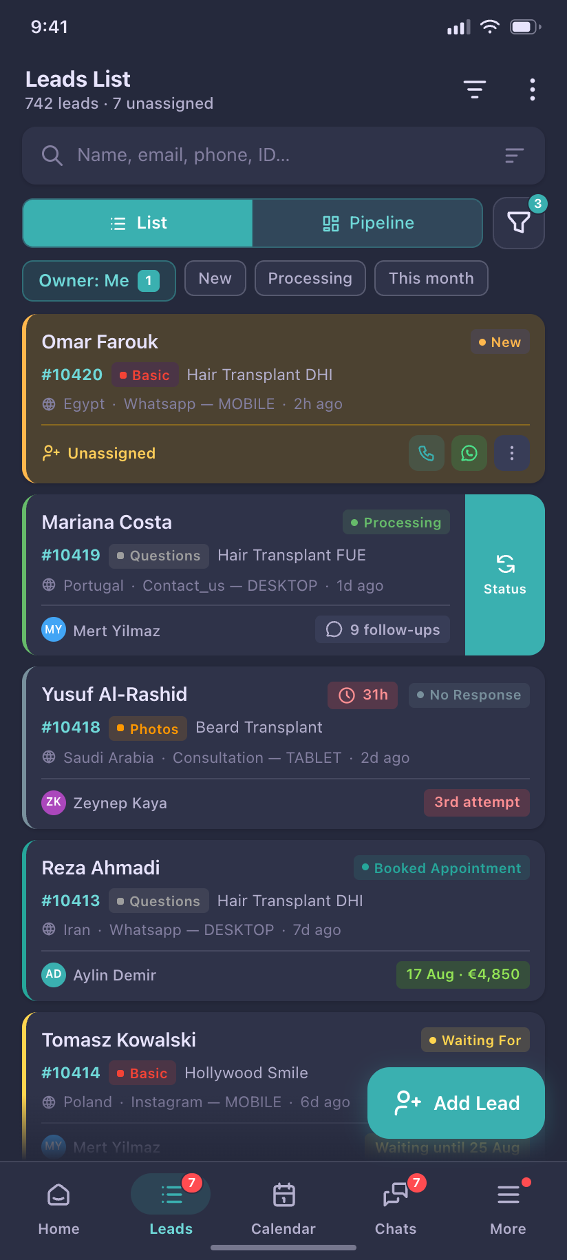
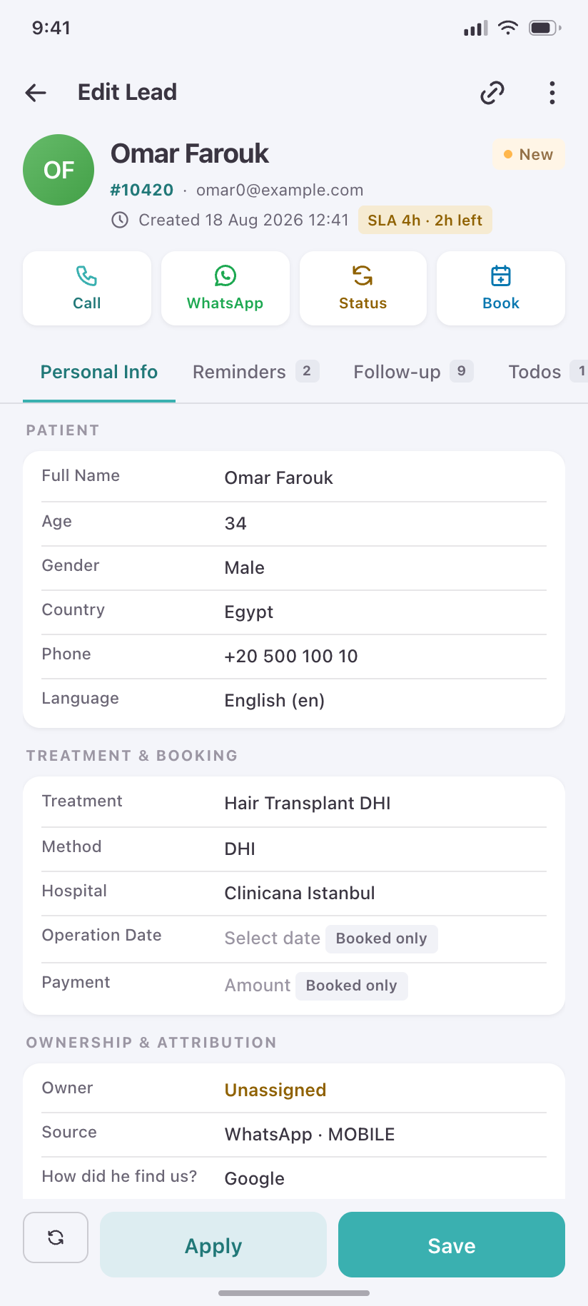
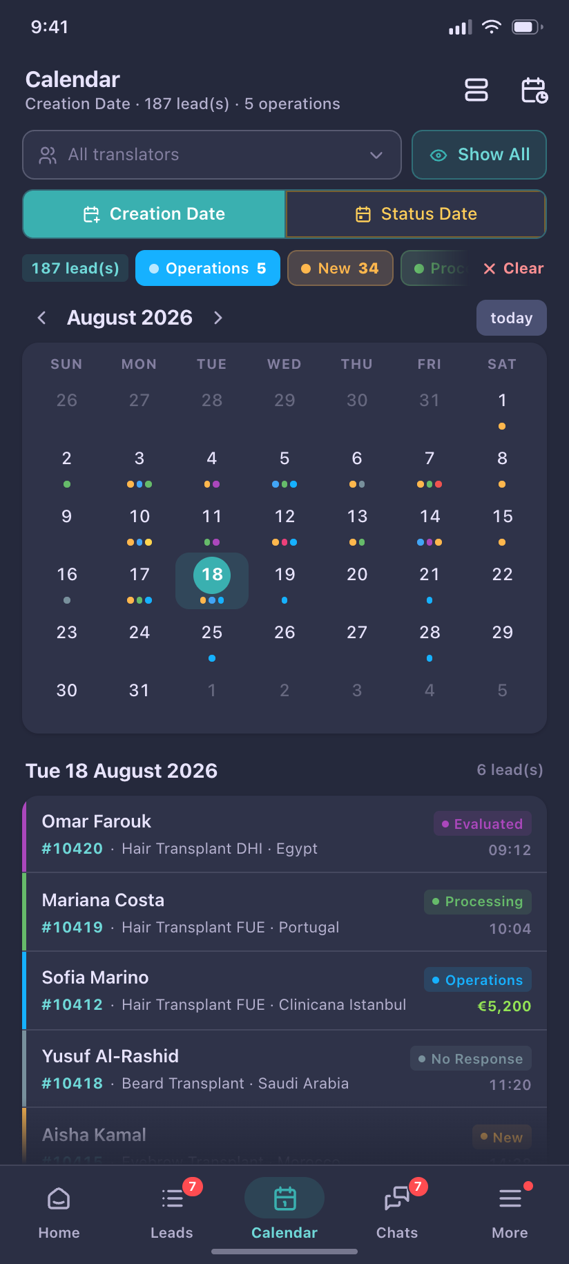
Clinicana CRM
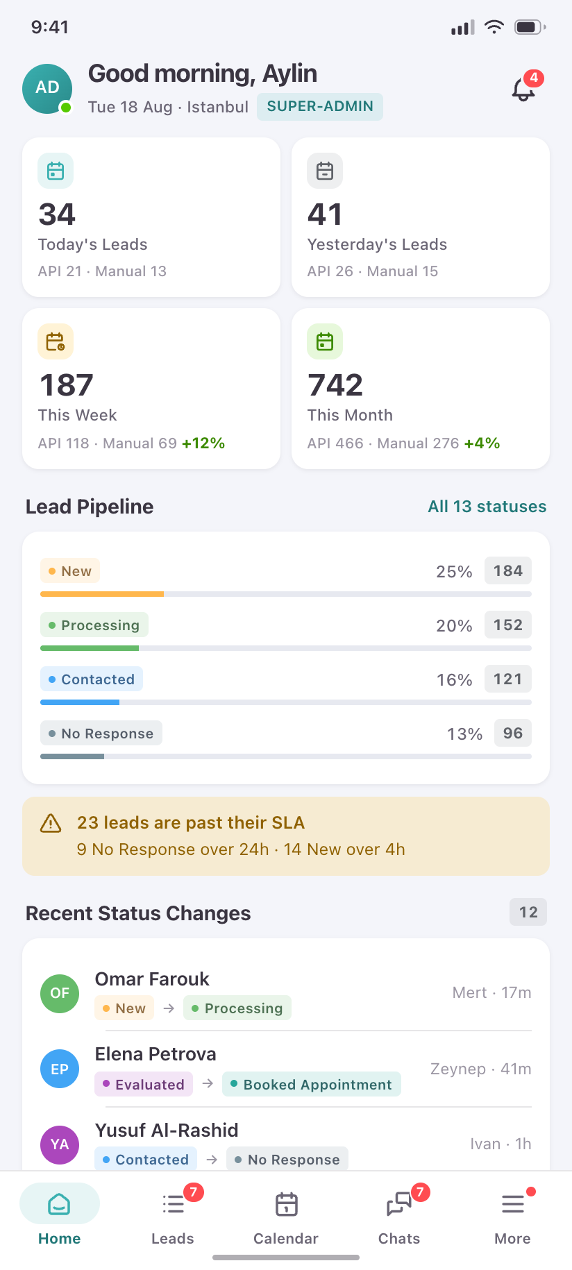
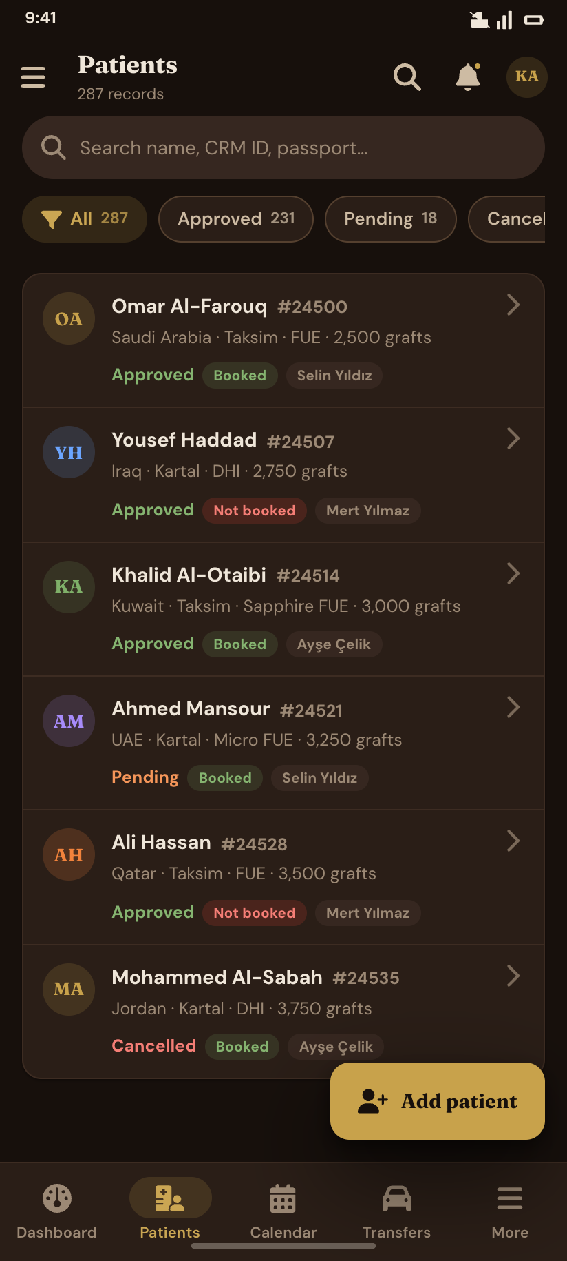
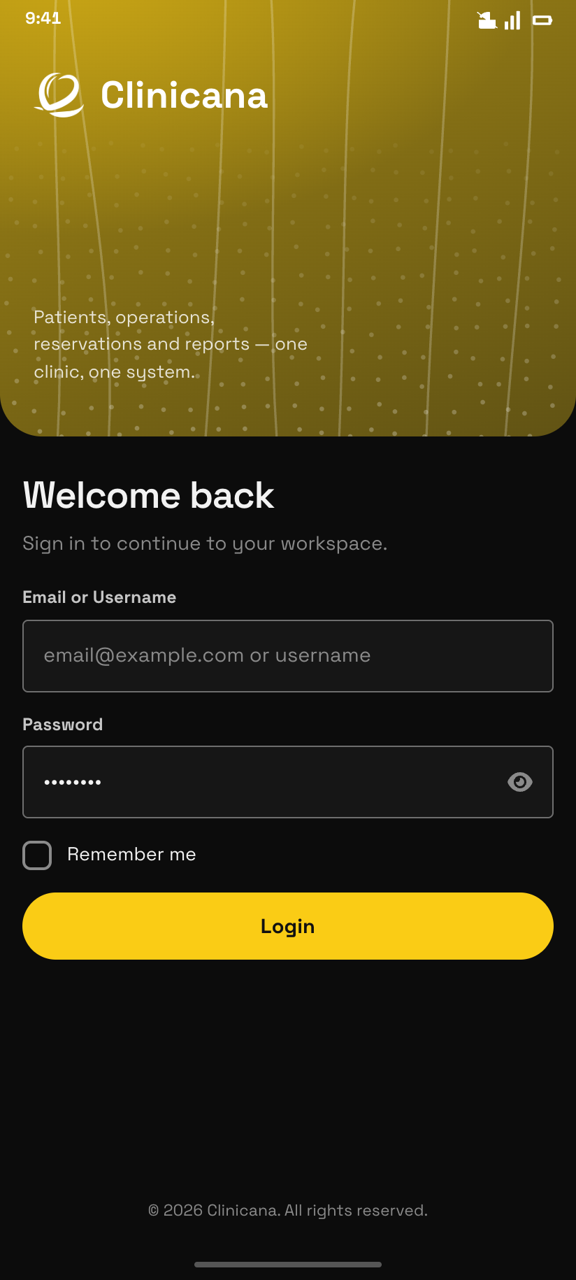
Every page of the patient-lead CRM on a phone — 94 screens in light and dark, designed from the running product: its real logo, its measured palette, its 13-status colour language.

Clinicana CMS
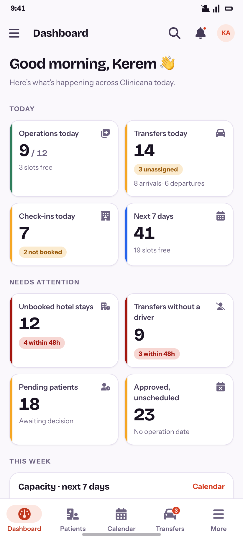
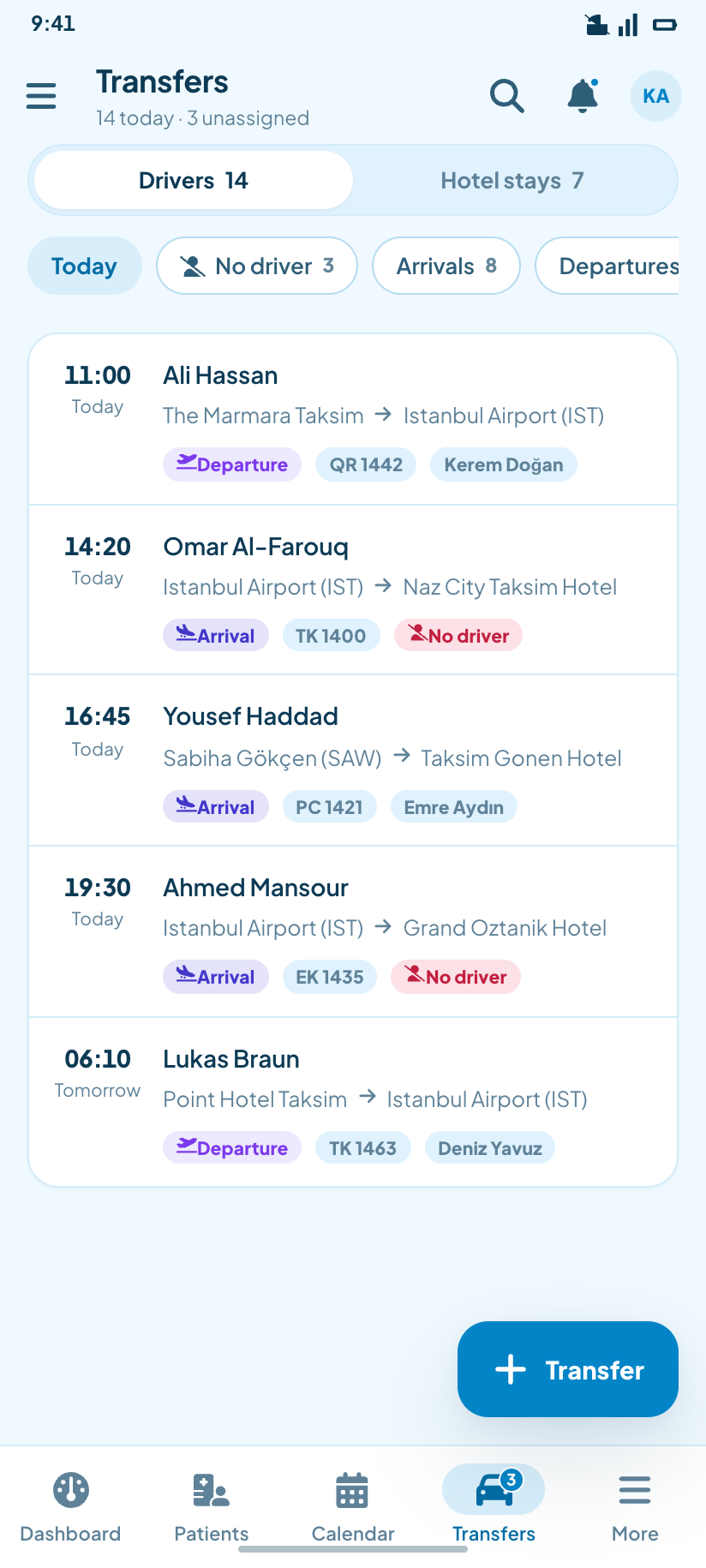
The clinic-management half — patients, operations, transfers, reports and a 13-role ACL. 103 screens in all six of the product’s styles, light and dark — 1,236 renders from one set of token-driven markup.
FitPulse
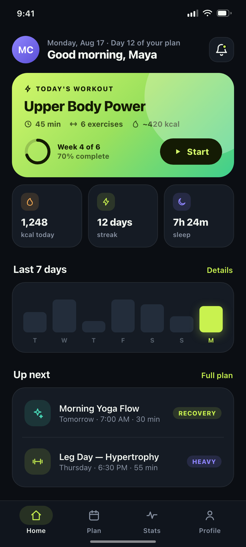
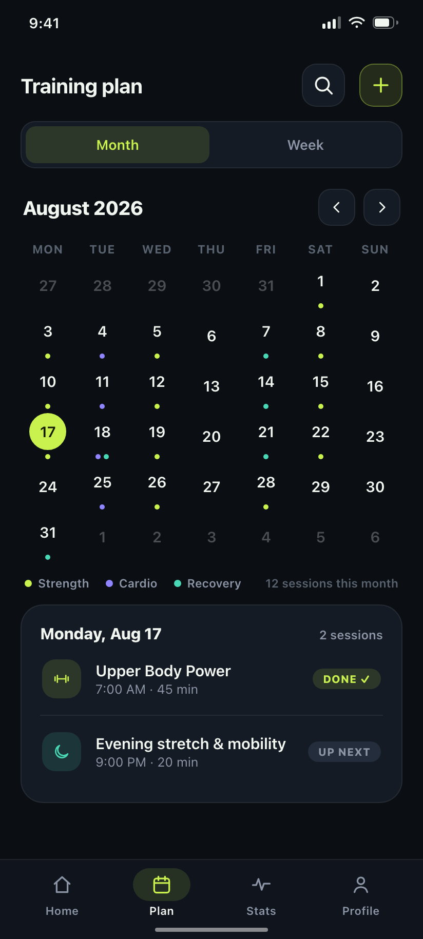
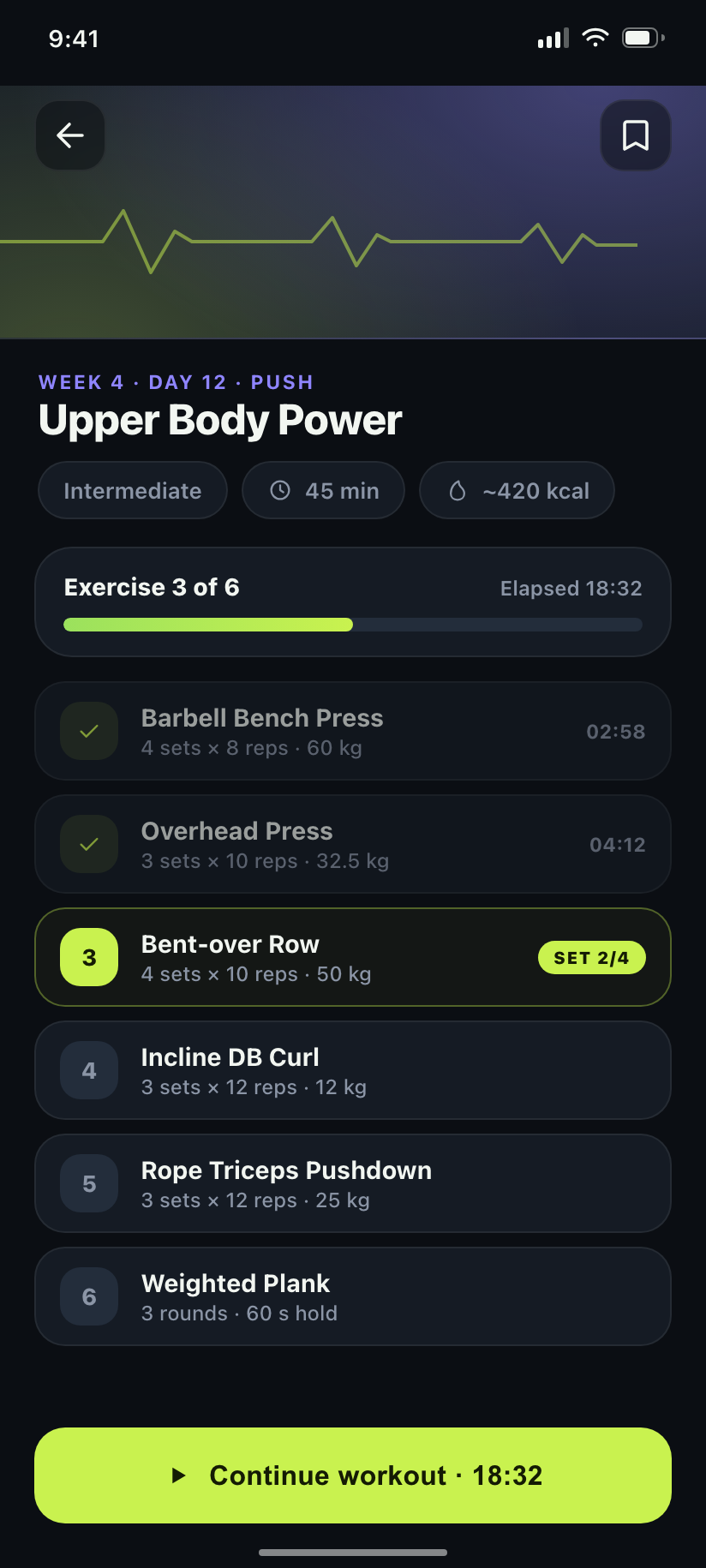
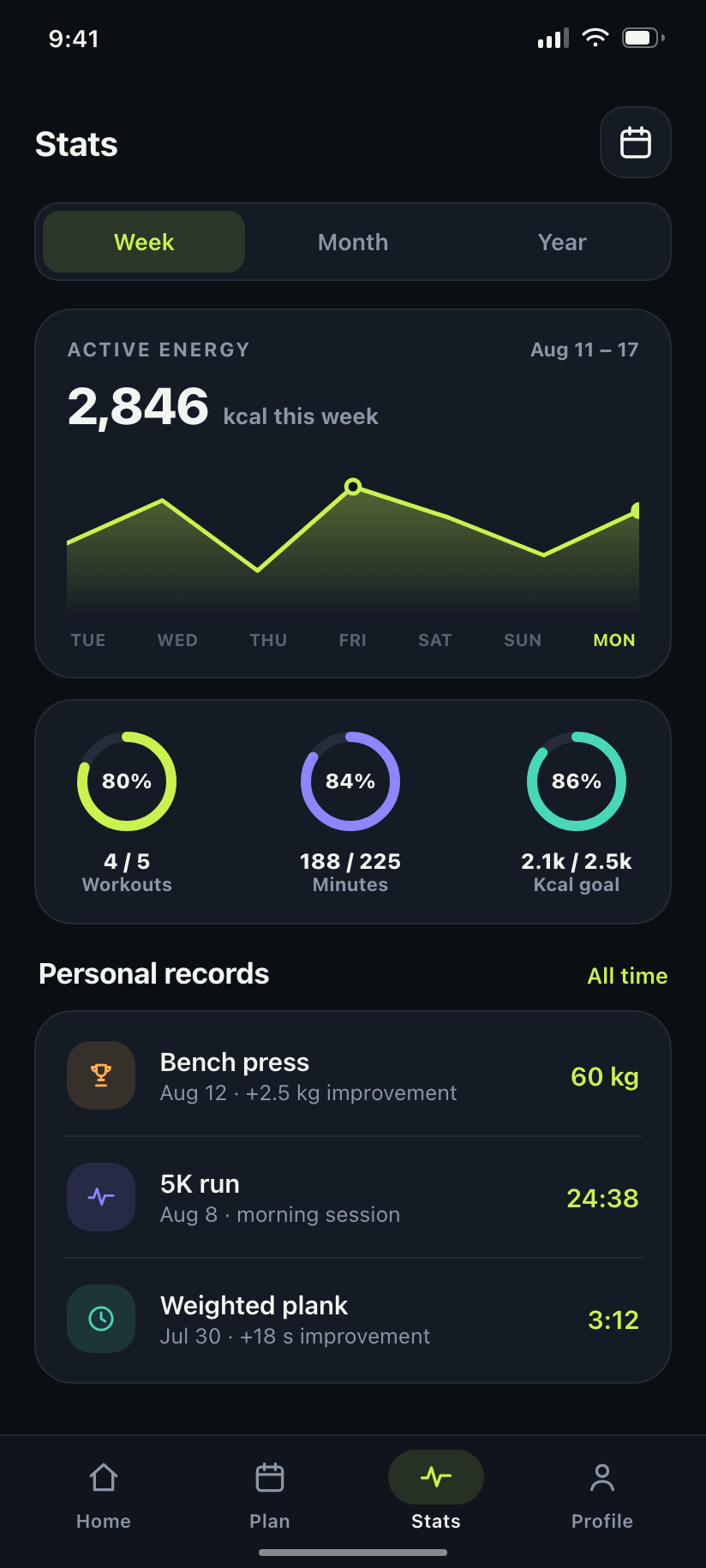
Fitness & workout tracking — dark, high-energy theme built for mid-workout glanceability.
Coinly
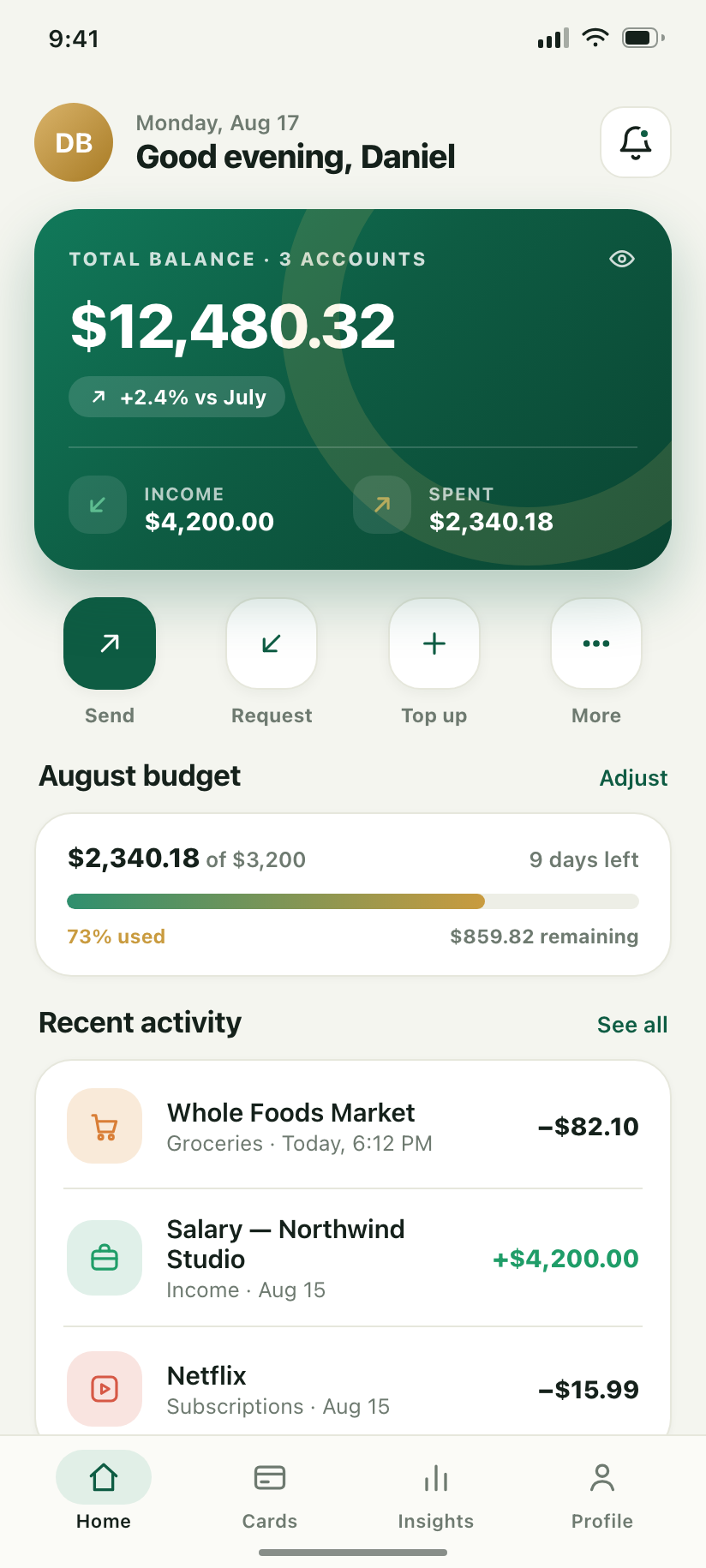
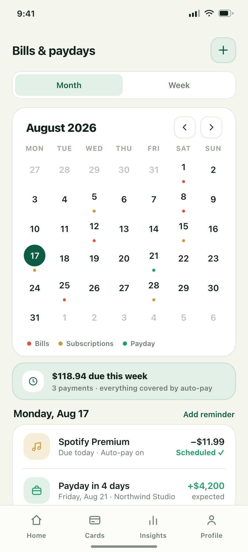
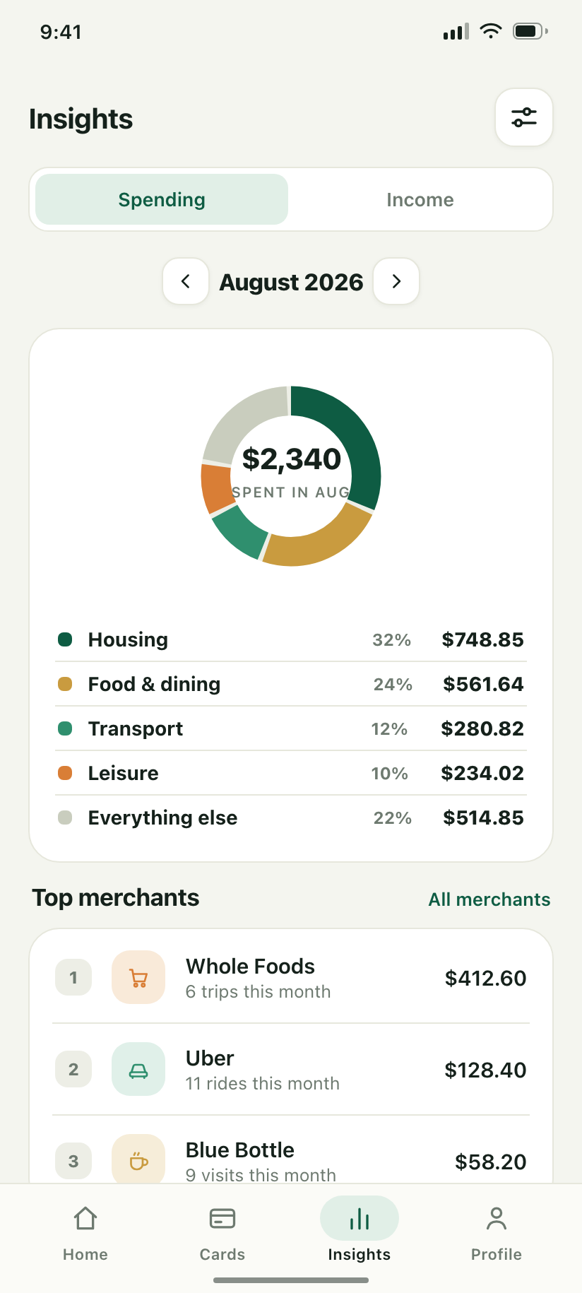
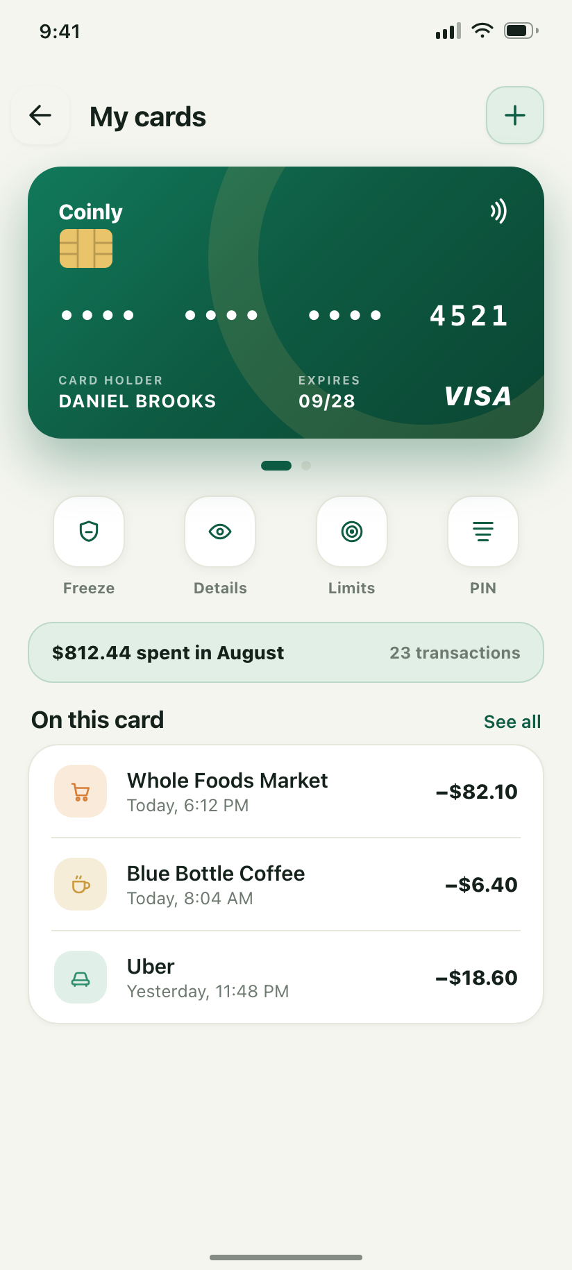
Personal finance & budgeting — light, calm, premium theme that earns trust on every screen.
How these files map to the Android codebase
Design tokens → theme
Each app's palette, spacing (8 dp grid) and radii are CSS variables in <app>/theme.css — the only file in a design allowed to hold a colour. In the starter they become Color.kt / Type.kt values inside core/designsystem, consumed by StarterTheme with light and dark schemes.
Screens → feature modules
- Onboarding →
feature:onboarding - Login / Register / Reset →
feature:auth - Home / Calendar / Insights →
feature:home+ new modules - Profile / Settings →
feature:settings - Alerts →
core:notifications(channels per type) - Compose translations → see
COMPOSE.md
No external assets
Chrome blocks subresource requests from a file:// page, so a mockup that links a webfont silently renders in Arial. Every face is base64'd into kit/fonts.css, and there are no photographs anywhere — imagery is drawn as CSS gradients and inline SVG, which is also why it re-colours correctly in dark mode.
Regenerating
Every screen is a standalone HTML file in <app>/screens/. The six newest designs share kit/: node kit/render.js <app>, node kit/lint.js, node kit/gallery.js <app> and node kit/index.js for this page. The two Clinicana folders keep their own copies of the same three scripts; FitPulse and Coinly share shared/screen.css and ./render.sh.