Getting in
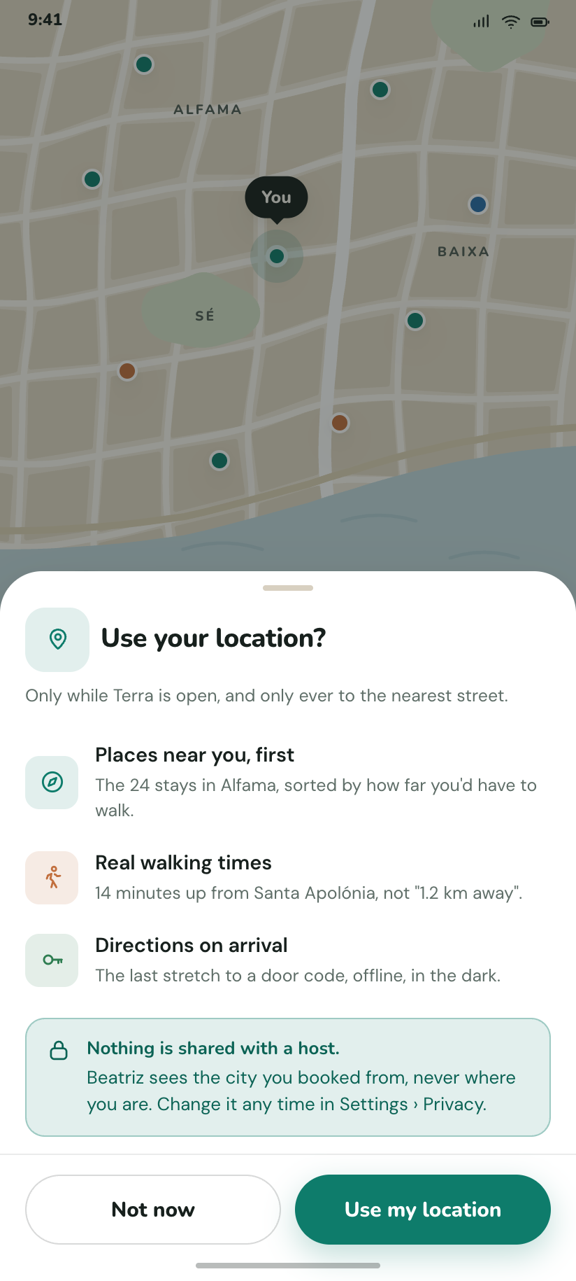
5Five screens, and only one of them asks for anything. The location prompt is drawn over a live map rather than an illustration, because the honest way to ask for a permission is to show what it buys.
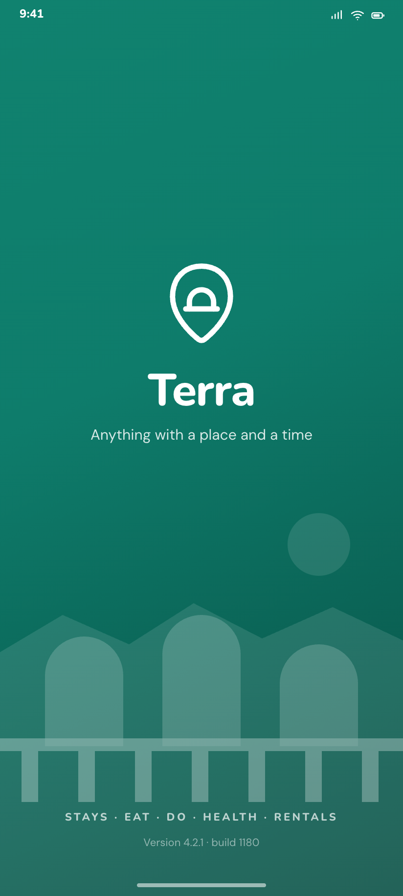
Splash
The one moment the app is pure brand: the mark on a deep teal field over a drawn horizon, white ink in both modes.
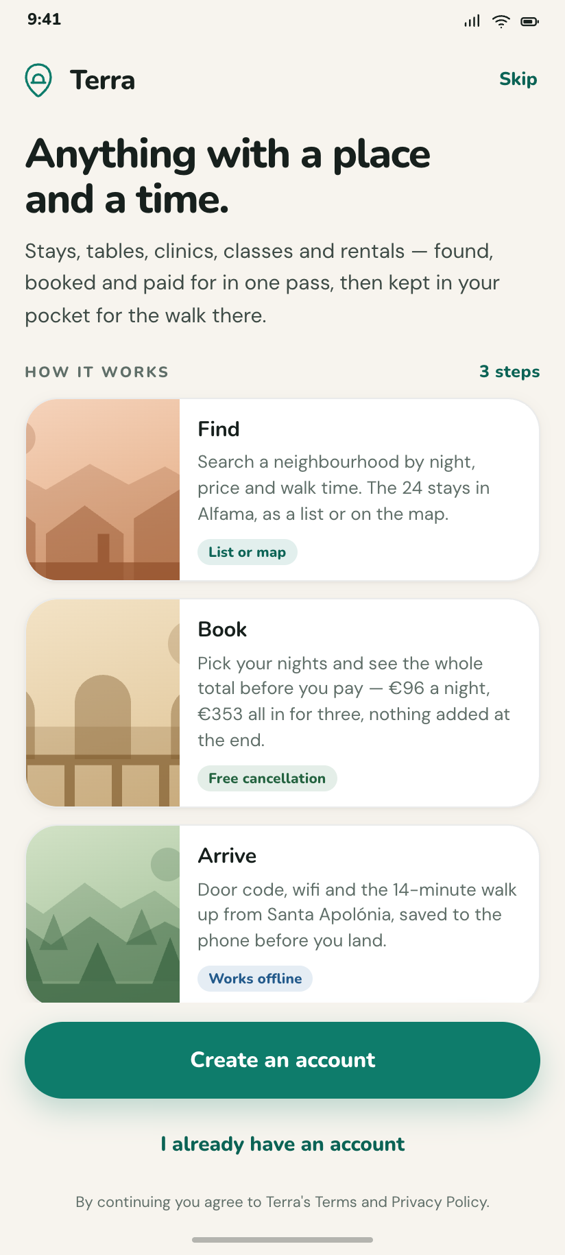
Onboarding
Three panels — find, book, arrive — each carrying a different plate pigment so the drawn imagery introduces itself before any listing does.
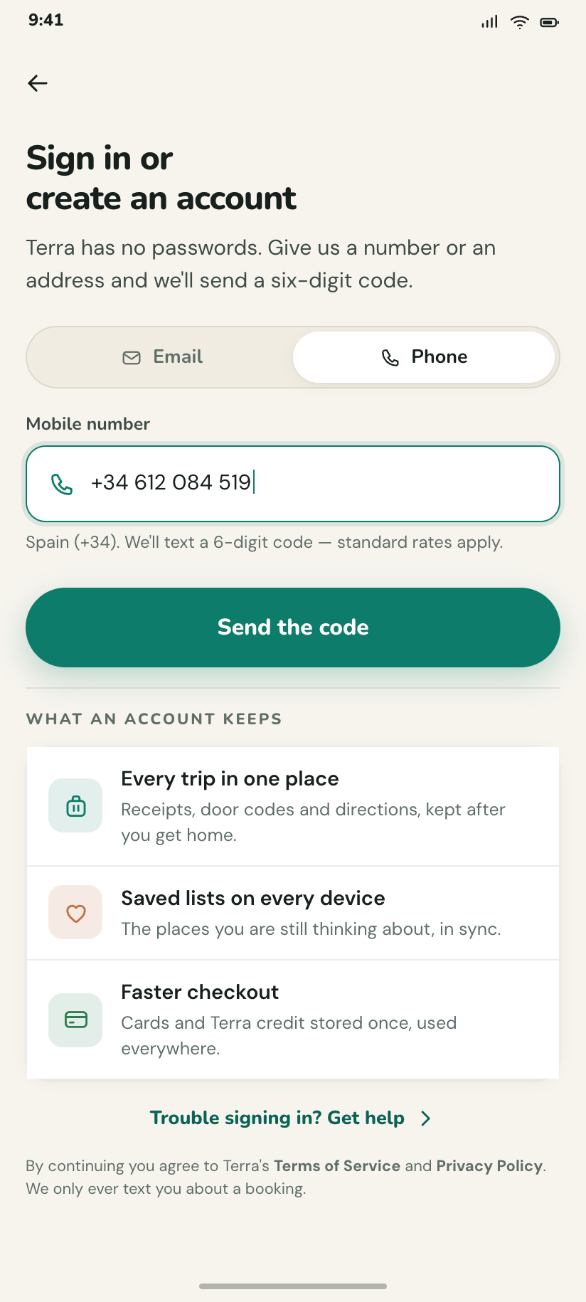
Sign in
Email or phone in one field with a segmented switch above it; no third-party buttons, because no brand logos exist in this kit.
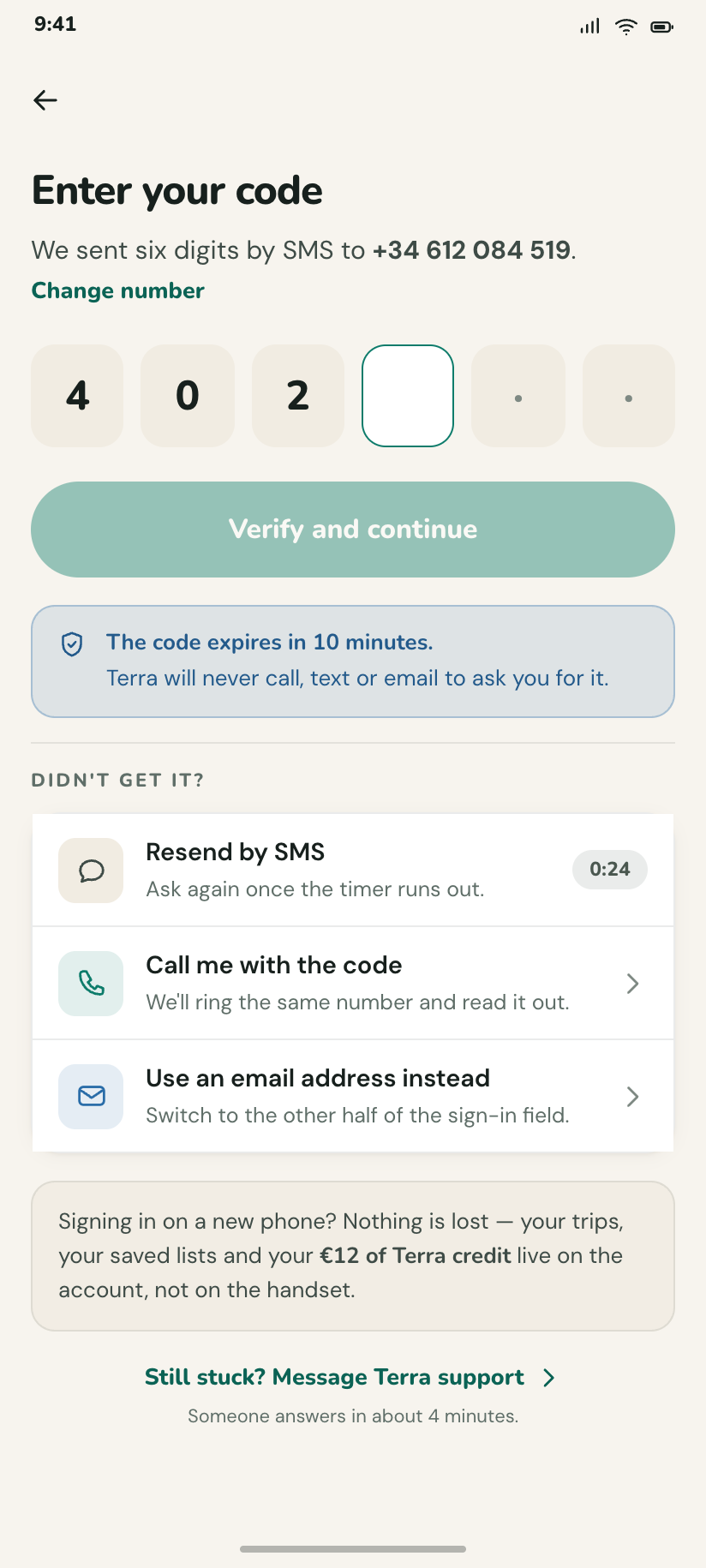
Verify
Six-box code with the fourth focused, the number it was sent to, and a resend timer counting down from 0:24.
Location permission
The rationale sheet drawn over a real map with the you-are-here ring already showing what "nearby" would mean.
Finding a place
8The search entry point is one pill that states the whole query — where, when, who — and every refinement is a sheet or a full-screen form that returns to the same list. Results and map are the same 24 stays in two projections.
Explore
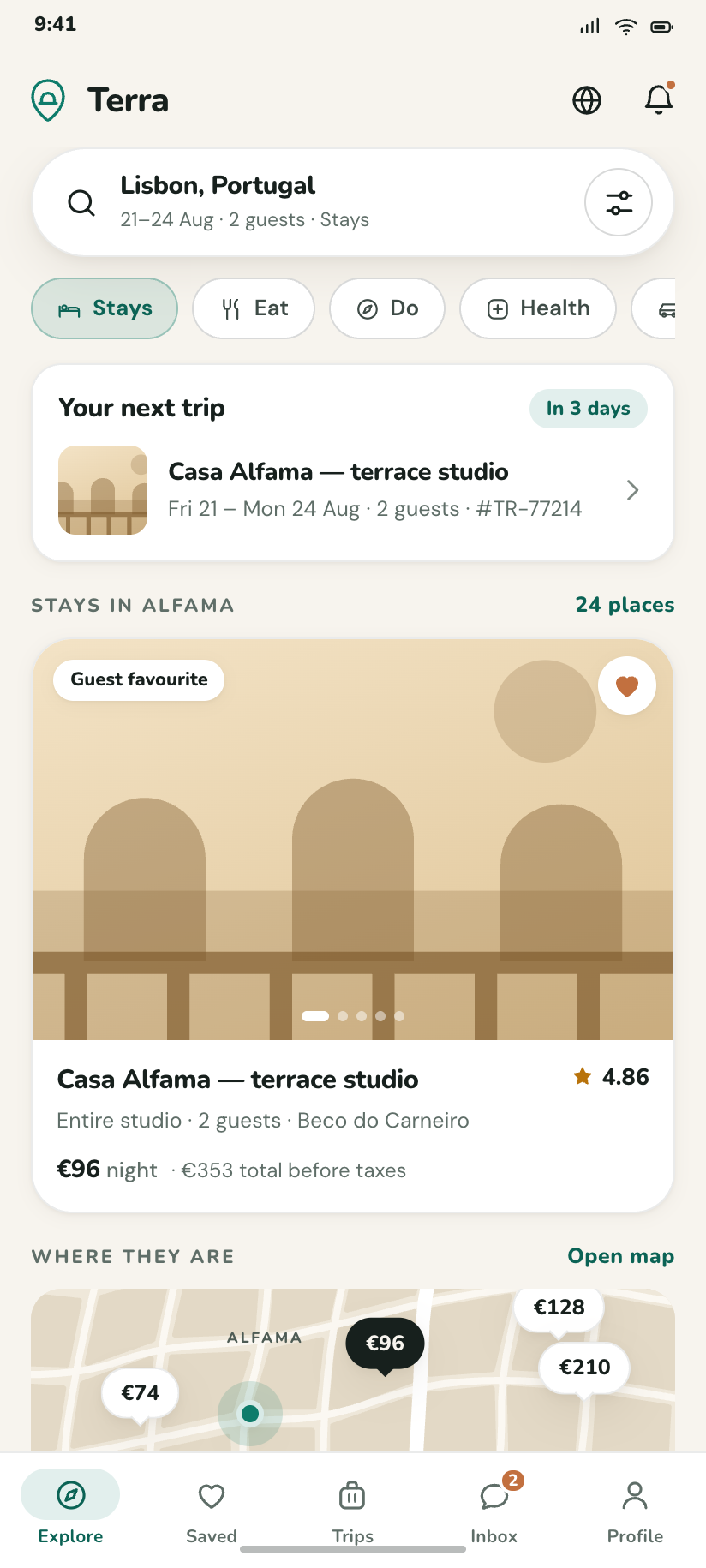
The busiest destination: the next trip first, then Alfama's stays, then the same stays on a map strip you can tap into.
Where · when · who
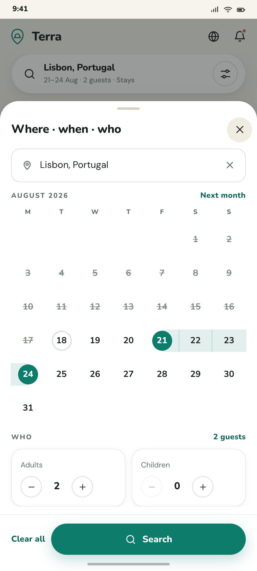
The search bottom sheet over Explore — a destination field, a two-month date range and guest steppers, with Clear all and Search in the footer.
24 stays in Alfama
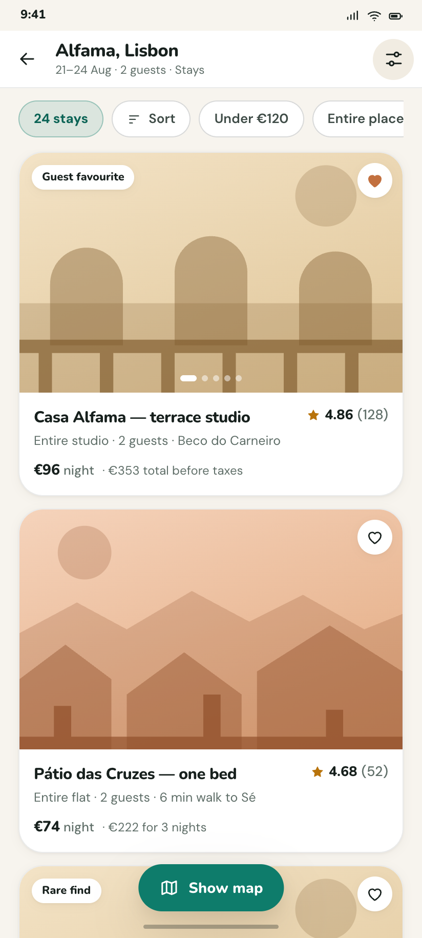
The list projection: full-bleed plate cards with rating, price and a saved heart, under a sticky filter row that says how many are left.
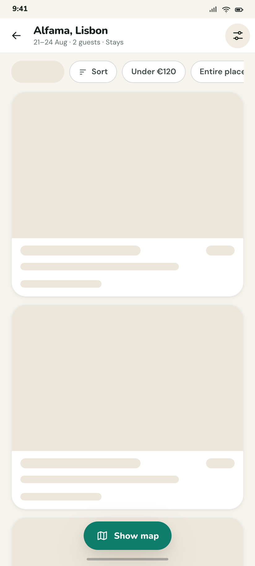
Results — loading
The same page as skeletons, shaped exactly like the cards that will replace them so nothing jumps when they land.
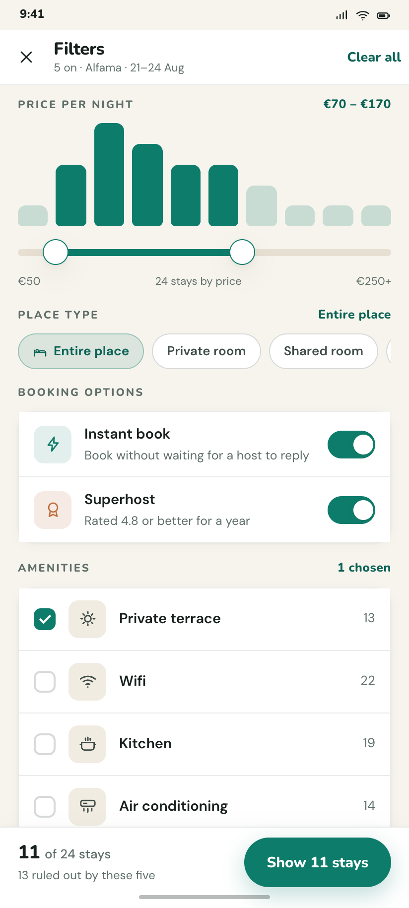
Filters
Full-screen: a price histogram with two handles, type chips, an amenity checklist, and a footer that previews the 24 → 11 the choices would cost.
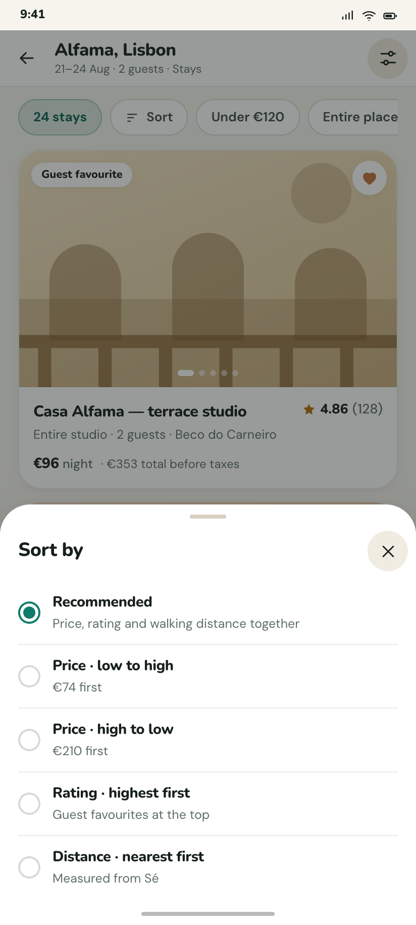
Sort
A short bottom sheet with five radio options over the results list, Recommended selected.
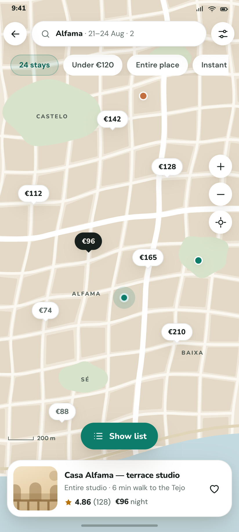
Results on the map
The showpiece: a whole drawn city, eight price pins with one selected, the you-are-here ring, and the peek card for the chosen stay.
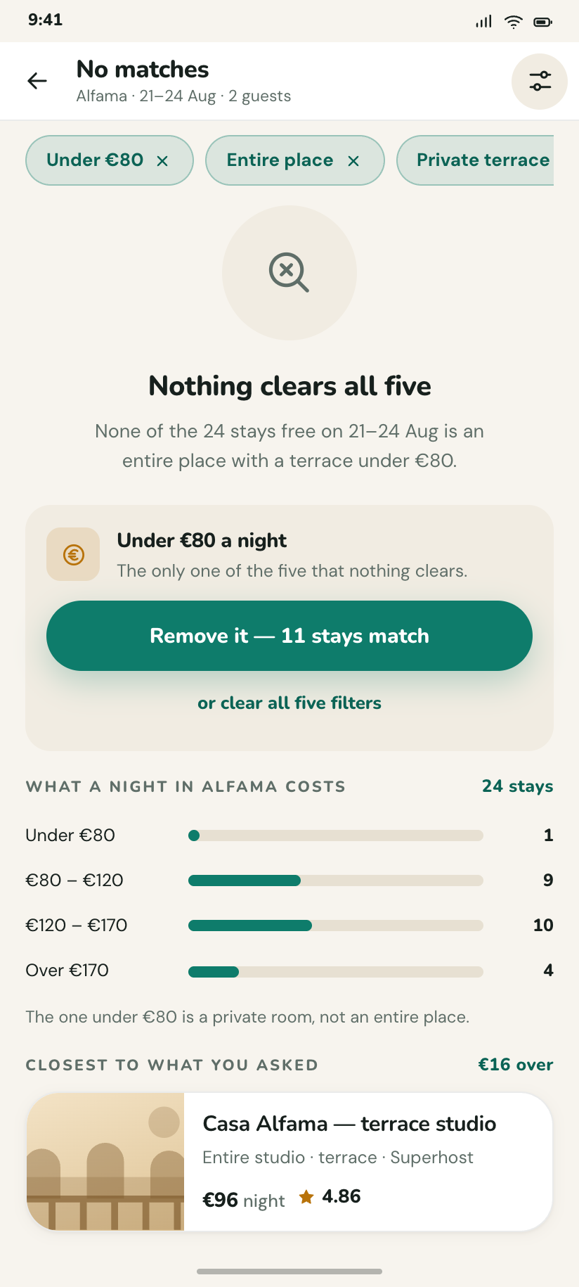
No matches
The empty state that names the filter doing the damage — "under €80" — and offers to drop just that one.
The listing
6One place, six screens. The detail page carries a sticky price bar; everything it links to is a full screen with a back arrow, because none of them is a nav destination.
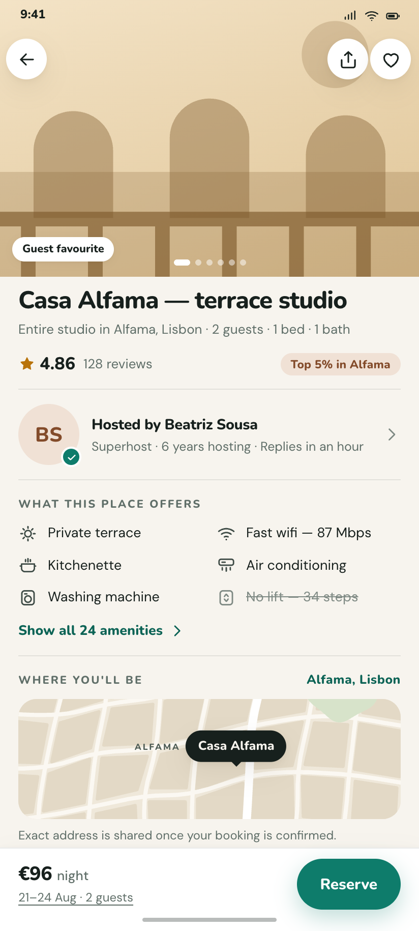
Casa Alfama
The dense detail screen: drawn hero, rating, host, amenities, a map of the block and a Reserve bar pinned to €96 a night.
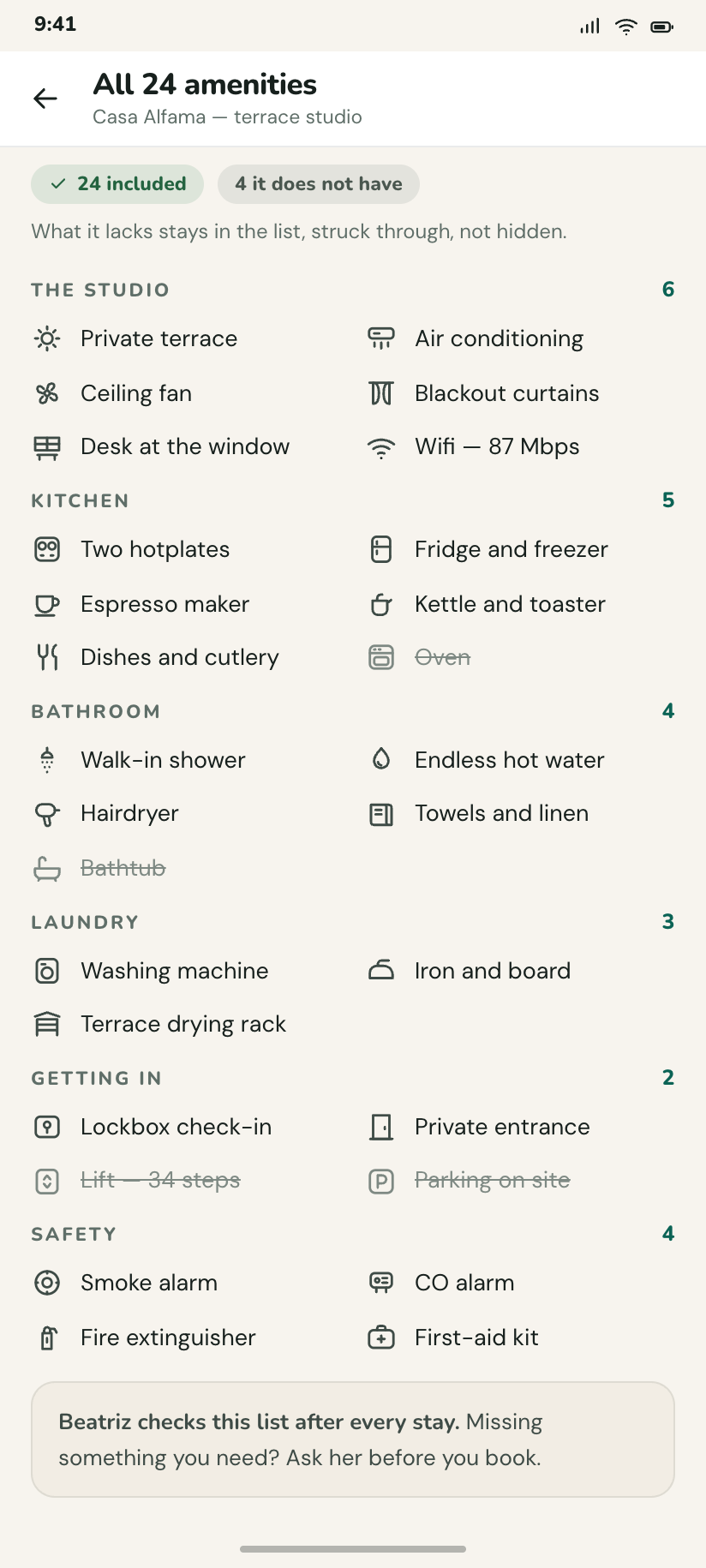
All 24 amenities
Grouped by room, with the four the place does not have kept in the list and struck through rather than hidden.
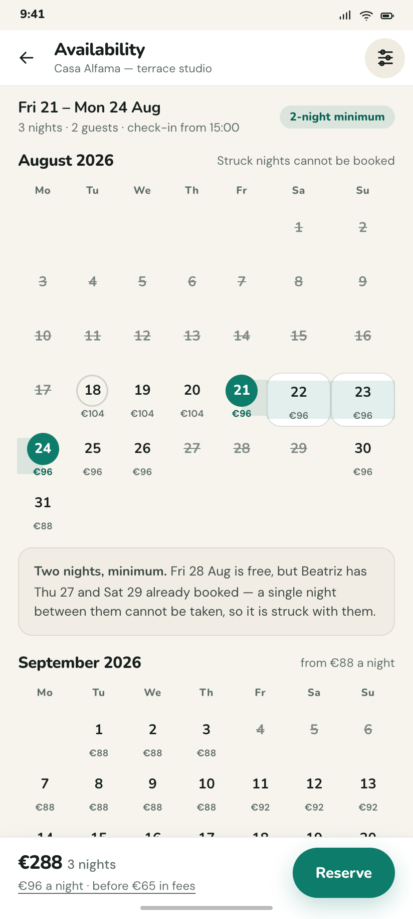
Availability
Two months with a price under every night, the 21–24 range banded, and the two-night minimum stated where it bites.
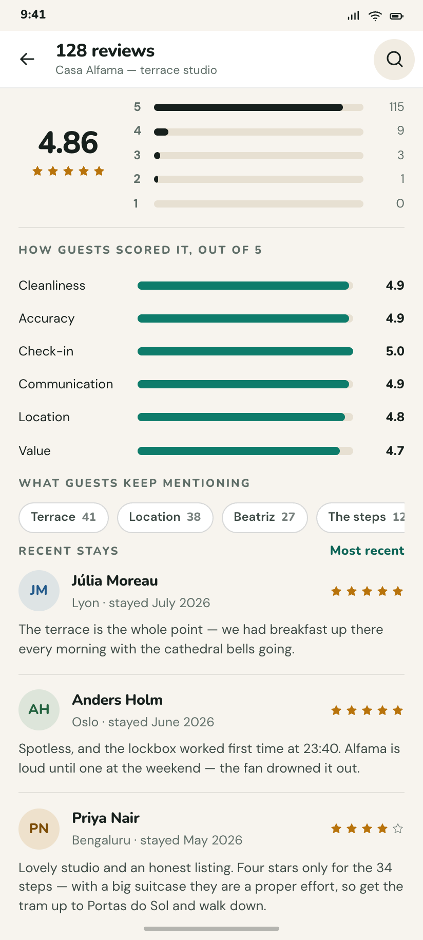
128 reviews
The 4.86 broken into five bars that sum to 128, six category scores, and three reviews with the guest's month of stay.
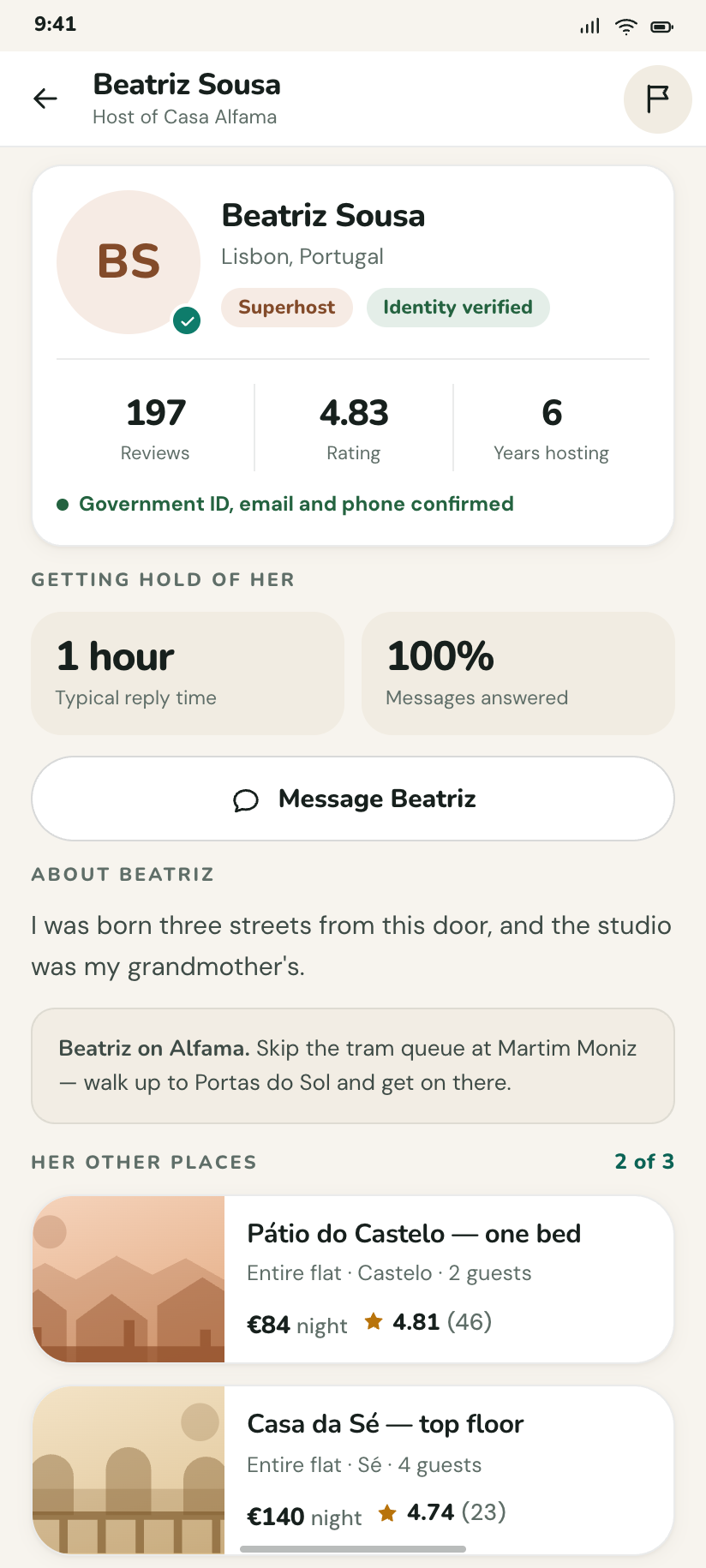
Beatriz Sousa
The host page: verified identity, response time, the two other places she lets, and what she says about the neighbourhood.
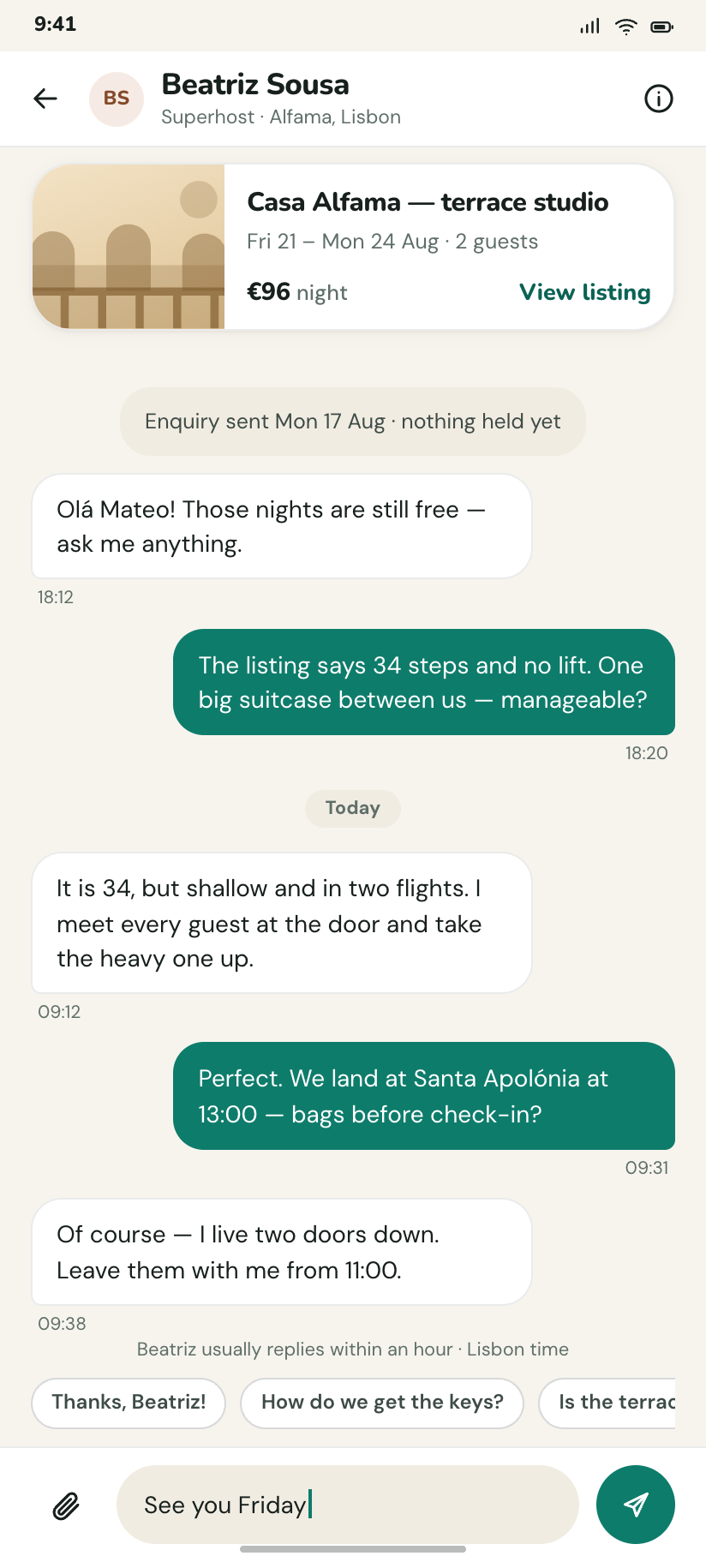
Message Beatriz
A chat thread with a listing card pinned at the top, quick-reply chips, and the note that she usually answers within an hour.
Booking and paying
5Three steps, a progress bar that is honest about which one you are on, and the total repeated in the same place on every screen so it can never quietly change.
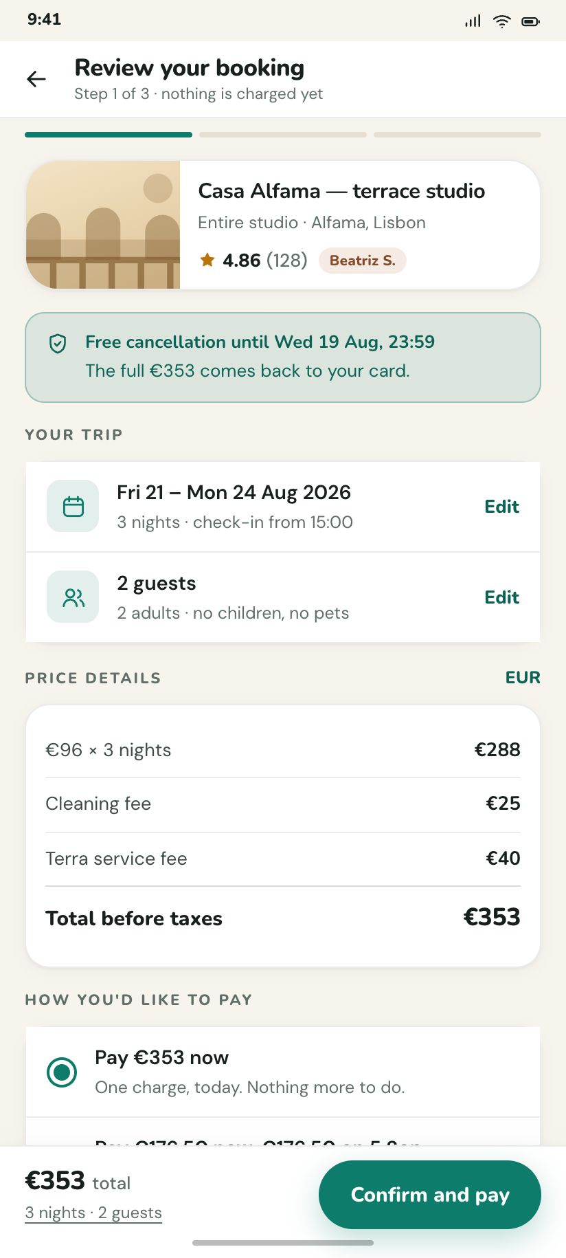
Review your booking
Step 1: what, when, who and exactly what €353 is made of, with the free-cancellation deadline above the fold.
Guest details
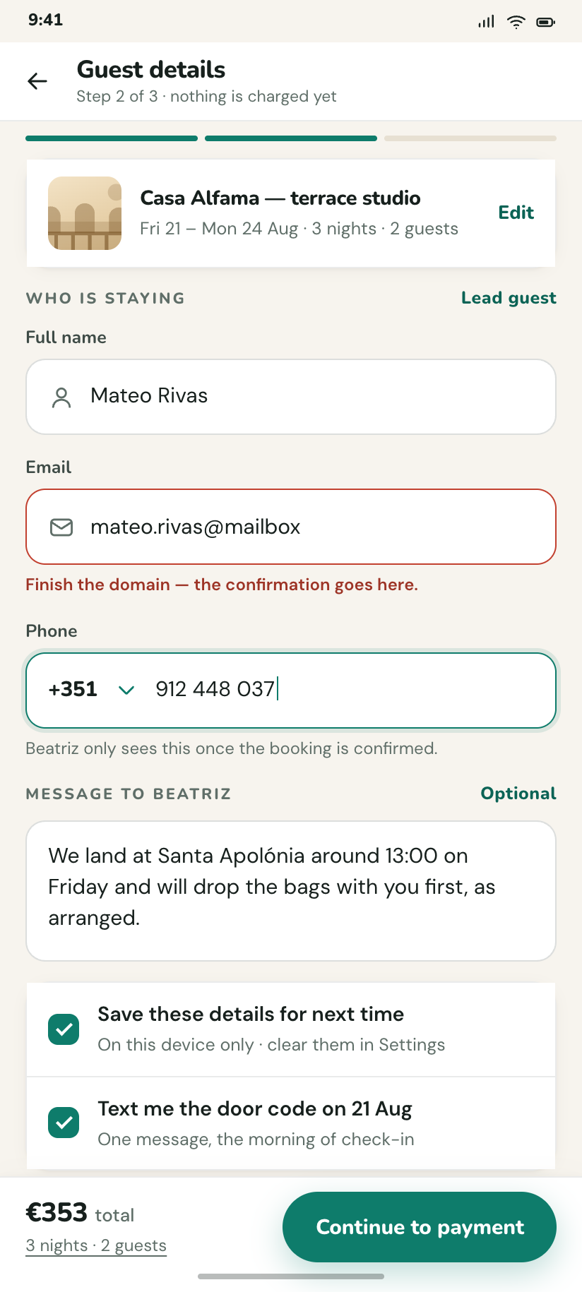
Step 2: the form — name, email, phone with country code, an optional message to the host, and one field showing its error.
Payment
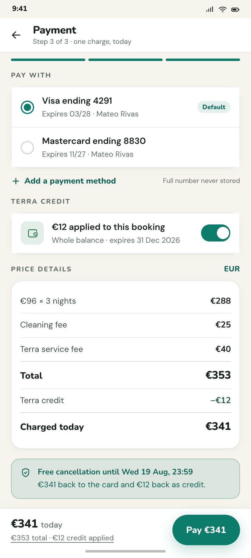
Step 3: saved cards as radio rows, €12 of Terra credit applied, and the charge restated as €341 on the button.
Booked
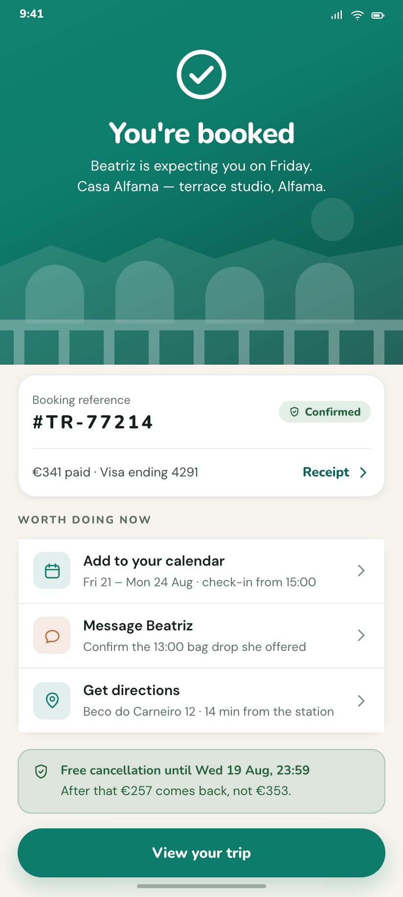
The brand field again, the reference #TR-77214, and the three things worth doing next — add to calendar, message host, get directions.
Receipt
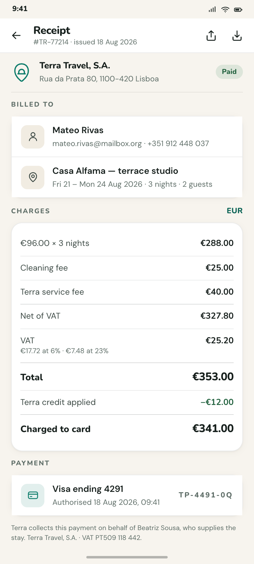
The itemised version with VAT broken out and the card's last four digits, laid out to survive being screenshotted for an expense claim.
The trip itself
6Everything after the money changes hands. The trip detail is the hub; directions and the day plan are where the map and the timeline earn their keep.
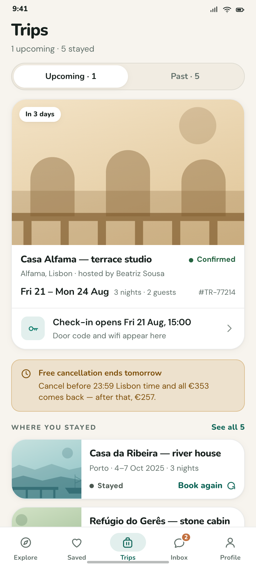
Trips
Upcoming and Past behind a segmented control, with the Lisbon trip counting down and two 2025 stays below it.
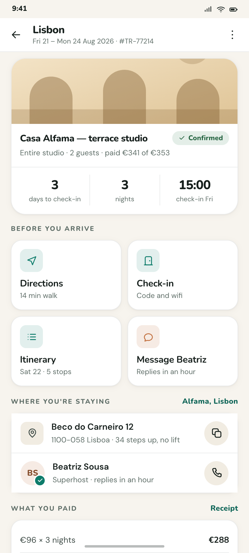
Lisbon · 21–24 Aug
The trip hub: countdown, address card, host row, and the four actions that matter in the 48 hours before check-in.
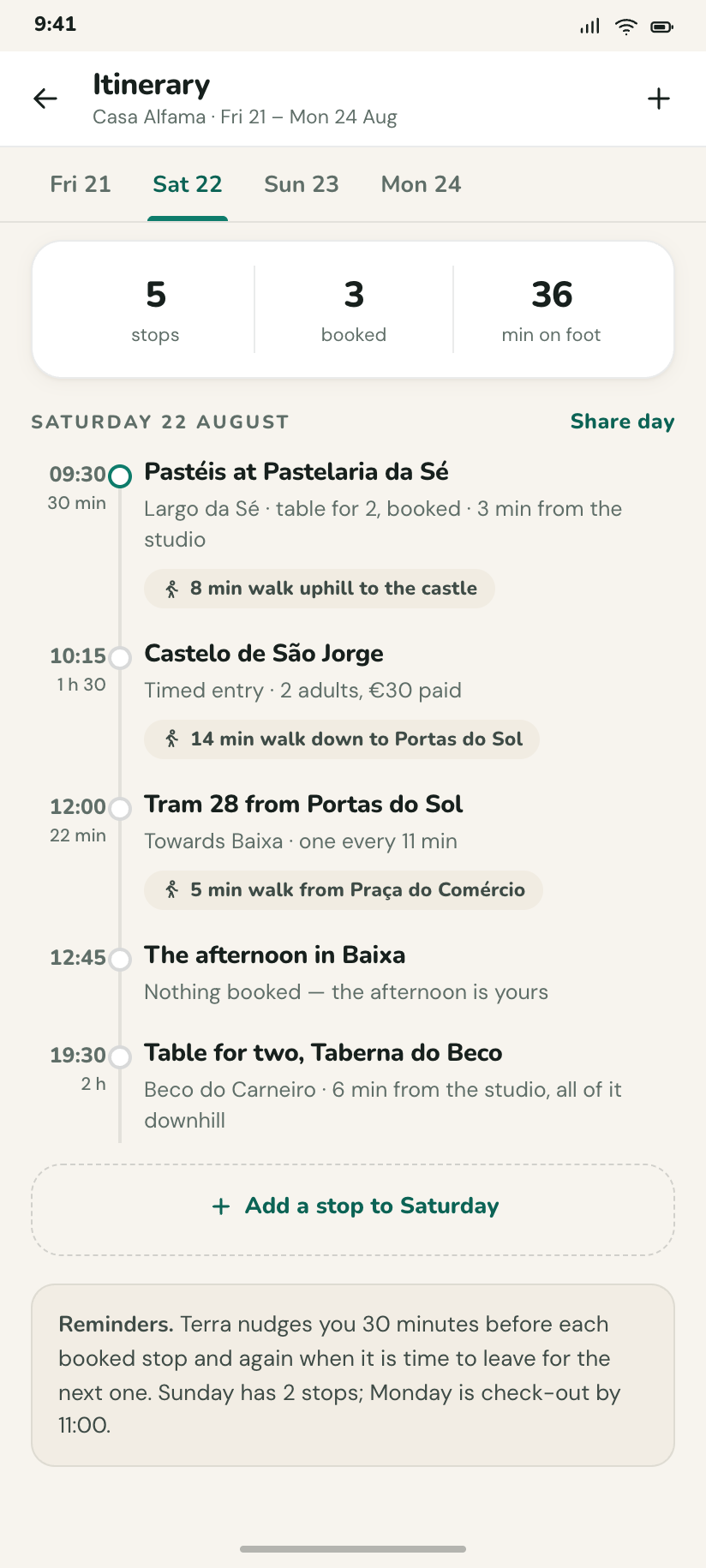
Saturday's plan
A timeline with real times down the left — a 09:30 pastry, a 12:00 tram, an 19:30 table — and travel gaps costed in minutes.
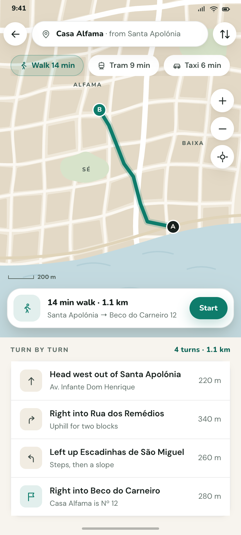
Walk to Casa Alfama
The drawn route from Santa Apolónia with A and B endpoints, 14 minutes, and the turn list under a peek.
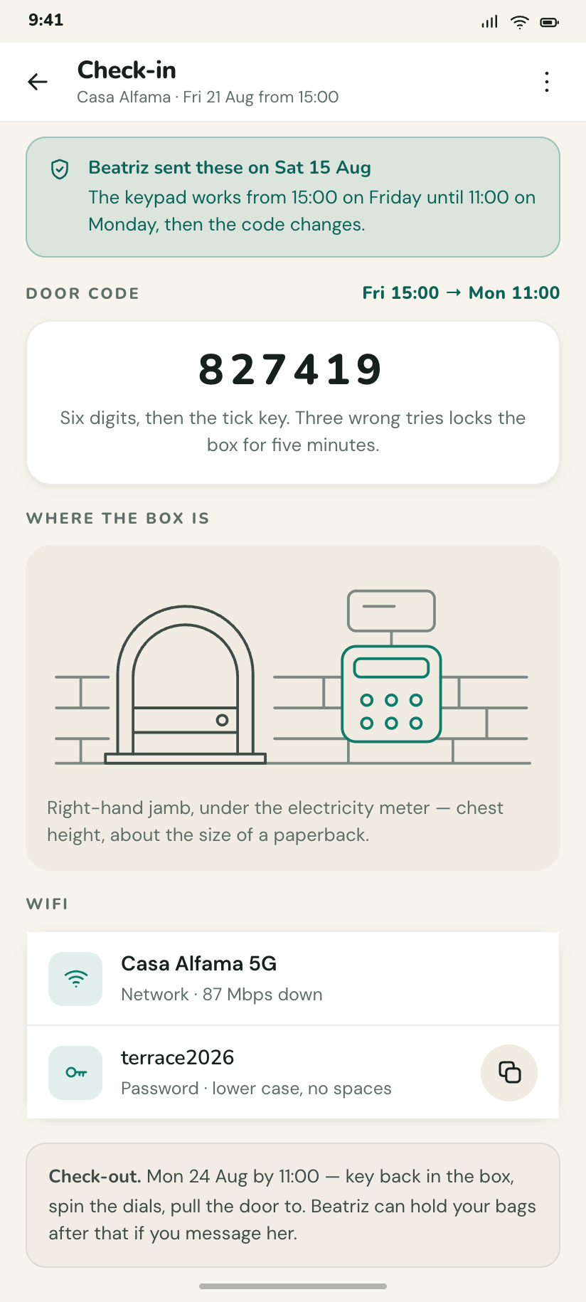
Check-in
Door code in large tracked figures, the lockbox photo replaced by a drawn diagram, and the wifi password with a copy affordance.
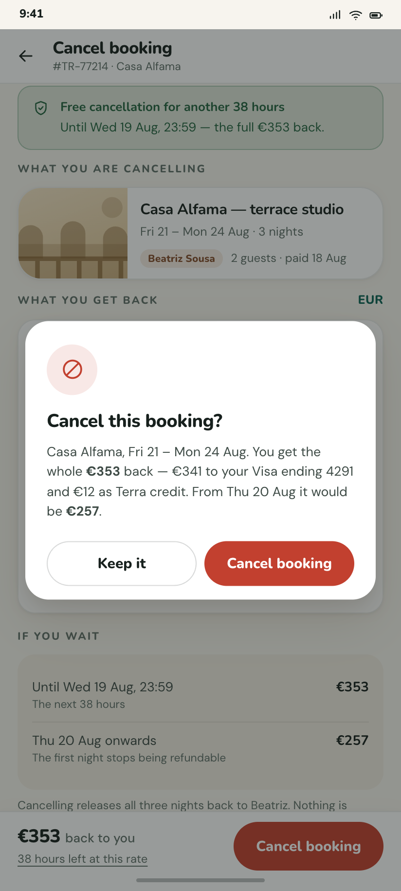
Cancel this booking?
The dialog over the refund breakdown, stating the exact €353 back and the deadline after which it would only be €257.
Inbox, saved, you
6The three remaining nav destinations plus their overlays. Selection mode lives on Saved because moving saved places between lists is the one bulk action this kit actually has.
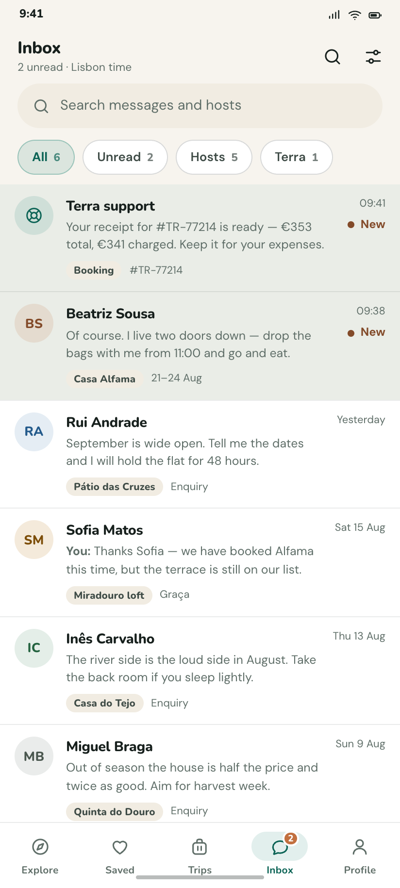
Inbox
Conversations with hosts and one from Terra support, unread ones tinted and carrying a clay dot.
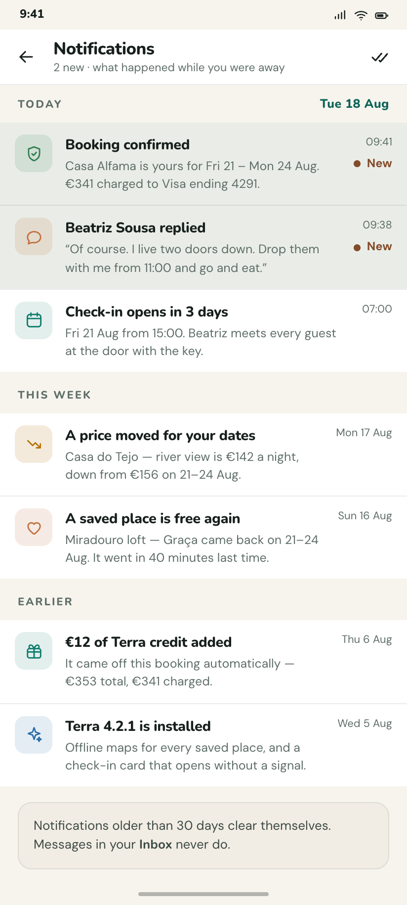
Notifications
Grouped Today / This week / Earlier, mixing price drops, a host reply and a reminder that check-in opens in 3 days.
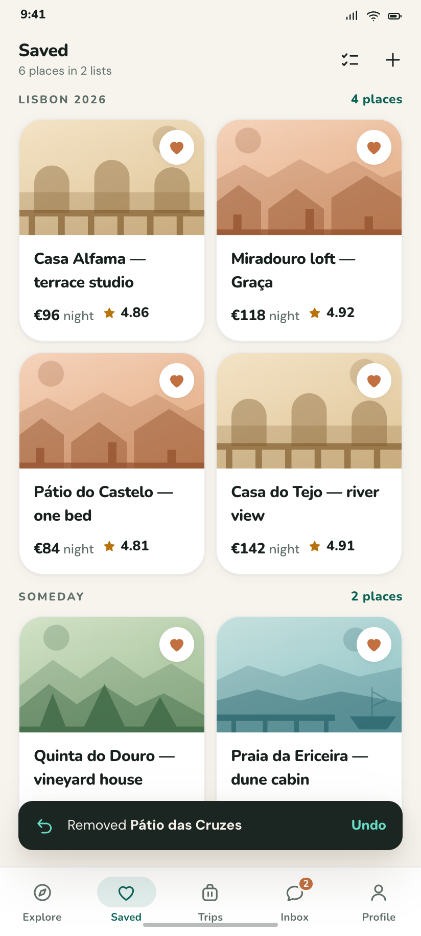
Saved
Two lists — Lisbon 2026 and Someday — as a grid of plates, with a snackbar undoing the place just removed.
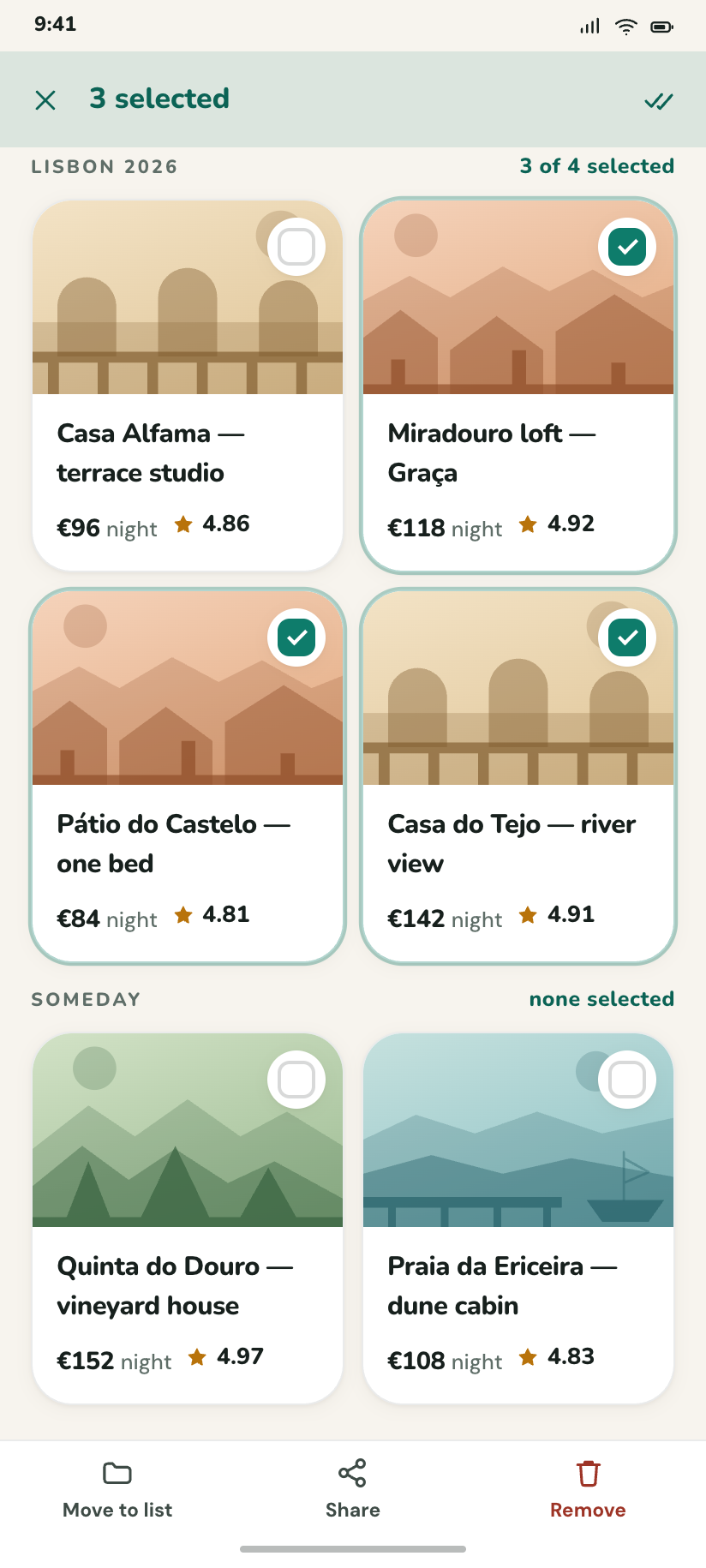
Saved — 3 selected
Selection mode: the app bar becomes a count, the nav becomes Move / Share / Remove, and three cards carry ticks.
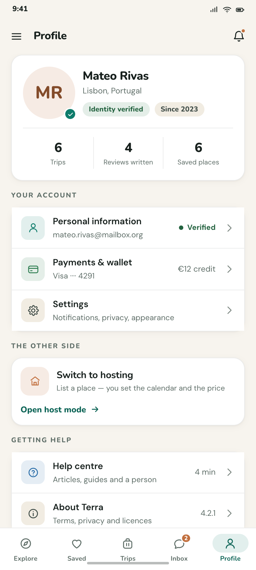
Profile
Mateo Rivas, verified, 6 trips and 4 reviews written, above the shortcuts into settings, wallet and host mode.
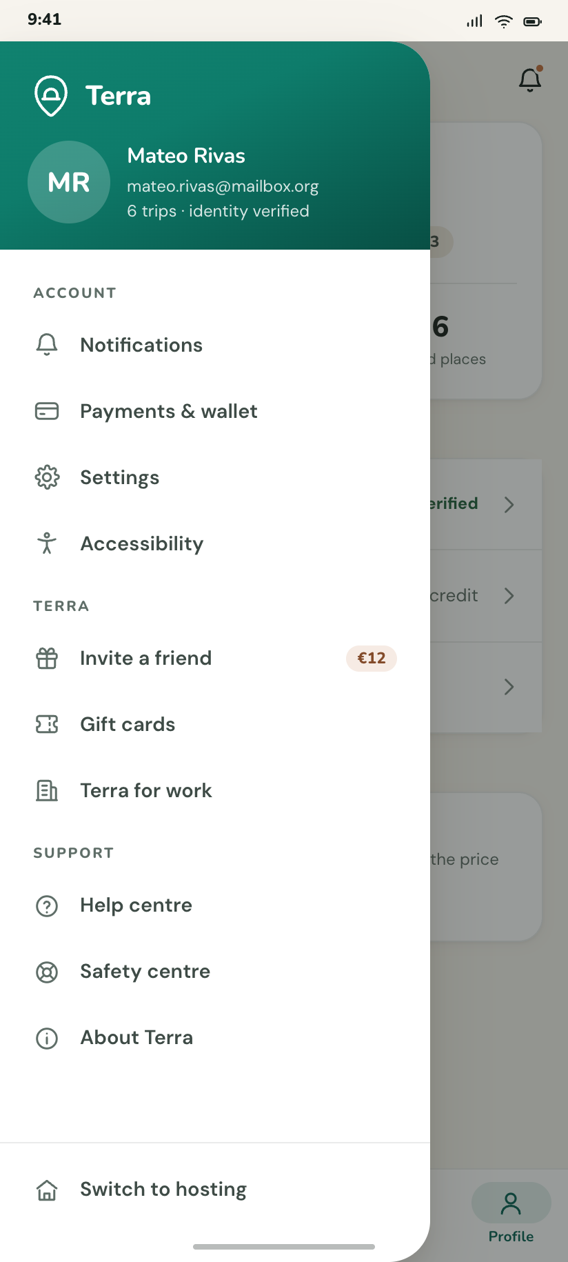
Menu drawer
The navigation drawer over Profile: a brand cap, everything the five tabs cannot reach, and Switch to hosting at the foot.
Settings
4A hub and three sub-pages. Each sub-page is a real page with real switches, not a list of labels — the notification page alone has eleven controls in four groups.
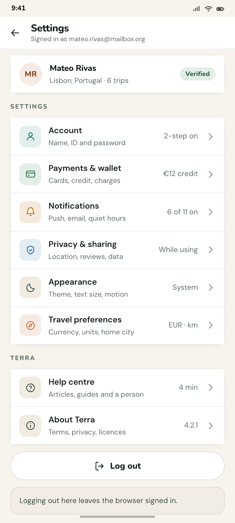
Settings
The hub: account, payments, notifications, privacy, appearance and travel preferences, each with its current value on the right.
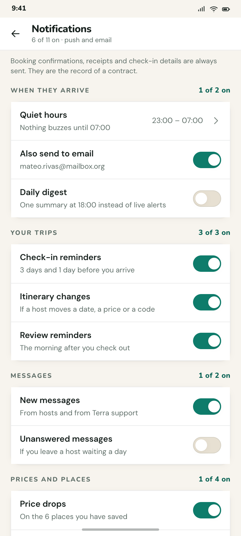
Notifications
Eleven switches in four groups, with the quiet-hours window and a note that booking confirmations cannot be turned off.
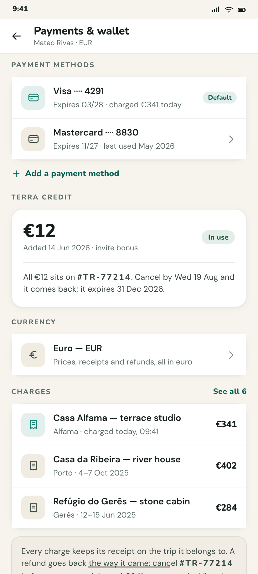
Payments & wallet
Cards, €12 of Terra credit with its expiry, the default currency, and what each recent trip actually charged.
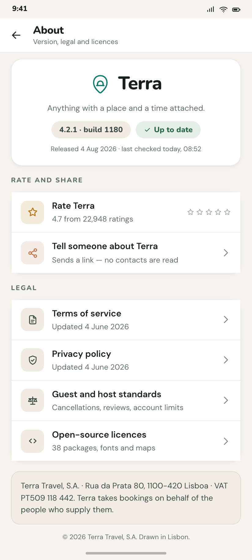
About Terra
The legal corner: version 4.2.1 (build 1180), terms, privacy, open-source licences and the rate-the-app row.
Host mode and the edges
4The other side of the marketplace, the help desk, and the two states every product ships and few design: no network, and a request that failed.
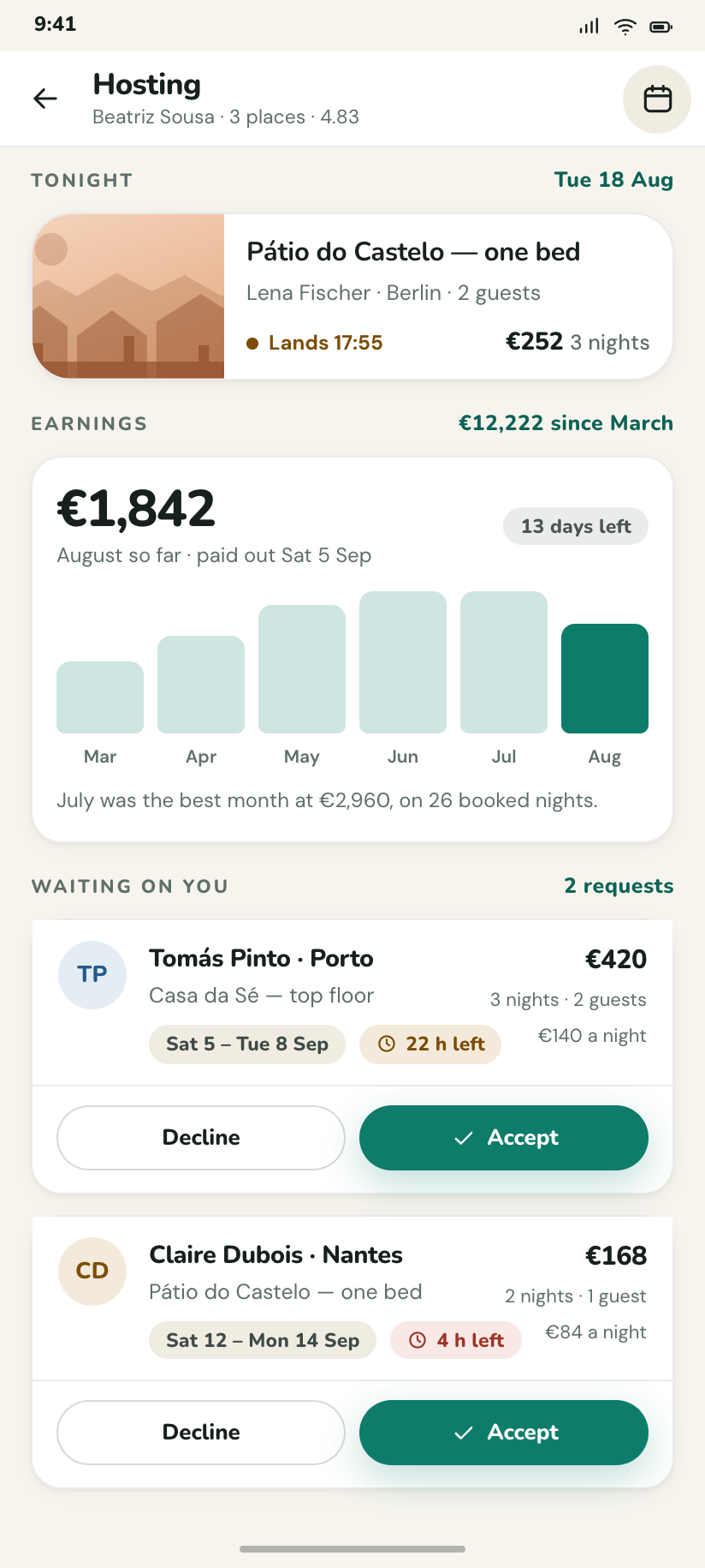
Hosting
Beatriz's side: tonight's arrival, €1,842 earned this month as a column chart, and the two requests waiting on her.
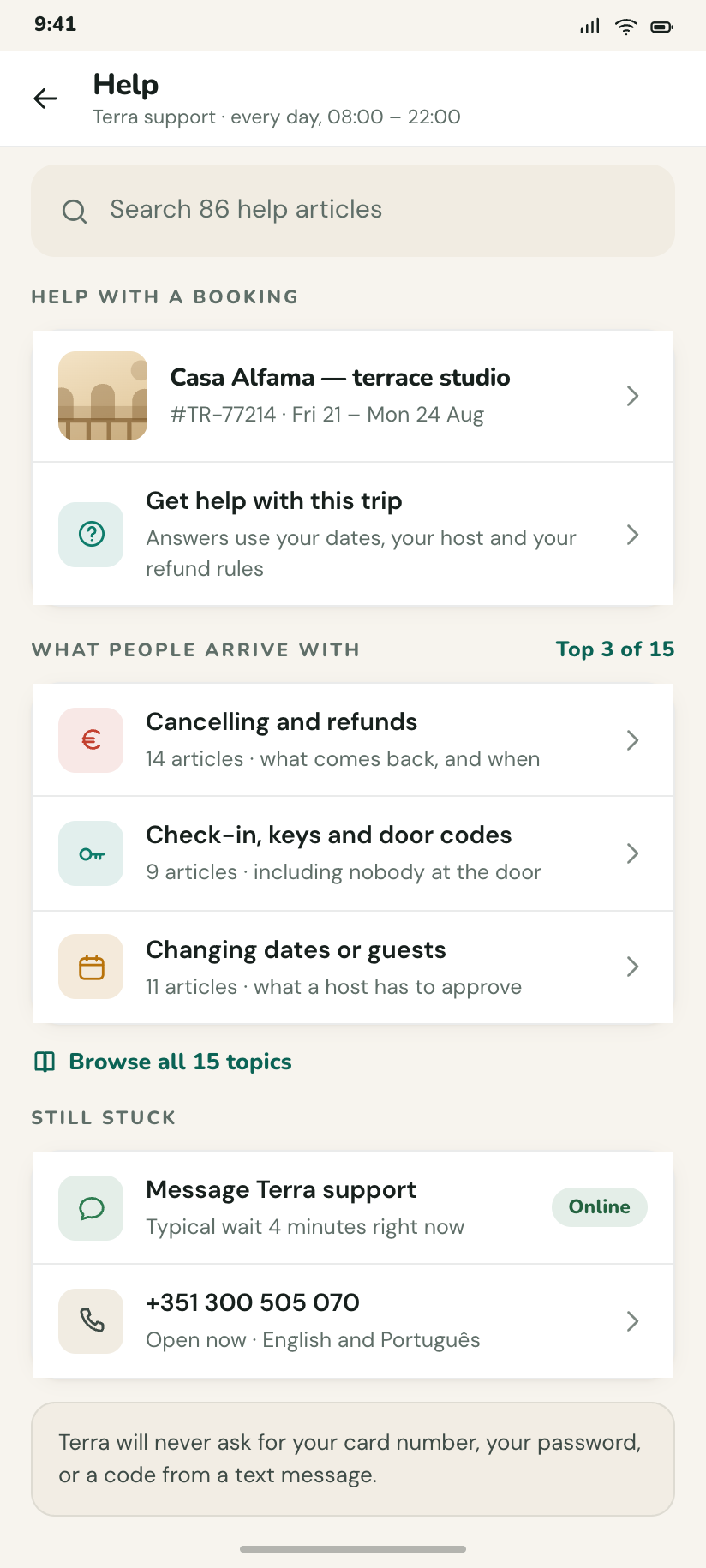
Help
Search over articles, the three topics most people arrive with, and a contact row that says the wait is 4 minutes.
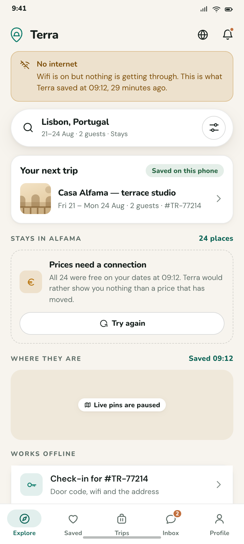
Offline
Explore with a persistent offline banner: the trip card still works from cache, the map strip is a flat placeholder.
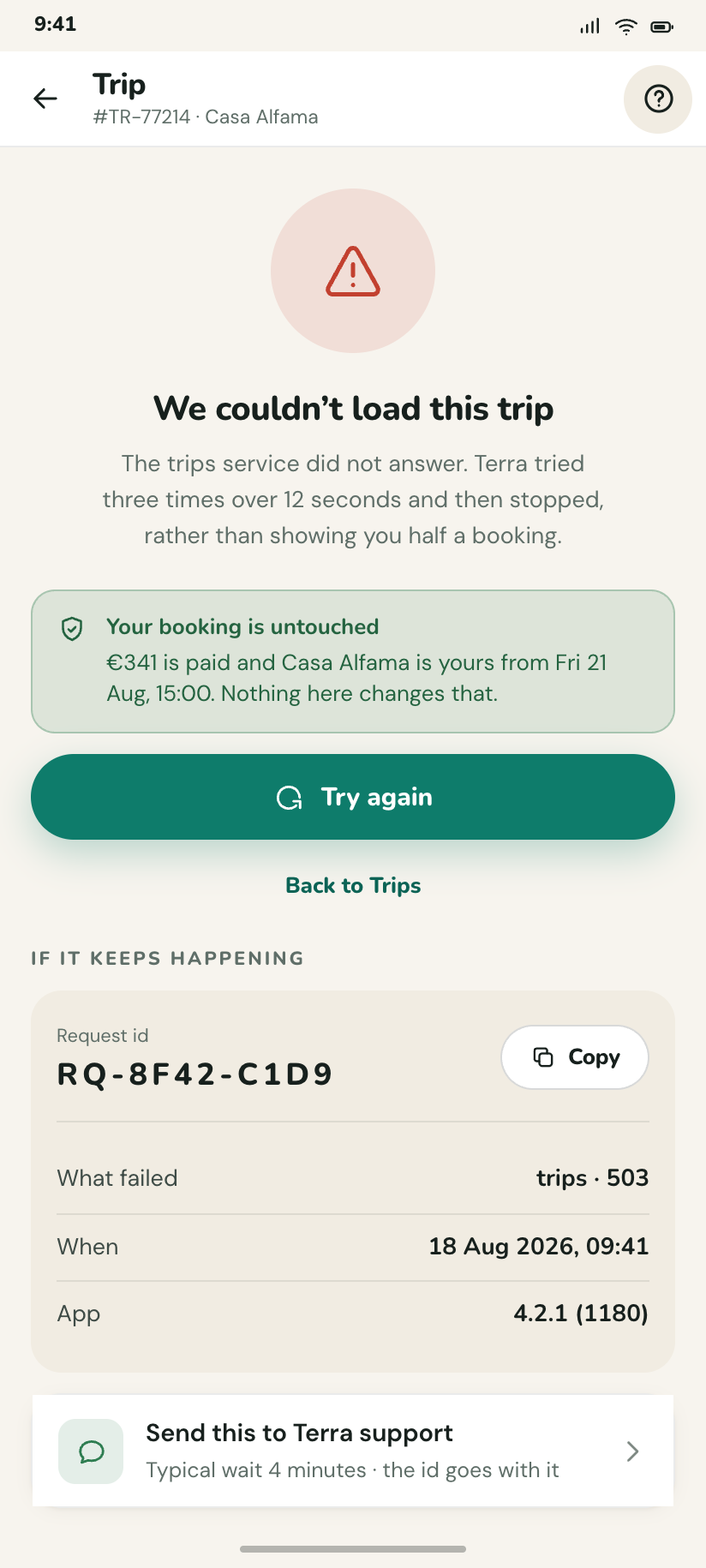
Something went wrong
The failure state that names what failed and gives a request id, so support has something to search for.
How this folder is built
Deep teal, clay second
Teal is transactional — prices, buttons, the booked state. Clay terracotta marks every human surface: hosts, reviews, wishlists, the badge on an unread message. Splitting the two means a screen never has to shout with the same colour twice.
A city with no tiles
.mapart is one SVG holding land, blocks, lanes, avenues, gardens, the river and its promenade, all read from --map-*. Panning and zooming is just moving the viewBox; a 118px strip on the home screen and the full-bleed results map are the same geometry.
Drawn imagery
No photograph exists in this design system, so a listing's picture is a .plate: a pigment plus a motif in three depth layers. Assigning one is content, not decoration — a stay gets sand, water gets sea, a walk gets pine.
Dark is designed
Elevation stops being a shadow and becomes a surface step: page, card, sheet, the thing on the sheet. Hues lift. The filled button inverts its ink because a lifted teal cannot carry white — but the brand field never inverts, it just gets deeper.